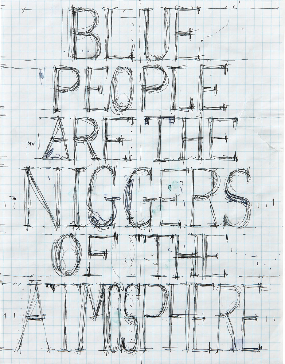
William Pope.L - Editions & Works on Paper New York Tuesday, April 18, 2023 | Phillips

Create your first list.

Select an existing list or create a new list to share and manage lots you follow.

  • “We live with the notion that, from very early on in American history, Americans have tended not to do things in the official way. And the spirit of my work is very much about that. My job in a way is to remind Americans about what self-image they want of themselves. Do we want an image of fear and compliance, or of adventure and democracy?”
    —William Pope L.


    On first encounter with William Pope. L’s Failure drawing #344F 6.29, 7.06.05, 9.02.05 (2005) what is most apparent is its elongated horizontal composition. Here we are presented with a drawn panoramic landscape with a body of water and a lone ship at its center, flanked by two mountain ranges. Move in closer and we encounter scattered spots of staining or soiling, scenes of the almost sci-fi landscape being drilled and excavated by unknown operatives, a tear reveals itself at one of the perforated tissue centers with strange text declaring the split in the sheet as a ‘time pucker.’ Or is it a ‘time fold’ or both? Yet another line reads “The Rocket’s Fear is its own Festival.” And stranger yet we are jolted back into reality with striations of sideways printed commercial text reading ‘ROSSMANN.’ Presumably corporate branding of some sort printed on the tissue paper come drawing sheet. This Failure Drawing is part of a larger ongoing body of work that number in the hundreds. They are executed while the artist is traveling, making use of materials he encounters along his journeys. Often the works contain familiar characteristics of travel i.e., wear and tear, folding, soiling etc. This intimate yet sprawling work remarkably contains many of the themes we associate with the artist’s larger oeuvre, the horizontal, the performative, the contradictory and the absurd. In this way one could argue the drawings contain a performative aspect in sync with other of his more well-known works like Time Square Crawl (1978). An endurance-based performance piece where the artist, dressed in a suit crawled on hands and knees through the sidewalks and streets of a section of Time Square.


    The absurd is also highlighted in his unique work on paper Gray People Fink Sunshine (2014). A painterly all over composition that formulates somewhat quickly into a text painting with the statement mentioned in its title. Was it originally painted to read Gray People Pink Sunshine? The ‘Pink’ inexplicably corrected to ‘Fink’? For what reason? Does this invented word ‘Fink’ feel more like a verb than adjective? Is ‘Fink’ an action or mistake. Either way one thing is certain, as this statement comes into focus its meaning becomes less so. Painted on a power tool advertisement in a palette consisting mostly of orange with dashes of black, green, aqua, and light pink it is reminiscent of a quickly dashed off sign one might see at a protest declaring some polarizing statement on one or another’s race. Is it true? Do we Laugh or take it seriously? It reads so short and sweet and almost to the point of hilarity that you struggle to decipher (and possibly agree or disagree), until your brain short circuits, and you are unable to defend or protest its code.  


    Unlike Gray People Fink Sunshine the race addressed in Pope’s Friendliest Black Artist in America (1997) is unambiguous. In bold white painted text on cream-colored paper, it declares quite clearly “WHITE PEOPLE ARE GOOD TO EAT.” It presents itself as more inherently political in its initial mention of a recognizable race. One cannot help but think of the now familiar anti-capitalist slogan (now infinitely appropriated by various sub-cultures and scrawled on the backs of back packs, jackets, and embroidered patches) ‘Eat the Rich’ attributed to the French Philosopher Rousseau as part of a political speech in which he stated, “When the people have nothing left to eat, they will eat the rich,” during the French Revolution. Pope’s statement is however presented with less context at first glance and so questions arise. Maybe they are? Have you tried? Are there other people good to eat? Who’s doing the eating? How hungry is the eater? Says Who? Our eyes move further down the sheet and our attention is drawn to the artist’s signature in black, followed by the title of the work in red, and finally dated in black. It is in this subtext and continuation of the statement that the author reveals themselves as the “Friendliest Black Artist in America.” Here is an author we can trust.

    • Provenance

      Mitchell-Innes & Nash, New York
      Acquired from the above by the present owner

374

Blue People are the Niggers of the Atmosphere

2008
Bic pen drawing, on graph paper.
10 7/8 x 8 1/2 in. (27.6 x 21.6 cm)
Signed and dated in ballpoint pen on the reverse, framed.

Full Cataloguing

Estimate
$800 - 1,200 

Sold for $4,445

Contact Specialist

Editions@phillips.com
212 940 1220


Editions & Works on Paper

New York Auction 18 - 20 April 2023