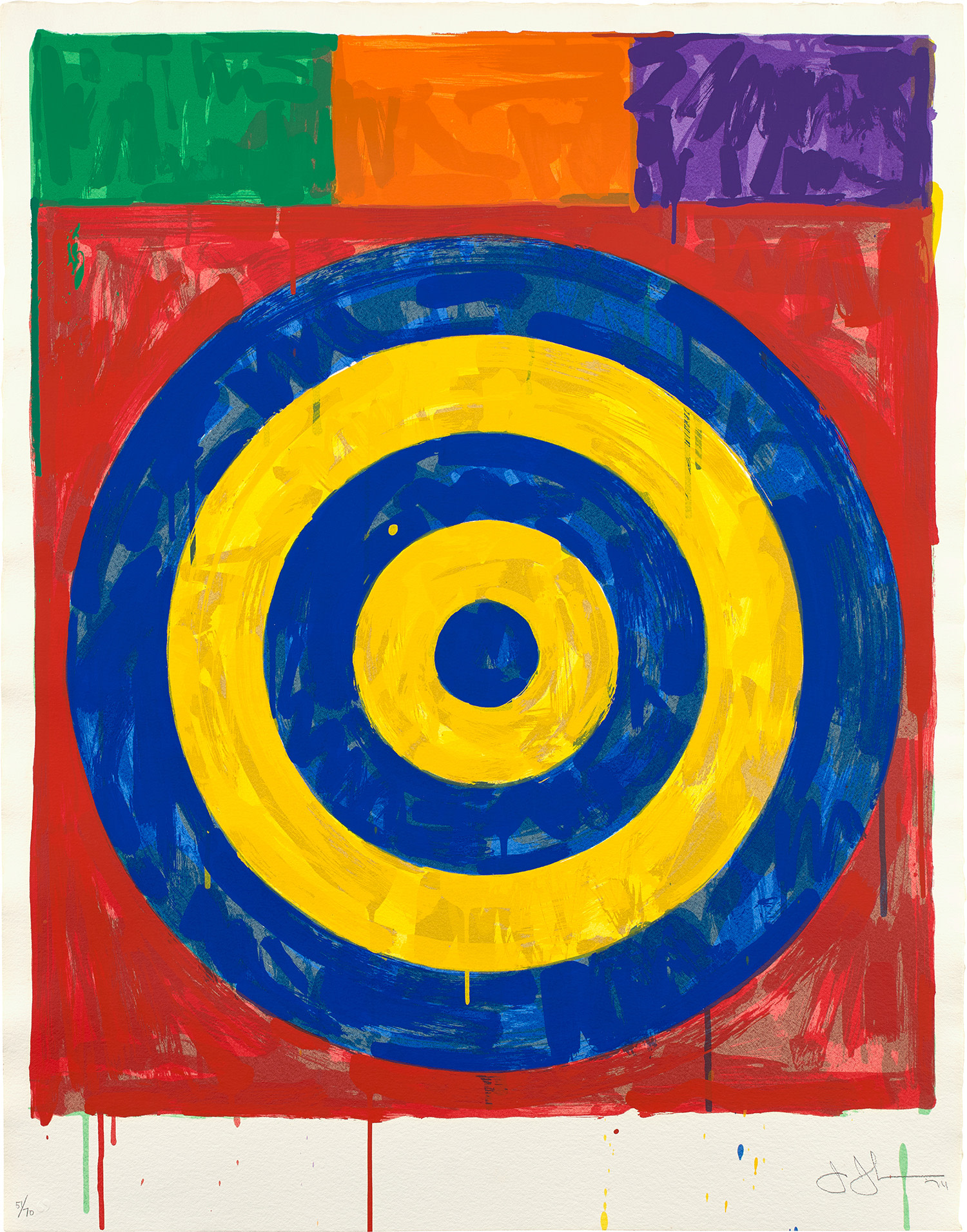
In prestigious collections such as MoMA, MFA Boston, and The National Gallery of Art, the 1974 Target is widely regarded as an exceptional work amongst Jasper John’s expansive print oeuvre. First embracing the image of the target in 1955, Johns famously remarked that he was interested in depicting “things the mind already knows” or “things which are seen and not looked at”: targets qua targets, flags qua flags, and numbers qua numbers, and so on.
"The proof of an aesthetic break is in the pudding. The targets work. The dead end of Abstract Expressionism as leapt over in an instant." Co-Founder of Flux Factory Morgan MeisRejecting the gestural immediacy and indeterminacy of form of abstract expressionist artists like Jackson Pollock and Willem de Kooning, Johns’ first target works required a deliberate hand, building up his images with layers of newspaper, cloth, and beeswax encaustic. And yet, the targets remain immediate... and immediately recognizable.
Johns would later turn to printmaking to experiment and build upon his target motif, creating a scrawled, ocular Target lithograph in 1960. In the early seventies, Johns, with the help of Hiroshi Kawanishi and Kenjiro Nonaka, began his screenprinting journey in the positive and master printers at Simca Print Artists studio in New York City, where he learned how to handle the medium. Printed and published in 1974 with Simca Print Artists Inc., Target, 1974 would become the crown jewel of Johns’ time there and one of the artist’s most important prints. Richard Field, Curator Emeritus of Prints and Drawings at the Yale University Art Gallery, wrote of the work:
In the Target of 1974 Johns continued to explore the relationship between loose brushwork and compositional structure. Far more complex than the Target with Four Faces of 1968, Target of 1974, repeats a painting of the same year now in the Seibu Museum, Tokyo. Both versions were inspired by the targets of the 1950s which were executed in layers of newsprint, encaustic, and pigment. Striving to match this painterly surface, Johns discarded the unmodulated flatness of the complementary colors printed underneath the red, white, and blue Flags I of 1973. In Target of 1974, broad strokes of green, orange, and violet were concentrated in the upper three rectangles. Once again, however, the execution was orderly and rational: each of the two triads was printed four times; only the last three screens were permitted to add irregular accents. This systematic execution did not exclude a spontaneity of brushstroke which continuously covers and uncovers itself, threatens to exceed established boundaries, or succumbs to the pull of gravity in the numerous vertical drips. Ironically, the drips suggest activity and time on the one hand, and rest and resolutions on the other. To achieve such ordered spontaneity required enormous effort from the artist; many screens were drawn, proofed, and subsequently discarded. During this activity, Johns ran off a two-screen Target in gray and black as a release from the problems of the color version. In this bold, two-color Target there is a greater complicity between the form of the image and the brushstrokes that articulate it—so much so that the chiaroscuro and spiral-like implosion threaten the flatness of the image.