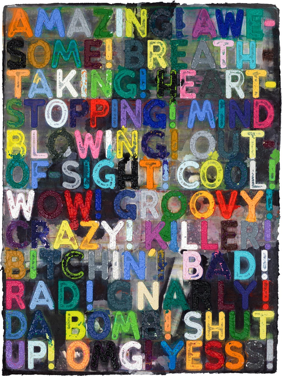
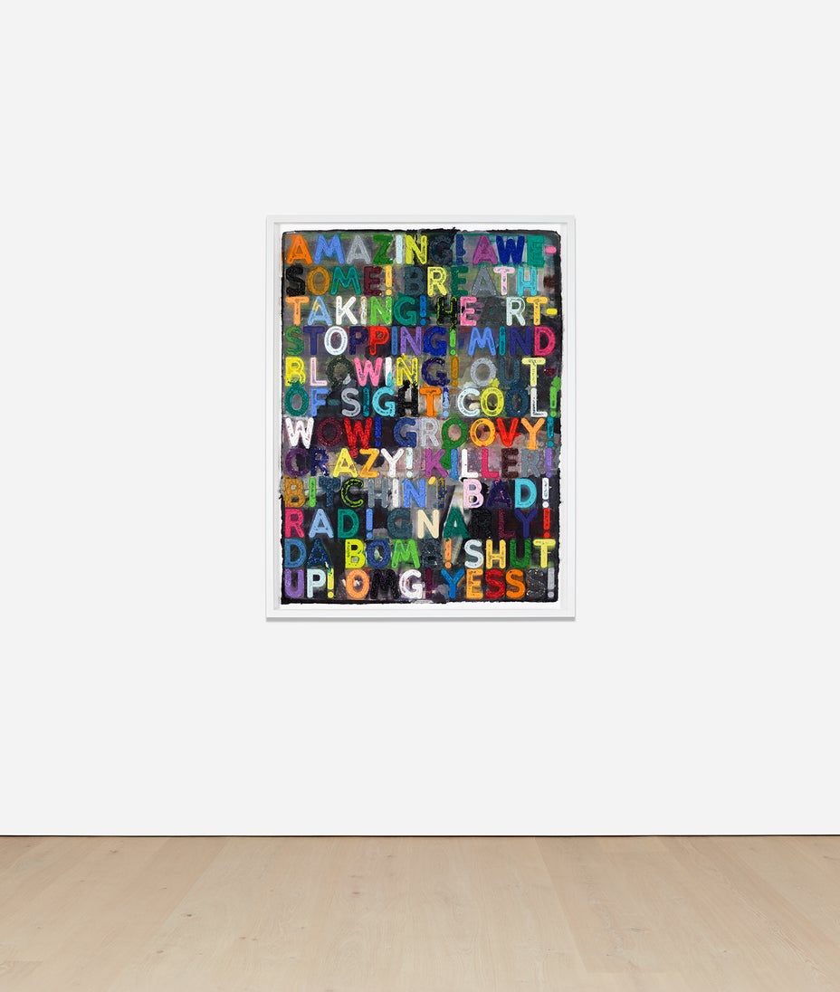
“Words and numbers, because they belong to everyone, don’t belong to anyone. That seemed like a place to start... Something I could believe in.”
—Mel BochnerMel Bochner’s artistic philosophy of democratisation and accessibility takes shape in works such as Amazing of 2018, which comprises a multi-coloured display of the artwork’s namesake and its many idiomatic synonyms, punctuated by exclamation marks. Bochner frequently refers to Roget’s Thesaurus, an English-language thesaurus published by scientist and lexicographer Peter Mark Roget in 1852 to provide a helping hand to "those who are painfully groping their way and struggling with the difficulties of composition” when it comes to words. In Amazing, however, there are some unabashedly contemporary inclusions, such as RAD!, YESSS!, and DA BOMB! In bold colourful letters, the artist morphs these commonly used words into a highly tactile mass of shape and colour, encouraging the viewer to question the familiar words they are reading.
Text and art have long been intertwined. From the ornate lettering in medieval manuscripts to René Magritte’s 1929 La Trahison des Images, artists have harnessed the power of language to shift perceptions and redefine familiar ideas. This connection deepened in the twentieth century, as mass media made text a pervasive part of daily life. Pop artists incorporated typography and commercial culture, making the written word an essential tool for critiquing consumerism and exploring authorship. Conceptual artists, including Bochner, took this even further, dematerialising the art object and using text as a central medium. Through language, viewers are invited to engage directly with the artwork, turning reading into an active, thoughtful experience. Through Bochner’s layered and tactile approach, text becomes more than a passive vehicle of meaning – it is an engaging, colourful experience that immerses the viewer in the texture and rhythm of language itself.
Bochner invented his own method of printmaking to achieve the thick three-dimensionality of Amazing. Produced in collaboration with Two Palms press, this unique monoprint was realised by filling a carved Plexiglas matrix of letters with viscous, gloopy oil paint before using a 750-ton hydraulic press to create unique prints on handmade, dyed paper. As the immense pressure on the matrix indents the paper and the oil seeps beyond its confines, the intentional yet subtly chaotic variability disrupts the typical clean and organised nature of printmaking and typography. The resulting thick, tactile forms of the printed letters verge into the realm of sculptural relief. We are enticed to reach out and touch the text, prompting a rumination on how we experience language and the unspoken codes that are entwined within our vocabulary.
Learn more about Bochner’s printing process here.