
107
Andy Warhol
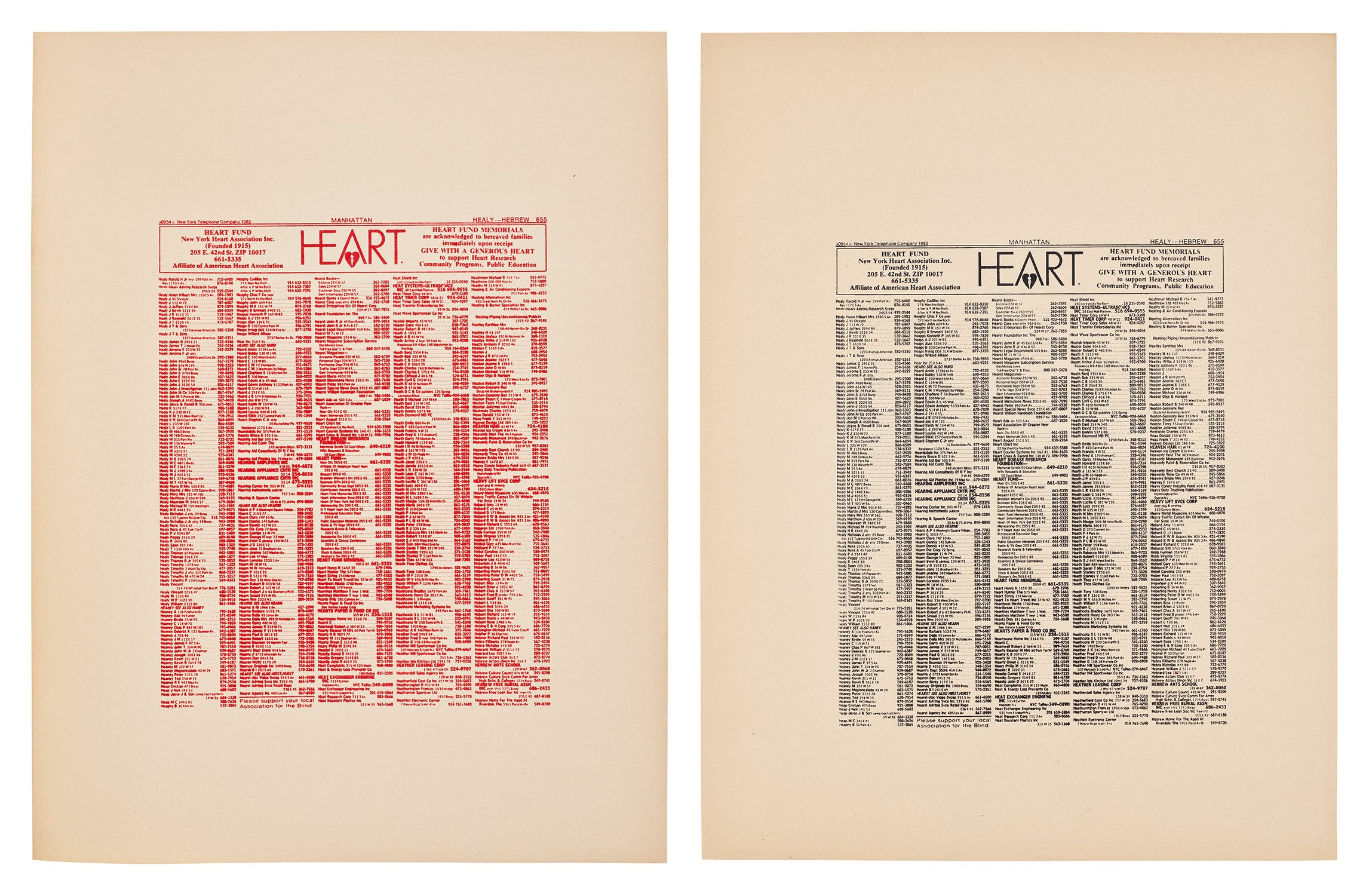
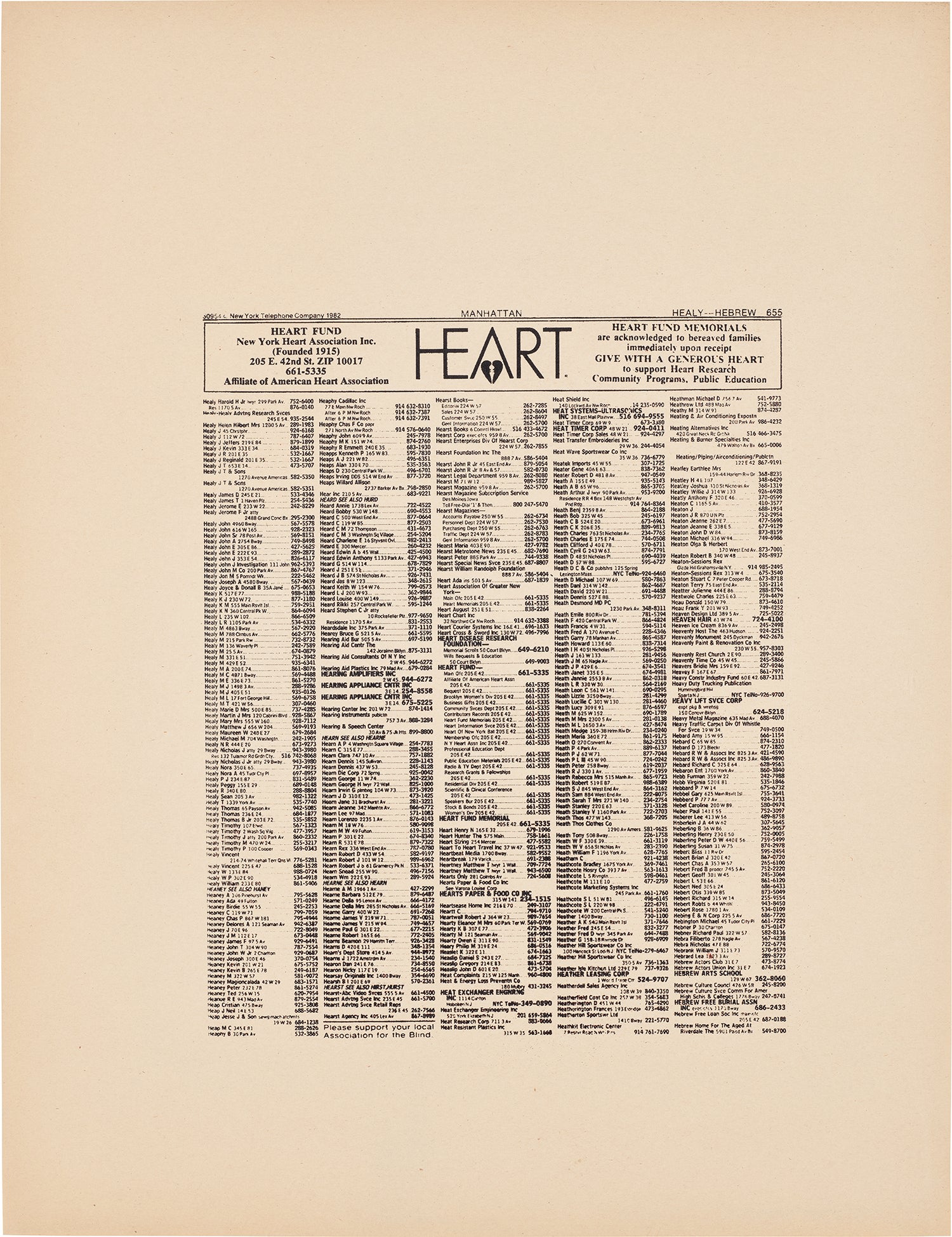
New York Heart Association Phonebook Ad (F. & S. IIIA.57)
one S. 56.2 x 38.1 cm (22 1/8 x 15 in.)
one S. 56.2 x 43.2 cm (22 1/8 x 17 in.)
Further Details
Full-Cataloguing
Andy Warhol
American | B. 1928 D. 1987Andy Warhol was the leading exponent of the Pop Art movement in the U.S. in the 1960s. Following an early career as a commercial illustrator, Warhol achieved fame with his revolutionary series of silkscreened prints and paintings of familiar objects, such as Campbell's soup tins, and celebrities, such as Marilyn Monroe. Obsessed with popular culture, celebrity and advertising, Warhol created his slick, seemingly mass-produced images of everyday subject matter from his famed Factory studio in New York City. His use of mechanical methods of reproduction, notably the commercial technique of silk screening, wholly revolutionized art-making.
Working as an artist, but also director and producer, Warhol produced a number of avant-garde films in addition to managing the experimental rock band The Velvet Underground and founding Interview magazine. A central figure in the New York art scene until his untimely death in 1987, Warhol was notably also a mentor to such artists as Keith Haring and Jean-Michel Basquiat.