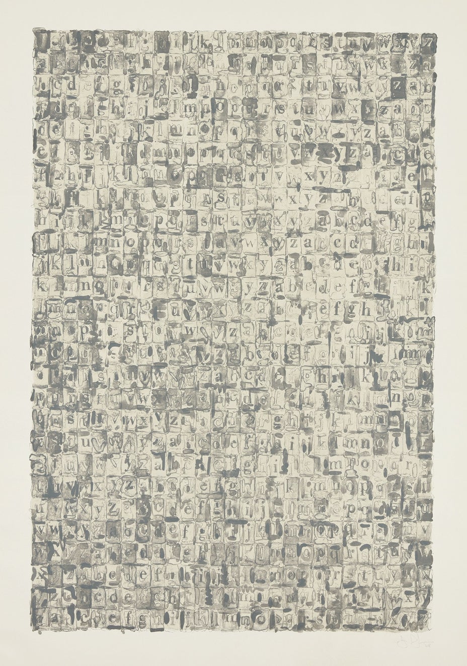

24
Jasper Johns
Gray Alphabets
- Estimate
- $80,000 - 120,000
$118,750
Lot Details
Lithograph in colors, on Rives Special paper, with full margins.
1968
I. 51 x 34 1/4 in. (129.5 x 87 cm)
S. 59 7/8 x 41 7/8 in. (152.1 x 106.4 cm)
Signed, dated and numbered 19/59 in pencil (there were also 8 artist's proofs), published by Gemini G.E.L., Los Angeles (with their blindstamps), framed.
Specialist
Full-Cataloguing
Catalogue Essay
The block-form letters of Gray Alphabets recalled childhood toys. Like much of Johns’ work, this print explored forms that seemed familiar while presenting as something new. The ambitious lithograph, Gray Alphabets, was not about the alphabet but rather of the alphabet. Letters themselves were taken from commercial stencils that Johns purchased in order to create an ethos that seemed arbitrary. When asked whether he used these stencils because he liked them, or simply because that was how he had bought them, Johns replied, “ . . .that’s what I like about them, they come that way.”
Johns played hide and seek with his imagery in Gray Alphabets through the use of transferring, overprinting and encoding as a kind of ceaseless act that merged figure with ground. Created at Gemini G.E.L. in Los Angeles, Gray Alphabets required a complex printing process of four different matrices in four different colors of gray: two warm and two cool. Johns also used water-tusche, stencils and stamps in order to capture the characteristics of a graphite wash; subtlety of hand was of absolute necessity.
Forms of the Latin alphabet are a long-standing and important theme in Johns’ work. Johns sometimes regarded his paintings as models for future drawings and his drawings as explorations for works in other mediums. Two important works preceded Gray Alphabets. Before this 1968 lithograph, an encaustic and collage produced in 1956 was Johns’ early engagement with alphabet imagery. A later 1960 pencil and graphite-wash drawing explored the same imagery and was titled similarly.
Upon completion, the Gray Alphabets lithograph was one of Johns’ largest prints and a great technical feat. In the printmaking studio Johns was eager to learn as much technical skill as possible, especially from master printers. One such renowned printmaker, Robert Blackburn remarked that Johns was the most demanding, the most specific and the most empirical of all the artists with whom he had worked. Johns quickly discovered how making multiples could enhance his practice and he remained fascinated by printmaking’s ability to easily retain imagery. The continuous exploration that printmaking provided appealed to Johns as an opportunity for endless discovery.
Provenance
Literature
Jasper Johns
American | 1930Jasper Johns is a painter and printmaker who holds a foundational place in twentieth century art history. Quoting the evocative gestural brushstroke of the Abstract Expressionists, Johns represented common objects such as flags, targets, masks, maps and numbers: He sought to explore things "seen and not looked at, not examined" in pictorial form. Drawing from common commercial and 'readymade' objects, such as newspaper clippings, Ballantine Ale and Savarin Coffee cans, Johns was a bridge to Pop, Dada and Conceptual art movements.
Beyond the historical significance, each work by Johns is individually considered in sensuous form. A curiosity of medium led him to employ a range of materials from encaustic and commercial house paint to lithography, intaglio and lead relief.
Browse ArtistBeyond the historical significance, each work by Johns is individually considered in sensuous form. A curiosity of medium led him to employ a range of materials from encaustic and commercial house paint to lithography, intaglio and lead relief.