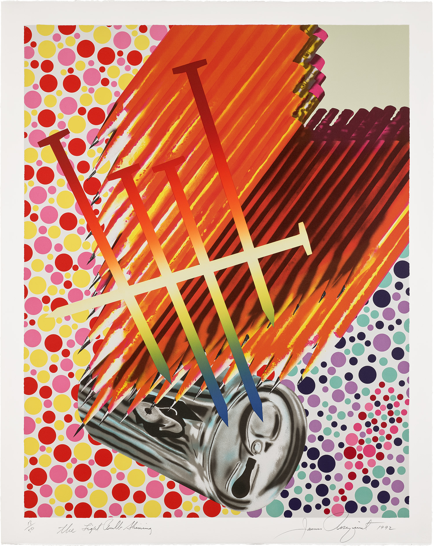
“This was a dirty bacon tan, this was a yellow T-shirt yellow, this was a Man-Tan suntan orange. I remember these like I was remembering an alphabet, a specific color...I felt it as a remembrance of things, like learning an alphabet.”
—James Rosenquist
In The Light Bulb Shining, the bright, multi-colored dots of a color blindness test serve as the backdrop for a wing of pencils and a tally mark of rainbow nails which rain down upon silver pull-tab can, united in a confusion of the senses. Within the otherwise brightly hued lithograph, the titular shining light bulb is ironically represented in the darkened, subtle shape of the can’s open tab.
This lithograph exemplifies Rosenquist’s adept engagement with color, an element frequently weaponized in advertising to grab the attention of passing consumers. He describes the unique place this type of commercial promotion holds in the United States, saying “in America from an early age you are bombarded with images trying to sell you something. Billboards with big juicy hamburgers and laundry detergent, and posters of movie stars. Later, when supermarkets came along, I remember being blown away by all the color. As you walked into a supermarket, you’d see all these items on sale, each marked with its own bright colors. The windows of supermarkets were plastered with proto-pop images: sale signs depicting giant cans, huge cereal boxes, monster-sized carrots, all in neon colors. It was looking at those colors that I remember best. I don’t think this kind of thing existed anywhere else. This jumble of color was unique to America.” Rosenquist treats the quotidian objects of the can, pencils, and nails in The Light Bulb Shining with the same, vibrant color used to entice the American consumer through their bombastic assault to the senses. Rather than merely walking through a supermarket, the print’s viewers are transported into an inescapable realm of ambiguous product placement indicative of their everyday lives.