LIVING THE AVANT-GARDE: THE TRITON COLLECTION FOUNDATION
30
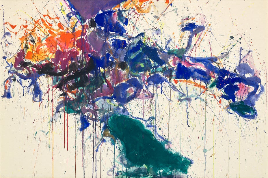
Sam Francis
Purple, Orange & Green
Estimate
$200,000–300,000
Sold For
$482,600
watercolor on paper
26 1/4 x 39 1/4 in. (66.7 x 99.7 cm)
Executed in 1958.