Article | Screaming Into The Void Or Just Being Cheeky Text Art Auction London
Screaming Into the Void or Just Being Cheeky?
The messages hiding in plain sight in works from our Evening & Day Editions London auction.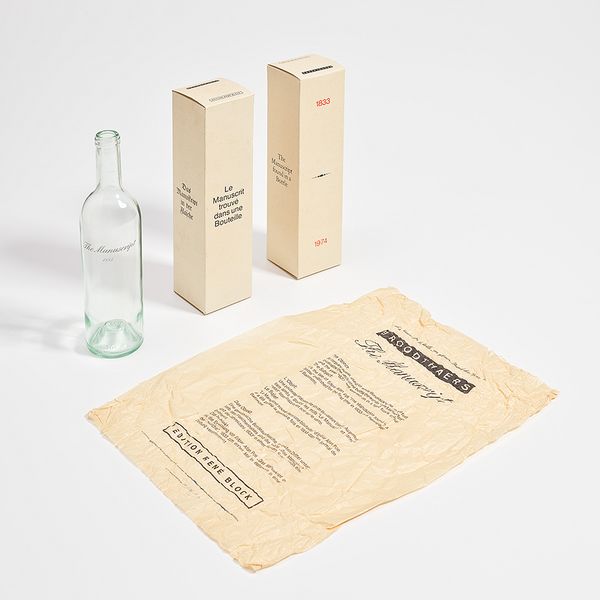
Marcel Broodthaers, Le manuscrit trouvé dans une bouteille (The Manuscript Found in a Bottle), 1974. Evening & Day Editions London.
I’ll text you later. Did you see my Slack. They didn’t text back. Why are your bubbles green. Hold on, I have to re-download that app because you’re the only one who uses it. Wait, what’s Bluesky?
Into the in/pervasive screens go our texts, perhaps never to be seen again. Today, the proverbial message in a bottle is more relevant than ever. But our messages are now data, our bottles are these phones we can’t put down, and the ocean? Isn’t it just amazing how the light bounces off the vastness of the server farm.
In fact, it’s been one year since our last note on the topic of text in art was carefully packaged into a tube and sent through the internet for safekeeping, and we still can’t shake the subject. And rightly so. For all of us, these questions of who we can really reach and who will respond are ever-present in our lives and have been exceedingly relevant to artists since what, the Telegraph? (No, that’s not an app).
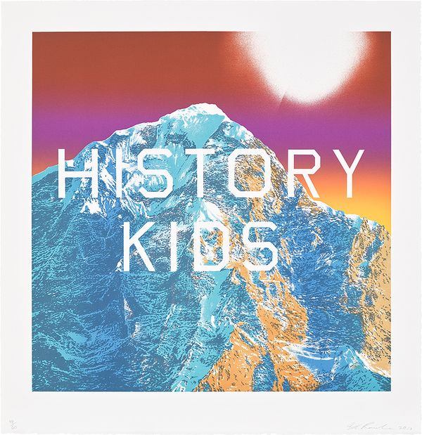
Ed Ruscha, History Kids, from Mountain Prints, 2013. Evening & Day Editions London.
Within today’s sea of online images with text and images as text, we find there’s an angle to see them as one of two things — they’re either kind of funny, meme-like constructions (call it being cheeky), or they’re deep thoughts on late modern anxieties (for drama’s sake, let’s call it screaming into the void). Albeit reductive, they both require meaningful consideration, so here we’re looking into art history from this lens to see what we can find with works in our upcoming Evening & Day Editions London auction.
Marcel Broodthaers: Scream into the void, but make it cheeky
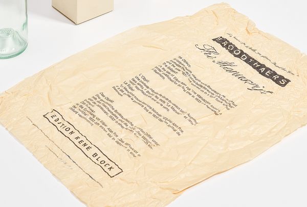
Marcel Broodthaers, Le manuscrit trouvé dans une bouteille (The Manuscript Found in a Bottle) (detail), 1974. Evening & Day Editions London.
Leave it to a poet-turned-artist to show us new ways to consider both text and the ideas it represents as a building block of visual art — and also to challenge our premise here from the start. Broodthaers, one of conceptual art’s most important early figures, understood text as code, text as symbol, and symbol as image, as seen clearly in the variety of his works in the Herbig Collection on offer here. But his 1974 work Le manuscrit trouvé dans une bouteille (The Manuscript Found in a Bottle) wraps these ideas in particularly compelling layers.
Within this beautiful box, packaged just like a fine wine or spirit, one finds a Bordeaux bottle containing a message, as the title suggests. The message is an idea that points out the distinction between subject and object, in this case the object being the bottle and the subject being a referential work — Edgar Allen Poe’s short story MS. Found in a Bottle. The story itself is a somewhat satirical piece of writing that calls readers’ attention in 1833 to the far-fetched nature of sea tales that were popular at the time (don’t tell Melville). In short, the subject of this work is the idea of a literary work that is itself an idea about an entire genre. Broodthaers cleverly uses this as a device to call into question the nature of conceptual art as both object and idea, which is about as “meta” as you could get in 1974 or even today — but don’t tell Meta™.
Mel Bochner! shut up omg yes
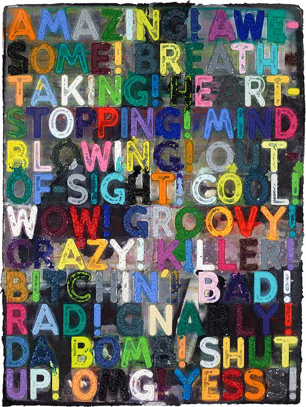
Mel Bochner, Amazing, 2018. Evening & Day Editions London.
And while we’re talking about ideas as physical objects and/or text as metaphysical ideas, let’s appreciate the tactile pleasure of this work by Mel Bochner. These letters appear almost as sculptural relief, resulting from carved Plexiglas molds filled with thick oil paint and pressed to paper with a 750-ton hydraulic press in collaboration with Two Palms Press in New York. Longing to explore accessibility in his works without sacrificing the strength of his conceptual ideas, Bochner turned to text, explaining, “Words and numbers, because they belong to everyone, don’t belong to anyone. That seemed like a place to start … Something I could believe in.” To our eyes, with its joyful colours and cheerful string of synonyms, it’s definitely not screaming into the void. But there’s more than one way to see it, as much of Bochner’s practice reminds us of the democratizing promise of contemporary and digital life. Either way, it makes us smile.
Twombly & Basquiat: Before the void, primordial scribbles
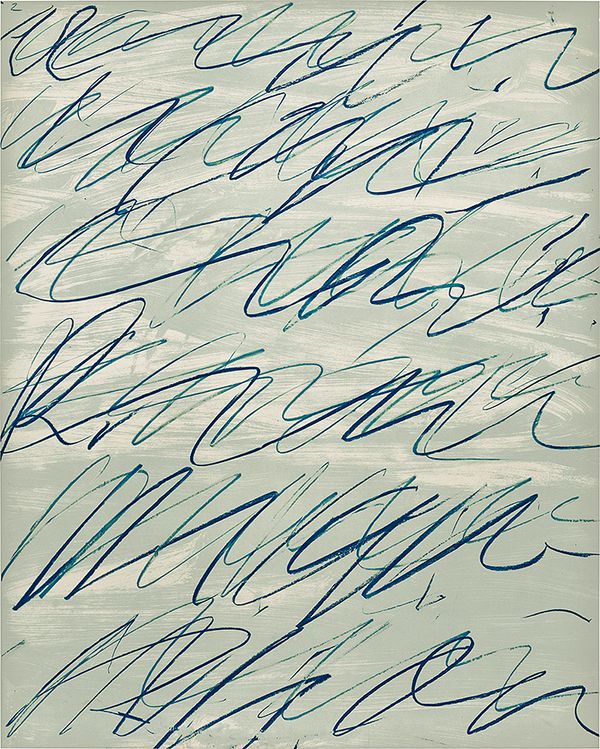
Cy Twombly, Roman Notes II, from Roman Notes, 1970. Evening & Day Editions London.
Remember being a child and seeing adults write with pens, so you did the same thing to mimic them, but you still felt like what you wrote expressed something because you couldn’t read yet? We can approach that feeling again after an extended viewing of Cy Twombly's and Jean-Michel Basquiat's works. Far from being indirect or immature, these shrouded meanings leave a strong, chant-like sensation even when they transcend vocabulary. We know that the elder Twombly influenced Basquiat, and what we find in both their works, through occasional letters and references to poetry, music, and more, is an infectious sense of image that appears to exist somewhere between drawing and writing. Today, the audience for these works is real and certainly not in a void, but the expression is so elemental that we can't help but admire their creative bravery and its ability to cut through the noise.
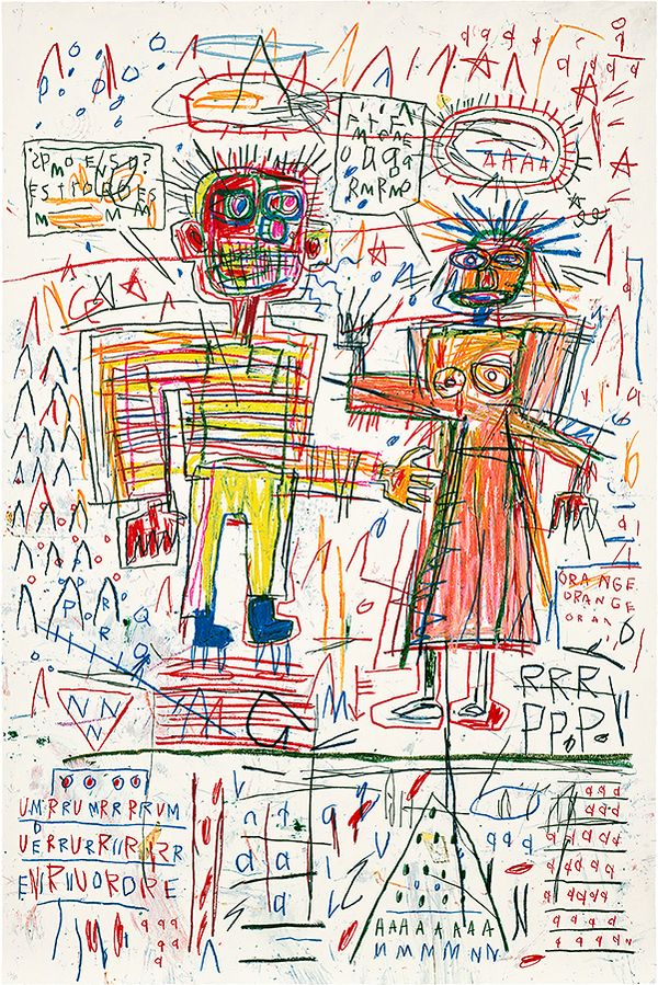
After Jean-Michel Basquiat, Untitled III, from The Figure Portfolio, 1982/2023. Evening & Day Editions London.
Ed Ruscha: How doesn’t that sound?
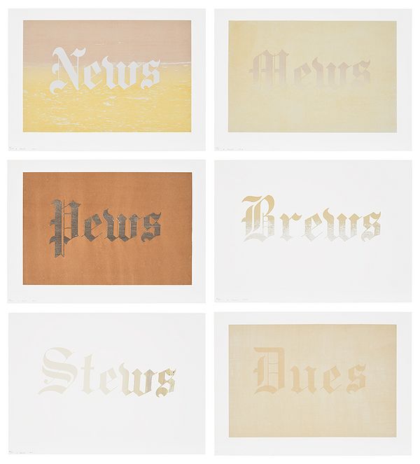
Ed Ruscha, News, Mews, Pews, Brews, Stews & Dues, 1970. Evening & Day Editions London.
Turning to Ed Ruscha, that doyen of text-based imagery, we uncover something transcendent. Though Ruscha’s works can often point out something thoughtful about culture that makes us chuckle, we realize that it’s more than just the text — in many ways, it’s the sound. For one, the images imply their sounds. After all, how many of us can look at Ruscha’s text-based works and not hear a characteristically American accent, be it Texan or Valley, pronouncing them? Ruscha’s use of colour and font treatments visually references not just the various aspects of American life they highlight — from consumer culture to media, community groups, and religious organizations — but also impacts how we audiate them. It’s not just the words that rhyme in the above screenprints — their appearance and ideas also do.
Andy Warhol: Expert re-sharer
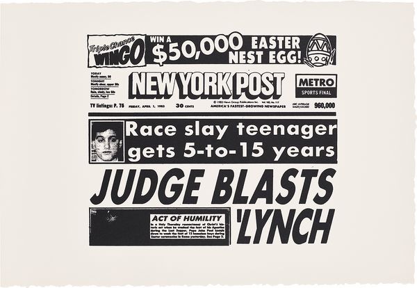
Andy Warhol, New York Post (Judge Blasts Lynch), 1983. Evening & Day Editions London.
Nobody else could pick a moment to freeze and edit quite like Andy Warhol, and here we glimpse a New York Post front page from April 1983. These stories are largely forgotten, and Warhol’s retelling leaves the details intentionally sparse. It calls attention to the repetitive nature of American sensational journalism, both in how it tells stories and the kinds of events that continue to occur. Seen today, it’s a stark reminder of the media’s place in society — wont as this publication is to boast its circulation numbers on its front page in the days before we could all see how many followers every source has. It’s also a reminder that our biggest issues haven’t been solved yet and perhaps suggests that the broad culture propping up this kind of publication is to blame. From this angle, a work by David Shrigley might have something to cheekily tell us.
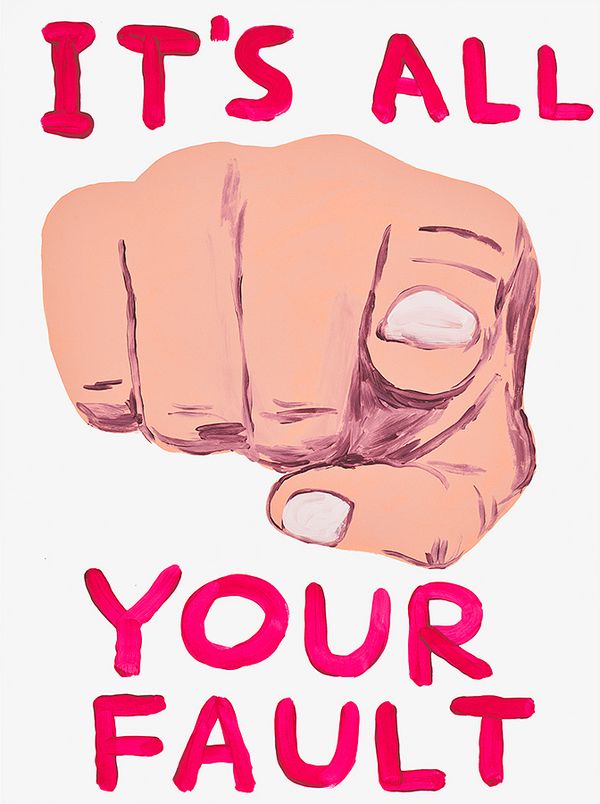
David Shrigley, It’s All Your Fault, 2019. Evening & Day Editions London.
Barbara Kruger: A cheeky goodbye kiss
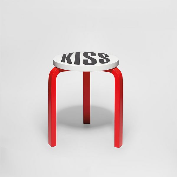
Barbara Kruger, Untitled (Kiss), 2019. Evening & Day Editions London.
As we send off 2024, we may find relief in the sentiment behind Barbara Kruger’s Untitled (Kiss). Its lip-red legs lead to a seat printed with the word “Kiss,” bringing new meaning to the word cheeky. (If you don’t get it yet, we won’t be much help). The work showcases some of Kruger’s most characteristic visual traits, including the use of red, white, and black colours and bold text. The elements come together in a work that’s more than simply amusing, shrewd, and irreverent — it’s empowering.
Or, for a more positive annual send-off, look again to Mel Bochner, who reminds us there’s nothing wrong with calling it a year.
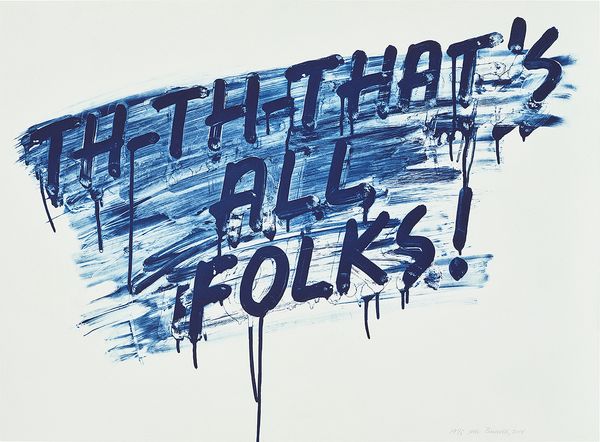
Mel Bochner, That's All Folks, 2014. Evening & Day Editions London.