Article | At Play With Abstraction What You See Is Not What You Get Editions Auction London
At Play with Abstraction: What You See Is Not What You Get
Works in our upcoming Evening & Day Editions auction in London offer a fresh look at abstraction.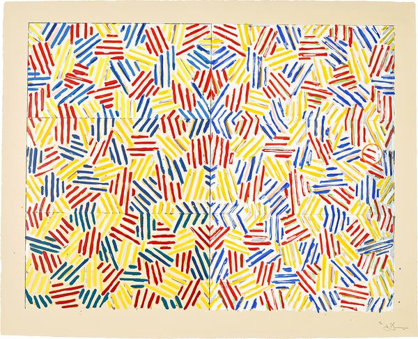
Jasper Johns, Corpse and Mirror, 1976. Evening & Day Editions London.
Abstraction is a language of possibility, where lines, shapes, and colours transcend the literal to evoke something deeper — an emotion, a rhythm, or a sense of place. It resists definition, slipping between the recognizable and the unknown, inviting viewers to interpret, imagine, and feel. In the works explored here, abstraction becomes playful, teasing us with glimpses of familiarity, be it a flag, a tennis court, or a fragment of graffiti, only to dissolve into patterns, gestures, and compositions that are non-representational explorations of form, gesture, and colour. These works play at the intersection of the known and the unknown.
Cy Twombly
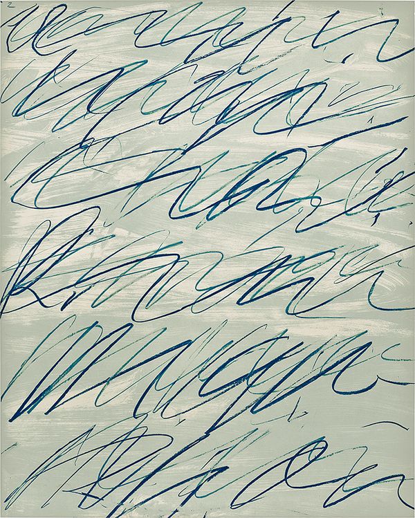
Cy Twombly, Roman Notes II, from Roman Notes, 1970. Evening & Day Editions London.
Cy Twombly’s Roman Notes II oscillates between the frenetic and the lyrical, its expressive marks resembling an indecipherable script. The varied, calligraphic gestures evoke the fluidity of cursive writing and the rhythmic undulation of waves, an ebb and flow that resists settling into any legible language. While the blue lines rise and fall across the page with an air of familiarity, they remain resolutely abstract, inhabiting a space between writing and drawing.
Twombly’s connection to Rome and its history is deeply embedded in this work. The layered gestures echo the city’s palimpsestic nature, where centuries coexist, evoking both ancient graffiti and Renaissance codices. Twombly’s marks relate to asemic writing — a form of wordless calligraphy that merges text and image, encouraging intuitive rather than literal interpretation. Twombly’s cryptologist training in the U.S. Army, where he studied codes and symbols, further shaped his practice, fostering an interest in the abstraction of meaning. In Roman Notes II, his layered scribbles feel both ancient and immediate, connecting past and present in gestural marks.
Jonas Wood
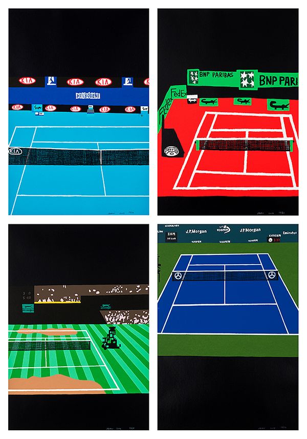
Jonas Wood, Four Majors, 2018. Evening & Day Editions London.
Jonas Wood’s Four Majors is a quartet of screenprints depicting iconic tennis courts from the international tournaments in Melbourne, Paris, London, and New York. Rendered in bold, flat colours and simplified geometric forms, the courts simultaneously evoke their real-world locations while dissolving into striking abstractions. The saturated hues — bright blue hardcourt, red clay, and verdant grass — are juxtaposed with stark black voids, creating dynamic visual puzzles. Logos and court lines ground each scene in specificity, while their flattened, graphic treatment gives way to a playful ambiguity, turning physical spaces into imagined compositions.
My paintings of tennis courts were about an interest in abstraction, and how the court becomes a geometric puzzle. —Jonas Wood
This interplay between reality and abstraction is a recurring theme in Wood’s work. His process often begins with collecting, cutting, and collaging found images, which he then deconstructs and reconfigures, forging new scenes that blur past and present, real and imagined. For Four Majors, the source imagery was photographs Wood took of his television while watching tennis. Wood revels in this uncertainty this creates when viewing the work: “I like that you don’t know where the work is coming from, if I orchestrated it or if I straight appropriated it.” Although logos and court markings tether the works to real locations, their flattened forms and bold colours cause the familiar settings to morph into abstract geometric puzzles — playful studies in colour and form, their graphic simplicity both striking and ambiguous.
Jasper Johns

Jasper Johns, Corpse and Mirror, 1976. Evening & Day Editions London.
Restless, hypnotic energy radiates across the surface of Jasper Johns’ screenprint Corpse and Mirror, its kaleidoscopic surface alive with the rhythmic cadence of both order and disorder. At first glance, the densely packed crosshatched lines seem chaotic, but closer inspection reveals a meticulous structure: interlocking diagonal marks that mirror and repeat across the composition. The geometric arrangement and bold palette evoke a fragmented version of the flag motif for which Johns is so renowned, with its vivid primary colours shimmering over subtle undercurrents of secondary tones. A faint imprint of a can lingers in the right-hand panel; a quiet, almost incidental trace that disrupts the work’s precision, hinting at the physicality of its creation. The screenprint transforms a simple crosshatch motif into a meditative puzzle, inviting the viewer to lose themselves in its shifting layers of coloured marks.
The title references the Surrealist game “Exquisite Corpse,” where participants collaboratively created disjointed compositions. Similarly, the mirrored halves of Johns’ work are not perfect reflections but subtly differ, keeping the viewer engaged in the process of discovery. Johns described the allure of crosshatching as having “all the qualities that interest me — literalness, repetitiveness, an obsessive quality, order with dumbness, and the possibility of a complete lack of meaning.” Utilizing colour, mirroring, and repetition, Johns transforms the crosshatch into a kaleidoscopic puzzle, creating a rigorous yet playful mediation on colour, rhythm, and perception.
KAWS
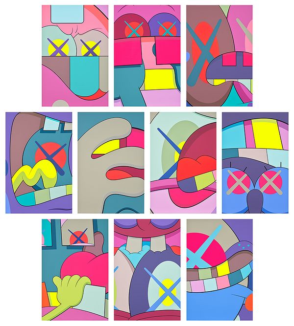
KAWS, UPS AND DOWNS, 2013. Evening & Day Editions London.
In the series of ten screenprints entitled UPS AND DOWNS, KAWS takes his cartoon-inspired icons and transforms them into bold, abstract compositions. The series of ten screenprints features close-cropped portions of the characters’ faces and hands, reduced to vibrant neon shapes and forms. The X-shaped eyes, a signature of KAWS’ figures, anchor the viewer’s recognition while the surrounding elements blur into abstraction.
“Abstraction always interested me,” KAWS notes. “What’s abstraction to somebody that knows something? If you look at something but then you know what it is, is it still abstraction?” This tension animates UPS AND DOWNS, as viewers oscillate between recognition and ambiguity. The series challenges conventional definitions of abstraction, transforming familiar motifs into dynamic compositions that vibrate with life. In doing so, KAWS challenges the viewer to question the very nature of abstraction: when does recognition end and abstraction begin?
Gerhard Richter
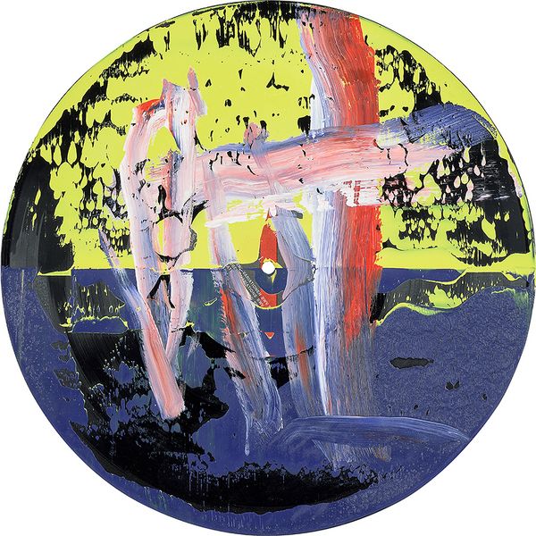
Gerhard Richter, Goldberg-Variationen (Goldberg Variations), from Hommage à Cladders, 1984. Evening & Day Editions London.
Chance and materiality are central to Gerhard Richter’s Goldberg-Variationen, which creates an unexpected convergence between abstraction and the real world. By painting directly onto a phonograph long play record, Richter challenges the very notion of what constitutes a painting's support. The record, Bach: The Goldberg Variations: Glenn Gould, of 1982 by Canadian classical pianist Glenn Gould — itself an object imbued with its own cultural and functional significance — becomes a canvas for colour, form, and movement. The vibrant brushstrokes, combined with the chaotic, squeegeed paint, stand in stark contrast to the skillful precision associated with classical music.
The unpredictability of the squeegee technique mirrors the complex layers of both the music and the visual work, reinforcing Richter’s assertion that art, like music, is bound by its material essence, not merely by form or intention. For Richter, abstraction is a means to give form to chance, creating tension between composition and accident. Untitled (Goldberg-Variationen) comprises an exchange between materiality and abstraction that signifies Richter’s desire to be guided by his materials and to create a conceptual artwork that is deliberately inscrutable but ultimately thought-provoking.
Andy Warhol
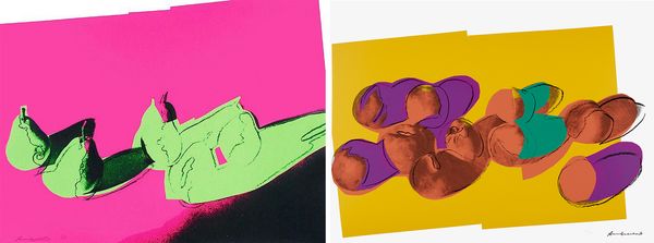
Andy Warhol, Pears and Peaches, both from Space Fruit: Still Lifes, 1979. Evening & Day Editions London.
Fusing abstraction with Pop art, Andy Warhol playfully subverts the traditional still life genre by transforming the familiar subjects into otherworldly compositions of vibrant hues and bold forms in the Space Fruit: Still Lifes series. The series began with photographs of watermelons, peaches, lemons, and more taken by Warhol’s assistant, Ronnie Cutrone, in which the fruit were dramatically lit as if spotlit on a stage. In screenprint, Warhol employed flat, vivid colour and collaged cut-out shapes to render the fruit almost entirely unrecognizable. The result is a series of works that hover somewhere between the natural world and the surreal, evoking everything from microscopic cells to flying saucers and strange, otherworldly forms. Warhol’s use of collaged cut-outs and his manipulation of light here prefigures his later Shadows series, which utilized the commercial aesthetic of Pop to push the boundaries of abstraction. Space Fruit: Still Lifes becomes an invitation to reconsider the everyday as a source of unexpected beauty and mystery, far surpassing the associations of still life and opening up new avenues for abstraction and imagination.
Recommended Reading