Article | Writing On The Wall Text In Contemporary Art London Auction Ruscha Holzer Bochner Pettibon
Writing on the Wall: Text in Contemporary Art
The power of language in works by Ruscha, Holzer, Bochner, and Pettibon.
Mel Bochner, Amazing, 2018. Evening & Day Editions, London.
Text and art have long been intertwined. Across eons, from medieval illuminated manuscripts to the provocative metamessage of Rene Magritte’s La Trahison des Images (1929), artists have manipulated the written word to elucidate and recontextualize the alphabet we are so familiar with. This intensified in the 20th century, owing to the advent of mass media and the pervasive presence of text in daily life, which led to typography taking a leading role in contemporary art. Diverging away from the gestural spontaneity of Abstract Expressionism, Pop artists defied the hierarchies of so-called high art and embraced the aesthetics of contemporary advertising, or “low” culture. Text became a critical tool for artists to react to the contemporary moment, for instance in analyzing the spectacle of consumer culture, or overturning established perceptions of authorship. The power of the written word as an accessible vehicle to convey ideas later took on an even greater precedence within the Conceptual art movement. Artists dematerialized and rethought the notion of the art object, often doing so by employing words as their central protagonist. By its very nature, text entices us to grapple with the artwork; we lay our eyes upon the written word and cannot help but engage in the act of reading, ceasing to be passive spectators, instead becoming active agents in dialogue with the artwork. With this in mind, we explore some highlights from the upcoming Evening and Day Editions auction, in which words take center stage.

Ed Ruscha, The End, 1998–2016. Evening & Day Editions, London.
I just happened to paint words like someone else paints flowers.
—Ed Ruscha
Throughout Ed Ruscha’s artistic oeuvre, text has reigned supreme as the primary motif. From Californian vernacularisms to brand names and onomatopoeia, few artists of Ruscha’s stature have so consistently employed text as the central component. From his iconic gas stations and “word paintings,” to experimentations with varying media in later works, the constancy of this central fundament is unrelenting. The four holograms that comprise The End (1998-2016) are no exception to this: the tetraptych plays upon the famous last words of classic Hollywood cinema. Engaging with and decontextualizing phrases from “the movies” have been hallmarks of Ruscha’s practice since he relocated to California in 1956. The black gothic font intermeshed with shifting iridescent tones of green, blue, and violet act to probe the textuality of Hollywood and the materiality of the film itself. Scratches, dust spots, and split frames recall vintage film’s textured celluloid surface and its tendency to malfunction. This calls to question our familiarity with the concluding moments of movies, when the words “The End” flash on screen and the final frames flicker, inviting new meanings and undermining the façade of Hollywood perfection.
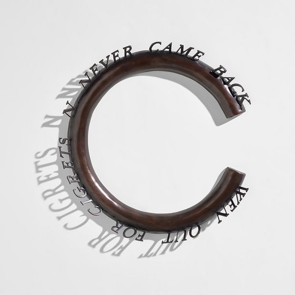
Ed Ruscha, Wen Out for Cigrets N Never Came Back, 2017. Evening & Day Editions, London.
In Wen Out for Cigrets N Never Came Back (2017), Ruscha’s lifelong preoccupation with the malleability of words takes the material form of a cast bronze sculpture. As a euphemism embedded within American vernacular, "went out for cigarettes and never came back" reflects soberly on the tragedy of the mundane in the nation’s domestic life. Originating in the mid-20th century, the trope encapsulates the stereotypical scenario of a father or husband leaving the family abruptly, using an everyday item, often a pack of cigarettes, as a pretext for their permanent disappearance without explanation. Over time, the “out for smokes” metonym has evolved into a narrative cultural trope used to convey this painful yet common event, sometimes to comedic effect. Building on Duchampian foundations of the readymade, Ruscha appropriates and isolates this found phrase, even removing certain letters so that it reads as an imperfect, colloquial idiom. This edition, an iteration of which was exhibited in Ruscha’s recent MoMA retrospective, is emblematic of Ruscha’s masterful use of simple yet emotionally charged text to reflect on both ordinary and iconic aspects of American culture.

Jenny Holzer, Blue Blue, 2004. Evening & Day Editions, London.
Opening with the remark “I DO NOT HEAR,” Jenny Holzer’s Blue Blue is a soundless installation piece that presents a cyclical text in cobalt LED lights. Presented in motion, much like a stock market ticker, the poetic narrative presents an emotive exploration of unhealthy relationships and their aftermaths. The poetic phrases, which are written from the first person, poignantly convey this widely felt trauma on a deeply personal level, allowing the personal experience to seep into collective politics and psychology. The lyrical movement of the text in Blue Blue was important to Holzer, and was the impetus for her use of electronic signs, “because motion is much like the spoken word… I write my text by saying the words out loud, or I write and then say words, to test them. Having text move is an extension of that process.”
Holzer’s use of isolated, capitalized text is a conscious means to ensure the accessibility of her messages. This builds on the foundations of her artistic practice, which involved pasting posters on New York streets in the 1970s — an intentional mode of presentation that aimed to be viewed by as wide an audience as possible. Holzer’s typographic artworks span a range of mediums, from carved marble benches and T-shirts to posters and colossal light projections across buildings. The LED signs such as Blue Blue evoke advertising and financial market displays, aligning with forms of direct mass-messaging. Holzer harnesses this mode of display to showcase her captivating written words, which explore the interplay between personal and shared experience.
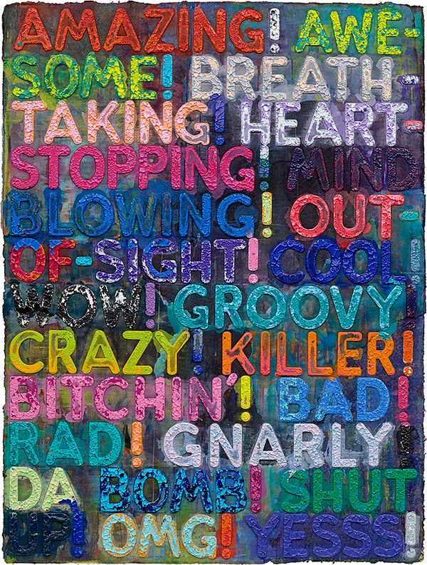
Mel Bochner, Amazing, 2018. Evening & Day Editions, London.
Words and numbers, because they belong to everyone, don’t belong to anyone. That seemed like a place to start... Something I could believe in.
—Mel Bochner
Mel Bochner’s artistic philosophy of democratization and accessibility, as attested by the above quote, embodies the principles of conceptualism as a broader artistic movement. This can be seen in works such as Amazing (2018), which comprises a multicolored display of the artwork’s namesake and its many idiomatic synonyms, punctuated by exclamation marks. Bochner frequently refers to Roget’s Thesaurus, which is an English-language thesaurus published by scientist and lexicographer Peter Mark Roget in 1852 to provide a helping hand to "those who are painfully groping their way and struggling with the difficulties of composition” when it comes to words. In Amazing, however, there are some unabashedly contemporary inclusions, such as RAD!, YESSS!, and DA BOMB! Produced in collaboration with Two Palms as monoprints, the edition was realized by filling carved Plexiglas letters with viscous, gloopy oil paint before using a 750-ton hydraulic press to create unique prints on paper. The resulting thick, tactile forms of the printed letters verge into the realm of sculptural relief. We are enticed to reach out and touch the text, prompting a rumination on how we experience language and the unspoken codes that are entwined within our vocabulary.

Raymond Pettibon, No Title (Our Secret Spot.), 2022. Evening & Day Editions, London.
Over the past thirty years, Raymond Pettibon has married images with text to develop his signature style and create artworks that express satire, critique, emotion, and historical reflection. This interplay takes hold in No Title (Our Secret Spot.), as a small red surfer catches an immense wave while the text “Our Secret Spot.” is revealed in a cloud that floats across the sky. While the colossal wave conjures the magnanimity and sublimity of nature, the text brings a distinctly intimate and human element, which almost whispers when juxtaposed with the crashing water. Pettibon often plays with punctuation, as seen in No Title (Our Secret Spot.) and in the title of his 2017 New Museum retrospective, A Pen of All Work. One effect of this is that it hints at the original source text from which Pettibon lifted the words — the artist estimated that roughly a third of his works draw on phrases from his favorite writers, such as Byron and Dickens. Another effect is to inspire tone and rhythm to the text as we read it, as if it is being spoken aloud. In doing so, the text synthesizes with the wave and surfer motifs to evoke storytelling and nostalgia, recalling Pettibon’s earlier comic-book-inspired works. Pettibon’s penchant for literature and all-consuming waves found its sweet spot in a 2020 limited-edition copy of the great American novel Moby Dick, for which Pettibon created the cover.
In a variety of ways, the artworks discussed here embody the turn to text in contemporary art that began in the mid-20th century. As the focus shifted from art as object to art as idea, so too did the passive spectator become an antiquated thing of the past. Instead, artists enlisted us, the audience, to engage with the creation of their work. Be it idioms cast in metal, tactile painterly letters in flamboyant colors, or poetic phrases whirling around a stock market ticker, text has served as a paramount tool for artists to manifest powerful ideas in a direct and accessible manner fitting for our contemporary society.
Discover More from Evening & Day Editions >
Recommended Reading
In Conversation: Pauline Schellmann & Anne Schneider-Wilson >