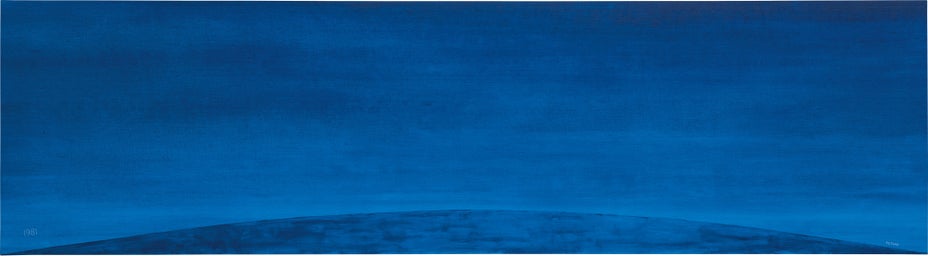
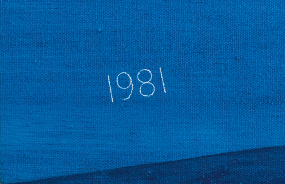
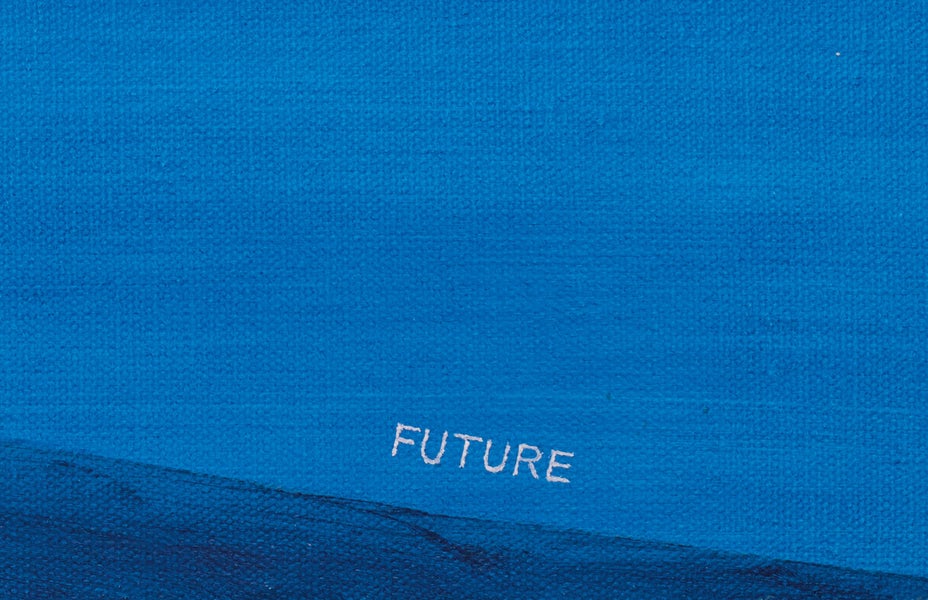
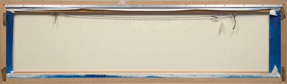
Ed Ruscha - 20th Century & Contemporary Art Evening Sale in Association with Poly Auction Hong Kong Tuesday, June 8, 2021 | Phillips

Create your first list.

Select an existing list or create a new list to share and manage lots you follow.

  • “I’m dead serious about being nonsensical.”
    — Ed Ruscha


    Ed Ruscha is a pioneering artist whose word paintings have established him firmly in the canon of art history, inspiring a legion of contemporary artists and their amalgamations of imagery and text. Ruscha’s oeuvre is a riveting fusion of typography, photography, painting, and collage, spanning over the course of 60 years. Employing tropes common to advertising and commercial models, Ruscha’s work attracts comparisons to the movements of Pop, Surrealism, Dada, Abstract Expressionism and Conceptual art, but is unique in many ways. 1981 - Future is a wonderful example of his word paintings to come to auction, one of his early experimentations with sublime landscapes which he first explored in 1977 with his painting, The Back of Hollywood, later becoming a favoured trope of the artist. In 1981 - Future, Ruscha places the delicate white lettering of ‘1981’ and ‘FUTURE’ on either side of a vast azure planet, the crest of which emerges into the panoramic picture plane created by the artist.


    Word Play


    Pablo Picasso, Glass and Bottle of Suze, 1912
    Collection of the Washington Gallery University of Art, St Louis


    Ruscha’s oeuvre revolves around words and phrases, often humorous in their evocation of sounds or through the use of literary devices such as onomatopoeia, puns and alliteration. In the late 1950s, Ruscha began making collages, pulling images and text from media such as advertisements, and using them in his paper works. The use of cut-out words in the Western artistic canon can be found at the start of the 20th Century in the work of cubist artists, Georges Braque and Pablo Picasso, and Dada artists, a movement that formed in Zurich during World War I, aiming to overhaul traditional art and producing work that was often satirical and nonsensical as a result. Further, collage was a favoured technique of the Dadaists, including imagery and text from newspapers in their politically charged works, as seen in the work of Kurt Schwitters for example, whose Merz pictures included found objects, typography and sound poetry in unique expressions of the time.


    Kurt Schwitters, Difficult, 1942-43
    Collection of Albright-Knox Art Gallery, Buffalo, New York 


    Typography and Tropes of Advertising 


    Jasper Johns, Target with Four Faces, 1955
    Collection of the Museum of Modern Art, New York


    As seen in 1981 - Future, Ruscha experiments with form and meaning in his work, and deftly manipulates scale while understanding how to captivate his viewer. His interest in typography dates as far back as 1956, when the artist left his hometown of Oklahoma City, moving to Los Angeles and enrolling in Chouinard Art Institute (now known as the California Institute of the Arts). Here, he took courses in lettering, design and advertising, honing his talent for combining imagery with words. As a student, he did layouts for an advertising agency and worked part-time at the Plantin Press, exposing him to the world of book production and typesetting by hand.


    It was also during his student years when he came across a work of Jasper Johns’s, Target with Four Faces (1955), and was struck by ‘Johns’s use of readymade images as supports for abstraction’.i In Target with Four Faces, Johns uses the target as his found object, onto which he mounts four plaster casts of faces, reimagining the possibilities and traditional limitations of painting. Inspired by Johns, Ruscha sought to find how ‘he could employ graphics in order to expose painting’s dual identity as both object and illusion’,i leading to his first word painting, E. Ruscha (1959), playing with scale to only include the first letter of his initial, ‘E.’ and ‘H’ and ‘C’. 


    Ed Ruscha, E. Ruscha, 1959
    Courtesy Ed Ruscha 


    “The single word, its guttural monosyllabic pronunciation, that’s what I was passionate about.”
    — Ed Ruscha


    Ed Ruscha, OOF, 1962 (reworked 1963)
    Collection of the Museum of Modern Art, New York 


    After his graduation from the Chouinard Art Institute, Ruscha worked for advertising agencies, further developing his ‘skills in schematic design and considering questions of scale, abstraction, and viewpoint’, for which he later became known.i Focusing on his word paintings from the early 1960s, his works draw on influences from popular culture, evocative of the work of Pop artists, and aspects of comic books, adopting a clear typography and a certain comedic quality. Paintings such as OOF (1962-3) explore noise in the silent medium of paint, and it is particularly difficult to view OOF without ‘verbalising the visual’.i


    The Museum of Modern Art, New York, points out the paradoxical nature of this deep blue painting in which ‘OOF’ is emblazoned in a vivid yellow, ‘as a word describing a wordless grunt’.ii Further, his obsession with Hollywood and its culture also permeates his word paintings, assimilating the Hollywood sign into his work since the late 1960s. Indeed, its rich film industry and the process of filmmaking has affected the formal compositions of his work, as seen in the present lot, 1981 - Future, which evokes the wide panoramic visuals utilised in many blockbuster films intended for the big screen. 

    “I’ve been influenced by the movies, particularly the panoramic-ness of the wide screen.”
    — Ed Ruscha


    Ruscha’s ability to assimilate advertising tropes in his work evokes the authoritative, striking oeuvre of American artist, Barbara Kruger. First working as a graphic designer for Condé Nast Publications after her graduation from Parsons School of Design in New York City, the artist used her understanding of graphic design and commercial models of image-making to inform her now iconic work of large-scale black and white images overlaid with eye-catching Futura Bold Oblique or Helvetica Ultra Condensed text, typically highlighted in red. However, Kruger is direct in her interrogation of politics, gender and the media, her background imagery often providing context for the words which he adds on top, different to the approach of Ruscha and his word paintings. 


    Barbara Kruger, Untitled (The future belongs to those who can see it), 1997
    Collection of National Gallery of Art, Washington, D.C.


    Landscapes of the sublime


    “Words are pattern-like, and in their horizontality they answer my investigation into landscape. They’re almost not words - they’re objects that become words.”
    — Ed Ruscha  


    1981 - Future is a spectacular example of Ruscha’s work from the 1980s, in which he explores words as landscape, illustrating the curvature of the earth’s surface in a sublime cobalt panorama. On the left of the image, Ruscha paints the small numerals of ‘1981’ at the point where the surface of the planet meets the border of the canvas, and at the same place on the right, he depicts the word, ‘FUTURE’. Painted in a crisp white that stands out amidst the tonal blue of the work, the artist uses a font of his own invention, “Boy Scout Utility Modern”, his signature style in which he squares off letters that are originally curved in form. 


    Mark Rothko, No. 61 (Rust and Blue), 1953
    Collection of the Museum of Contemporary Art, Los Angeles


    1981 - Future is enthralling, its emblazoned words drawing in the viewer as we are urged to physically move closer to the work in order to decipher these tiny textual interventions. Once close to the words, we are then struck by the dazzling blue surface, reminiscent of the mesmerising colour field paintings of the likes of Mark Rothko. The words of this painting do not develop meaning in this context, and instead the words and sublime background exist as two separate entities. While the meaning of ‘1981’ and ‘FUTURE’ in conjunction with one another is ambiguous and arguably nonsensical, it is perhaps a subtle shot at humour—painted in 1980, the year 1981 is indeed, in the future.


    Ed Ruscha, A Particular Kind of Heaven, 1983
    Courtesy Ed Ruscha


    “A word by itself can be relished for its own sake, but I also like combinations of them. Some of them come to me through random thoughts or dreams.”
    — Ed Ruscha  


    Hiroshi Sugimoto, OPTICKS 008, 2018
    Courtesy the artist and Gallery Koyanagi, Tokyo


    Commencing in 1977 with his series of “grand horizontal” paintings, Ruscha placed words and phrases against atmospheric landscapes and technicolour sunsets, as seen in the present lot, and other works such as A Particular Kind of Heaven (1983). These works are comparable to the landscapes of Japanese contemporary artist, Hiroshi Sugimoto and Vija Celmins, a Latvian American contemporary visual artist known for her photo-based paintings and drawings of nature. Like Ruscha, Celmins began using found photographs from magazines and books in the 1960s as the source material for her work. And as with Ruscha, it is hard to categorise her work in one movement, although it contains distinct Pop references through the use of found objects. Additionally, her work recalls the fantastical images of the Surrealists, such as René Magritte and Giorgio Morandi, again similar to the surrealist quality of Ruscha’s oeuvre and specifically works such as 1981 - Future


    Vija Celmins, Ocean: 7 Steps #2, 1973
    Collection of the Museum of Modern Art, New York


    When contemplating Ruscha’s word paintings on magnificent, divine landscapes, it is interesting to consider his fellow American artist Lawrence Weiner, working with language since the late 1960s and creating work that forms a special relationship with its environment. Publishing a book together in 1978, Hard Light, depicting the lives of two young women in Los Angeles, Ruscha and Weiner have since developed a long friendship and are often compared to one another for their inventive use of text in art. Described by many as a conceptual artist, but seeing himself as a sculptor, Weiner explains his sculptural medium as ‘language + the material referred to’, putting his work up onto walls and buildings and allowing people to read it.iii While Weiner often places his work within a specific landscape as seen in his art piece donated to Vail, To the extent of how deep the valley is at some given time (2001), Ruscha’ work differs in the way his landscapes and textual experimentations usually exist within the boundaries of the canvas or paper, and within the visual world which he creates. Nevertheless, both artists leave the interpretation of their work up to the viewer, or reader, and are both pioneering artists in their use of language in art. 


    Lawrence Weiner, To the extent of how deep the valley is at some given time, 2001, as pictured in Vail Valley, Vail, Colorado


    Collector’s Digest


    Named by Tate Gallery as ‘one of the world’s most important artists’, Ed Ruscha’s career has spanned over six decades. Having been represented by Gagosian since 1993, Rucha has been honoured with an incredible 21 solo exhibitions, including Ed Ruscha: Paintings in their New York gallery in 2020 and Ed Ruscha: Eilshemius & Me at their London location in 2019.


    In 2004, the first retrospective of his drawings was held at the Whitney Museum of American Art, and in 2005 he represented the United States at the 51st Venice Biennale with Course of Empire, inspired by the work of nineteenth-century American artist Thomas Cole of the same name. This installation of ten paintings was later shown in 2018 at the National Gallery in London alongside the paintings of Cole.


    His work is in the permanent collections of numerous significant public collections, including The Museum of Modern Art, New York; Metropolitan Museum of Art, New York; The Museum of Contemporary Art, Los Angeles; Musee National d’Art Moderne, Centre Georges Pompidou, Paris; Stedelijk Museum, Amsterdam; Tate Gallery, London; and The Whitney Museum of American Art, New York.


    This year, Rucha’s work is featured in the solo exhibition, Ed Ruscha: Travel Log, at the Sonoma Valley Museum of Art, Sonoma, California (30 September 2020- 30 May 2021), displaying colour lithographs from his well-known word paintings series.


    i ‘Artists; Ed Ruscha’, Gagosian, © 2021, online 
    ii ‘Edward Ruscha, OOF, 1962 (reworked 1963)’, MoMA, © 2021, online
    iii ‘Lawrence Weiner’, Lisson Gallery, online


    • Provenance

      Ace Gallery, Los Angeles
      The Christopher Samish Foundation
      Sotheby's, New York, 12 November 2009, lot 266
      Acquired at the above sale by the present owner

    • Exhibited

      Los Angeles, ARCO Center for Visual Art, Ed Ruscha: New Works, 6 January - 14 February 1981, n.p.
      Vancouver, Ace Gallery, Edward Ruscha: Recent Paintings, June - July 1981

    • Literature

      Kay Larson, 'Art', Village Voice, 1980, n.p.
      Peter Schjeldahl, 'Edward Ruscha', Arts + Architecture, vol. 1, no. 3, August 1982, p. 25 (illustrated)
      Robert Dean and Erin Wright, eds., Edward Ruscha: Catalogue Raisonné of the Paintings, Volume Two: 1971-1982, New York, 2005, no. P1980.26, p. 348 (illustrated, p. 349)

    • Artist Biography

      Ed Ruscha

      American • 1937

      Quintessentially American, Ed Ruscha is an L.A.-based artist whose art, like California itself, is both geographically rooted and a metaphor for an American state of mind. Ruscha is a deft creator of photography, film, painting, drawing, prints and artist books, whose works are simultaneously unexpected and familiar, both ironic and sincere.

      His most iconic works are at turns poetic and deadpan, epigrammatic text with nods to advertising copy, juxtaposed with imagery that is either cinematic and sublime or seemingly wry documentary. Whether the subject is his iconic Standard Gas Station or the Hollywood Sign, a parking lot or highway, his works are a distillation of American idealism, echoing the expansive Western landscape and optimism unique to postwar America.

      View More Works

Property from an Important Northern European Collection

24

1981 - Future

signed, titled and dated '“1981 - FUTURE" Ed Ruscha 1980' on the reverse
oil on canvas
56 x 202.9 cm. (22 x 79 7/8 in.)
Painted in 1980.

Full Cataloguing

Estimate
HK$4,000,000 - 6,000,000 
€424,000-636,000
$513,000-769,000

Sold for HK$4,410,000

Contact Specialist

Charlotte Raybaud
Head of Evening Sale, 20th Century & Contemporary Art
CharlotteRaybaud@phillips.com

20th Century & Contemporary Art Evening Sale in Association with Poly Auction

Hong Kong Auction 8 June 2021