Article | Masterpieces Of Meaning
Graphic Masterpieces of Meaning
Works from our October MODERNISM and Editions & Works on Paper Sales are more than meets the eye.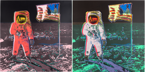
Andy Warhol, Moonwalk, 1987. Editions & Works on Paper New York.
Andy Warhol: Money for nothing, pics for free
Rendered in dayglow hues befitting its decade, Andy Warhol’s 1987 work Moonwalk was intended to be part of a larger series titled TV, in which moments of American television history, from Martin Luther King Jr.’s famous “I Have a Dream” speech to The Beatles’ first performance on the Ed Sullivan Show, would be processed through Warhol’s inimitable iconography. However, the artist’s unexpected death later that year resulted in Moonwalk being the only print from the proposed series to be realized, making it a remarkably sought-after work.
Beyond its inspiration and place within Warhol’s final projects lay a quintessentially Warholian factor: the source image did not come from a television broadcast. Its place in our popular consciousness is most often remembered as an ident for MTV. Warhol amalgamated two photographs taken by Neil Armstrong of his fellow astronaut Edwin “Buzz” Aldrin Jr. during the Apollo 11 mission, extracting elements like the American flag from one and Aldrin’s visor from another. The work is a standout reminder of Warhol’s capacity for image-making as a form of spectacle and the artist’s role in manufacturing an idealized representation, even when its source isn’t as it appears in reality.

Andy Warhol, Sunset, 1972. Editions & Works on Paper New York.
Warhol's Sunset series, published in 1972, was commissioned by the architects Johnson & Burgee for their new Marquette Hotel in Minneapolis. In contrast to the building’s highly geometric and functional aesthetic, Warhol's screenprints decorated each guest room in vibrant color, with an impressive 472 installations for the hotel’s opening. A massive undertaking, the total project encompassed 632 unique color impressions, with 160 pieces set aside and assembled into 40 portfolios of four, making the series one of Warhol's most ambitious editions, with no two pieces the same. The 472 prints from the hotel are differentiated by the additional "Hotel Marquette Prints” ink stamp on the reverse, designating their history in this cutting-edge hotel. In 1981, the hotel underwent a renovation, and the Sunset prints were all removed from the rooms and returned to Warhol.
Unlike many of Warhol’s famed screenprints, his source material for the series was not appropriated from popular culture but reworked from an unfinished film started five years prior. In his 1967 Sunset film, Warhol captured dusk across America as a meditation on temporality and everyday life. Unsatisfied with the project, Warhol instead translated the iconography into an edition that sought to capture the unique illumination of each day's end. Employing color to transcend naturalistic representation, the vibrancy of the Sunset series reflects Warhol's mastery of color theory and his adept application of the screenprint medium.
Man Ray: Hang in there

Man Ray, Obstruction, 1920/1961-64. MODERNISM: Editions & Works on Paper New York.
Man Ray first met Marcel Duchamp in 1915, sparking both a lifelong friendship and an era-defining shift in modern art. Through Duchamp’s readymades, Ray identified what would come to distinguish his own approach to working with objects from that of his dear friend. “My attitude toward the object is different from Duchamp’s, for whom retitling an object sufficed,” Ray said. “I need more than one factor, at least two. Two factors that are not related in any way. The creative act for me rests in the coupling of these two different factors to produce something new, which might be called a plastic poem.”
The poeticism Man Ray described is apparent in Obstruction through its simultaneously graceful and mathematical construction. Consisting of 63 individual wooden coat hangers – inspired by those discarded by his landlady, a dressmaker – each hanger drapes more examples of itself. To each end of the first, Ray drilled a hole and hung another; to each of these two hangers, he hung two more, and so on, until the progression was deemed complete. With the original sculpture, which consisted of 117 hangers, he only stopped adding more rows when the accumulation began to obstruct the space of his studio, hence its title. Through Obstruction, first executed in 1920 and revisited from 1961-64 in the present work, Man Ray introduces notions of movement and multiplicity – his two factors – to the genre of readymade sculpture, affecting the maximum possible impact with the least possible physical modification in a foreshadowing of Alexander Calder’s famous mobiles.
Keith Haring: Dog whisperer

Keith Haring, Dog, 1986. Editions & Works on Paper New York.
One of the artist’s most iconic motifs, Keith Haring’s barking dog imagery first appeared in his subway drawings of the early 1980s. Drawn “by necessity quick and simple” to evade arrest, Haring’s bold, energetic figurations conveyed messages of love, unity, and defiance against the injustices of his era. These powerful sentiments were embodied by the dog motif, which endured across Haring’s oeuvre.
By the 1980s, local health campaigns pushed for dog owners to clean up after their pets and “put children before dogs,” while city officials lobbied for tougher enforcement against graffiti, loitering, informal gatherings, and loud music. The subtext of these campaigns was not lost on the gay community, which was becoming increasingly visible as liberation movements grew in New York and around the United States. The dog motif echoes imagery of Anubis, the ancient Egyptian god of funerary rites and grave protection. Haring's Dog, adorned with drawings of dancing figures, man-dog hybrids, erotic scenes, and more, subverts the traditional notion of protection, challenging the authority and governmental power symbolized by the dog, and turning it into a dynamic expression of rebellion and creative dissent against a backdrop of systemic oppression.
Henri de Toulouse-Lautrec: In motion

Henri de Toulouse-Lautrec, Le Jockey, 1899. MODERNISM: Editions & Works on Paper New York.
Henri de Toulouse-Lautrec, the storied chronicler of late 19th-century urban Paris, completed several notable pastoral works away from the boulevards and dance halls of the city. One such edition and one of his final published works, the lithograph Le Jockey was produced in 1899 while Lautrec was a patient in a countryside psychiatric hospital two years before his death. Near the end of his stay, Henri Stern, one of Lautrec’s main printers, as well as publishers at Pierrefort de Rue Bonaparte suggested he work on a series of editions centered on some of his earliest iconography: horses and horse racing. He took on the project despite his health, yet Le Jockey is the only one of the four prints in the series set at the racetrack near the Bois de Boulogne to be fully editioned or printed in color.
Unlike the other prints in the series, Le Jockey features a race in progress. Echoing the rückenfigur, a pose associated with German Romanticism in which the subject faces away from the viewer, the work places the audience as spectators watching horses and jockeys fly past. However, Lautrec’s motion emphasizes the figure rather than drawing focus to the landscape, giving visual legibility to Lautrec’s artistic philosophy and the alteration to the pose’s meaning as well as his compositional focus on human and equine forms; in Lautrec’s own words: “Nothing exists but the figure... landscape is nothing, and should be nothing but an accessory.”
Helen Frankenthaler: Reaching new heights

Helen Frankenthaler, Freefall, 1992-93. Editions & Works on Paper New York.
Helen Frankenthaler played an immense role In the mid-20th century fine print renaissance. Her monumental soak-stain paintings acted as a springboard for extraordinary approaches to printmaking and emboldened a new generation to explore and redefine the medium through her constant experimentation. Freefall is ambitious and grand in scale: at over six feet tall, it is the largest print Frankenthaler ever made. The work began as a handmade paper maquette composed of dyed paper pulp and gel, after master printmaker Ken Tyler of Tyler Graphics persuaded Frankenthaler to embrace the artistic potential of paper as both a medium and an experiment in form, which the artist then continually developed until it reached its towering, celestial form. “Since I am essentially a painter,” Frankenthaler noted, “I never feel that work in another medium is a matter of reproducing what is on canvas. Rather, it is my translation of my image in a new vocabulary.”
While Frankenthaler continually sought new challenges in printmaking, she became most fond of the jigsaw woodblock method, a relief technique in which a single block is cut into separate pieces that are individually inked and then reassembled like a puzzle for printing. Unlike traditional woodcut printing, which typically revealed negative space between color areas, this technique allowed for a more seamless color transition. While Frankenthaler’s gestural, fluid style is almost at odds with the necessary precision of woodblock prints, the artist relished in the ability to learn how to adjust her “gesture, [her] language, [her] mark within the jigsaw’s rigid laws.”
Georges Braque: All worth saying is worth seeing

Georges Braque, Si je mourais là-bas (If I Died There), 1962. MODERNISM: Editions & Works on Paper New York.
Georges Braque’s illustrations take the form of woodcuts, a new technique for the artist but uniquely well-suited to his aesthetic sensibilities. Through these eighteen woodcuts, Braque evokes Cubist collage, mimicking the look and texture of torn paper for an array of compositions that emphasized immediacy and privacy: still lifes, florals, a repetition of birds, and more. The tenderness of Braque’s imagery, with a peaceful, masterful balance of line, color, and negative space, offset the intensity of Apollinaire’s writings in a marriage of beauty and melancholy. This rare deluxe version is made special by an additional suite of images, each signed and numbered in pencil.
A masterpiece of the illustrated book, Braque’s Si je mourais là-bas unites images with the words of the artist’s close friend, Guillaume Apollinaire. The artist and poet met in Paris before the outbreak of the First World War; Braque dedicated his livre d’artiste to the poet, referring to him as his “comrade in the trenches,” though both men eventually served at different times. Such camaraderie was evident in the mutual admiration they held towards one another, with Braque being especially grateful for Apollinaire’s promotion of – and at times of backlash, defense of – Cubism in the Parisian cultural sphere.
Pablo Picasso: Facets of a face

After Pablo Picasso, Tête de Femme (Dora Maar) (Head of a Woman, Dora Maar), 1943. MODERNISM: Editions & Works on Paper New York.
The aquatint Tête de Femme (Dora Maar), produced in 1943 by the Roger Lacourière in Paris, continues Picasso’s series of women's faces that was a mainstay throughout his practice. Picasso regularly depicted the women in his life and the states of their relationships, often displaying the ongoing tension between artist and sitter. Surrealist photographer Dora Maar, whom Picasso met in 1935 and remained entangled with until 1946, was the inspiration for and subject of many of his works in the tumultuous years between the Spanish Civil War and the close of the Second World War. Maar’s political influence on Picasso led to the creation of Guernica and the Weeping Woman, and she posed directly for the latter.
The piece, representative of his iconic portraiture, implies a degree of strain alongside care and inspiration that mirrors Picasso’s relationship with Maar. While their time together was creatively stimulating for both, his continued involvement with other women, especially Marie-Thérèse Walter, caused considerable friction. Their conflicts, as well as her more overtly political nature, led to sadness becoming a crucial theme in his prints, paintings, and drawings concerning her. The composition of Maar’s face in the aquatint crowds and overwhelms her head. Though Picasso’s relationship with Maar and with women in general were not uncomplicated, pieces like Tête de Femme (Dora Maar) also prove that their presences in his life were hugely influential on his work and development.
Yves Klein: Victory in color

Yves Klein, La Victoire de Samothrace (Winged Victory of Samothrace), 1962/73. MODERNISM: Editions & Works on Paper.
The classical La Victoire de Samothrace commemorates a Greek naval victory in the 2nd century B.C. in the image of the mythological Niké, the winged goddess of victory, her marble drapery dynamically formed as if windswept. Inspired by his studies and travels throughout Europe, Yves Klein executed his rendering of La Victoire de Samothrace in the final year of his life, during a period in which the artist embarked on a series of projects reinterpreting major works of the art historical canon with his instantly recognizable International Klein Blue (IKB) pigment.
Exacting a small-format plaster replica coated in the intensely ultramarine hue, Klein transformed this crown jewel of the permanent collection of the Louvre with his radical, monochrome sensibilities. Through his application of IKB pigment, the artist stripped the famed sculpture of its historical and cultural specificity, save for the stone base that serves as a trace reminder of the original marble. To the artist, IKB was not just a color, but a portal to the infinite, inspired by an experience in being struck by the immaterial void of the sky as a young man on the beaches of Nice; it symbolized a certain freedom, obliterating the constraints of representationalism and the physical realm. Thus, under Klein’s command, La Victoire de Samothrace becomes not just a mere synthesis of antiquity and experimentalism, but a totem of immateriality, of a spiritual dimension beyond the visible world.
Recommended Reading