Article | Irving Penn Process And Perfection Photographs Auction New York
Irving Penn: Process and Perfection
Phillips’ auction of 'Visual Language: The Art of Irving Penn' showcases the photographer’s mastery of photographic printing.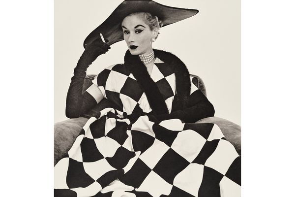
Irving Penn, Harlequin Dress (Lisa Fonssagrives-Penn), New York, 1950. Visual Language: The Art of Irving Penn.
—By Christopher Mahoney, Senior International Specialist, Photographs
In 1977, Irving Penn lamented, “What bothers me now is that, with the smaller size of fashion magazines and less expensive printing, the picture doesn't come to fruition on the page. I feel as if I'm looking at photographs under water.” Penn, who had elevated magazine photography to the level of fine art, had always been keenly attuned to the physical realization of his images, whether printed in the pages of periodicals or in his groundbreaking 1960 monograph Moments Preserved. Frustrated by the declining quality of magazine reproduction, he pivoted to making his own photographic prints, approaching the darkroom with rigor and experimentation. The results were extraordinary. Here is a look at a few of the printing processes that Penn mastered and made his own.
Platinum and Palladium
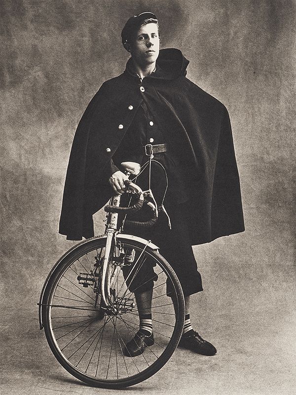
Irving Penn, Télégraphiste, Paris, 1950. Visual Language: The Art of Irving Penn.
“I began to love what occurs when you coat good paper by hand with these remarkable metals. My delight in the material itself makes me seek out subject matter that will best take advantage of these possibilities.” —Irving Penn
In 1963, after Penn visited the world-class photographic collection at the George Eastman House, he stated, “I was just staggered by the old photographers. They had a love for [the] print . . . as though it were a painting . . . To me this is thrilling.” He was especially drawn to the antiquated platinum printing process for its long gray scale — its ability to display a seemingly infinite array of gradations between pure white and absolute black. In 1964, he made his first trial prints in platinum from negatives taken in Japan and from the window of his studio above Bryant Park. These experiments served as the groundwork for Penn’s exploration and ensuing command of the platinum-palladium process.
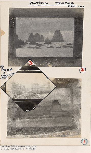
Irving Penn, First Platinum Attempts, Following Clerc’s Process of Mixing Chloroplatinite in the Developer, 1964.
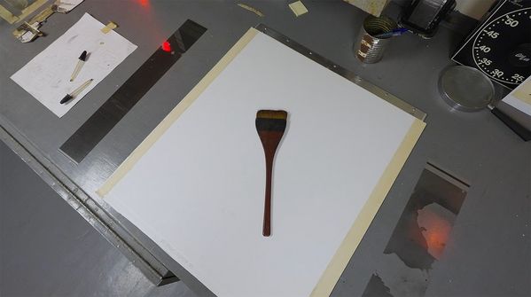
Irving Penn’s Darkroom, Long Island, New York.
The platinum-palladium process requires direct contact with the negative, so Penn first enlarged his negative to the desired print size. He hand-coated paper with platinum and palladium sensitizers, then, once dry, sandwiched it with the enlarged negative and exposed it to light. Through experimentation, he discovered that recoating and reexposing a single sheet two or three times produced prints of greater depth and subtlety. To solve the challenge of precise realignment of the paper and negative for multiple exposures, he adapted a graphic arts technique: mounting the paper on aluminum with pin registration guides along the edge.
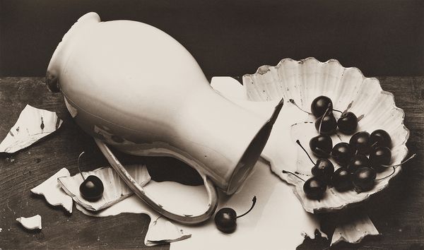
Irving Penn, The Spilled Cream, New York, 1980. Visual Language: The Art of Irving Penn.
From the 1960s onward, Penn refined and expanded the process, using it to achieve the richly nuanced tonal effects of Télégraphiste, 1950, or the elegant graphic minimalism of Harlequin Dress (Lisa Fonssagrives-Penn), 1950. When it came to platinum-palladium prints, perfection for Penn did not necessarily reside in consistency. In fact, Penn leaned into the many variables of the technique to see how many ways he could make a print that met his high standards.
Gelatin Silver
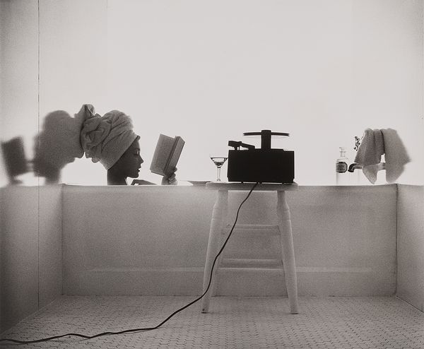
Irving Penn, Girl in Bath (Jean Patchett), New York, 1950. Visual Language: The Art of Irving Penn.
“Penn was not one to accept given formulas or approach a task or an idea in a very elemental fashion. Penn was not shy about thinking outside of the box.” —Vasilios Zatse, Irving Penn’s assistant, Deputy Director at The Irving Penn Foundation
The gelatin silver print was the dominant photograph of the 20th century and could be relied upon to produce adequate prints for an array of purposes. But Penn liked to push his media to extremes, and his approach to printing in gelatin silver was, predictably, completely unconventional. Even his straightforward prints, such as Girl in Bath (Jean Patchett), 1950, are marvels of tonality and detail, the result of the complex darkroom choreography of burning and dodging (selectively increasing and reducing exposure), and masterful control over exposure and contrast.
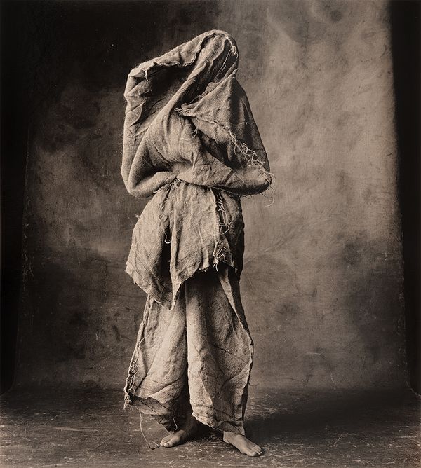
Irving Penn, Woman in a Burlap Sack, New York, 2007. Visual Language: The Art of Irving Penn.
Penn frequently employed chemical toners, like selenium, which imparted a range of effects depending on the strength of the solution and length of immersion, so beautifully illustrated by Woman in a Burlap Sack, 2007. He also used bleaching agents, which drastically altered their appearance. Penn’s darkroom virtuosity and continual experimentation ensured that his gelatin silver prints looked like no one else’s.
Color, and Beyond

Irving Penn, Mouth (For L’Oréal) (A), New York, 1986. Visual Language: The Art of Irving Penn.
“He should be regarded not only for being a brilliant, masterful image-maker, but a printmaker as well.” —Vasilios Zatse, Irving Penn’s Assistant, Deputy Director at The Irving Penn Foundation
For his color work, Penn favored the dye transfer process for its rich saturation and detail, which most closely matched the look of his images in the pages of Vogue. The process was complex and labor-intensive, requiring a specialized lab and skilled technicians. Yet the presence of an intermediary did not diminish Penn’s adventurous spirit; he oversaw the printing with meticulous attention, often spending weeks on proofs and corrections before approving a final print. Penn’s dye transfer prints could be full of tightly controlled detail, like Mouth (For L’Oréal) (A), 1986, or awash in Impressionist hues like Seine Rowboat, 1951.
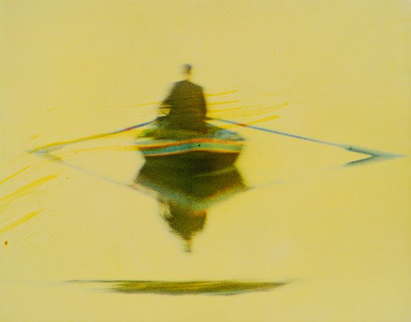
Irving Penn, Seine Rowboat, France, 1951. Visual Language: The Art of Irving Penn.
When Kodak discontinued the dyes, Penn turned to chromogenic and dye-destruction prints, selecting whichever best suited the palette of a given image. In 2003, the Penn studio acquired its first inkjet printer, finally enabling him to make color prints in his own space and to direct every stage of editing and printing. Penn embraced the new technology enthusiastically, exploiting its flexibility and control. Poppy 'Burgundy', 1968, is just one triumph from this late period. In a sense, this brought Penn back to the formative experience of seeing his photographs translated into ink on paper, and he continued to create prints that reflected his genius as a photographer and printmaker.
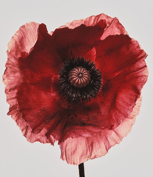
Irving Penn, Poppy 'Burgundy', New York, 1968. Visual Language: The Art of Irving Penn.