18Ο︎
Mark Rothko
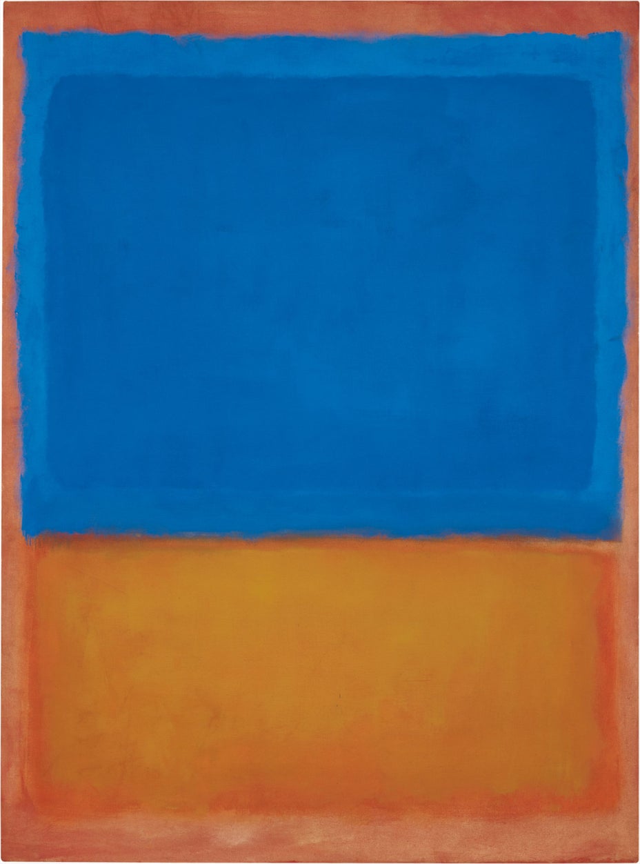
Untitled (Red, Blue, Orange)
Estimate
On Request
Sold For
$56,165,000
oil on canvas
66 5/8 x 49 3/8 in. (169.2 x 125.4 cm.)
Estate number: 5194
Signed “Mark Rothko” on the reverse.
Signed “Mark Rothko” on the reverse.
Full-Cataloguing
"The noble, the sublime are hollowed unless they hold, to the bursting point, a core of the Wild. This idea, verbalized, I have held on to — in a large sense. This I recognize as irrevertably true..."
MARK ROTHKO, 1954
Mark Rothko’s masterwork, the glorious Red, Blue, Orange of 1955, is an exceptional example of one of the greatest artists of the twentieth century working at the height of his painterly powers. It is in this era that we see Rothko come in to his own and become the iconic artist of his time. Bold and assertive, this painting’s luminescence—as in all the greatest of Rothko’s paintings—appears to stem forth not from the surface of the canvas but from some other, mystical space deep within its very fibers. Deploying a rarely seen double hued blue field of color over an ochre expanse, set atop a burning orange tinted background, the present lot is a remarkable testament to the preeminence of Rothko as an artist during the most important period for painting in American history.
A trailblazer in the use of abstraction and a master of color and scale, Rothko was above all a painter of emotion and a humanist who believed in the emancipatory capacity of great art to free us from our worldly bonds. Painted just a decade after the close of the most disastrous war the world had ever seen, one that saw devastation on battlefields across the world as well as the leveling of entire cities, and the attempted genocide of entire races, Rothko’s electric works such as the present lot, offer a tacit acknowledgement of human folly while also offering the possibility of alternatives. Painted at the dawn of the space age and at the mid-point of what would come to be known as the “American Century,” Rothko and his abstractionist New York school colleagues are painting with all the power and confidence of that city and country at a unique moment. With the tensions of the Cold War and possibility of nuclear destruction heavy in the air—Rothko points in another direction in the best of his canvases.
The bold power of his work exists not just in the harmonious structures, though they first capture the eye, but in the effect on the subconscious, and even the soul of the viewer. These pictures have the ability to inform the very core of who we are, and in a dialectical process to elevate and inform both subject and object. While abstract on its surface, for Rothko these paintings are meant to move beyond any simple didactic rejection of the dichotomy between representational and abstract; they are meant to capture the full range of human emotions and interior life from ecstasy to tragedy. As in the present example, the most powerful of Rothko’s works unify vibrant colorization with sensitivity to weight and scale, further capturing the soul as well as the eye. However, despite how formally sophisticated his paintings are, in Rothko’s own words, “I am not an abstractionist. ... I am not interested in the relationships of color or form or anything else. ... I'm interested only in expressing basic human emotions — tragedy, ecstasy, doom and so on — and the fact that a lot of people break down and cry when confronted with my pictures show that I communicate those basic human emotions... The people who weep before my pictures are having the same religious experience I had when I painted them. And if you, as you say, are moved only by their color relationships, then you miss the point!” (Mark Rothko, in Conversations with Artists by Selden Rodman, New York, Devin-Adair, 1957, p. 93.) As he clearly expresses and as can be seen throughout his career, including in his earlier representational and surrealistic modes, for Rothko the aesthetic concerns though first experienced are certainly not where he wishes the effect of his paintings to stop.
Rothko once stated that he wanted his works to possess such a "presence" that "when you turned your back to the painting, you would feel [them the] way you feel the sun on your back." (M. Rothko, in J. E. B. Breslin Mark Rothko: A Biography, Chicago, 1993, p. 275). Red, Blue, Orange typifies this sensation of being overwhelmed with the colors of the painting to the point where, as a viewer, we can physically feel it pulsating on our back. This sentience is only brought about via a dexterous combination of color magnification where in the radiant rectangular fields of color appear to physically resonate and vibrate with a ribald energy as though they were the burning August sun shimmering low, but not yet melting into a watery horizon. In Red, Blue, Orange we see both the blue and orange quadrants manifest themselves from the inside out, seeming to shimmer up above the thinly washed background; they lightly manifest themselves as marvelous entities that magically materialize for the purpose of entrancing us.
It is in this service of this type of almost metaphysical encounter wherein Rothko trains his formidable power. For Rothko, and it can be said similarly for many of his most accomplished contemporaries, the move to non-objective art was about a subtle but important shift in what they expected their work to deliver to and receive from our viewership. The revolution that Rothko advanced was one that situated a painting as being not about an experience in and of itself, but instead about the experience of viewing it, of being in its presence and feeling how it changed you and your subjectivity. Though subtle, this is a fundamental shift and one that changes how we can perceive the act of viewing - the very act of looking at an artwork. For Rothko it is about the emotive connection and the sublime space between the painting and the viewer that is most fertile. This experiential understanding of the power of art is one that, while bordering on the religious, is fundamentally humanist in nature in-so-far as it is dependent upon the individual’s energy in reaction to a specific time and space as opposed to an existing hierarchy. In fact it is the absence of hierarchy in this moment that most sets his work apart. It is this reliance on and ribald exploration of the space of the sublime that makes Rothko’s contributions to the history of art so important and enduring.
Philosophers from enlightenment onward had often theorized the notion of the sublime, of a greatness that could exist beyond all possible calculation, measurement or imitation. We know Rothko was influenced by the writings of both Immanuel Kant and Friedrich Hegel, who had both developed complex and nuanced definitions of the sublime and its important expression in the arts. It is plain to see how this exploration and interest in the political, spiritual and social ramifications of the sublime lead to the artist creating a new, experiential as opposed to representational art.
Of course Rothko was not the first painter to utilize and explore notions of the sublime in his works. In the naturalistic scenes by the romantic painter Caspar David Friedrich we are exposed to a concern with the awe that the natural world can inspire in the soul. Though pre-dating him by over one hundred and fifty years, Friedrich’s Monk by the Sea, 1808-10, has an almost Rothko like composition with an expanse of blue sky at the top, layered over a darkening horizon that immerses a solitary monk looking out from his perch on wild dunes. In this painting we see man contemplating the smallness of his being in the face of the greatness of the natural world and in fact being lifted up by that dichotomy.
Even more directly related to Rothko’s most powerful paintings and the notion of the sublime is the oeuvre of J.M.W. Turner. In the wonderfully rendered, almost smoky surfaces of Turners most extraordinary works, we can see clear fore-tidings of abstraction and a drive to enrapture the viewer. Rothko’s palette is “Turneresque” with its subtle almost imperceptible differences in hue and shade creating vast degrees of spatiality. Turner’s exuberant Sunset, 1830-35, is a prime example with its ochre top half melding into an inky, expanding horizon line and foreground beneath. Like Rothko after him, Turner is using highly efficient economy of difference in his palette to create a seemingly infinite and in flux sense of space and color. Similar to Rothko’s paintings, the Turner palette at first glance seems to utilize a handful of colors, however careful study brings the realization that the hues are themselves made up of multitudes of variations. And in that moment, when the eyes continue to gaze into the canvas and almost (but not quite) lose focus, is wherein the sublime—the magnitude of feelings that far surpasses what is evinced—emerges and exerts its powerful impact.
With its pulsating cloud-like expanses of floating color, Red, Blue, Orange typifies the paintings of Rothko’s mature and most important era. Boldly rendered in its titular colors, the work from 1955 encapsulates the artist’s sophisticated and revolutionary handling of pigment, scale, and composition. The painting’s dazzling upper blue half seems to vibrate as it fills our field of vision, its dark core offset by a subtle border of more lightly rendered azure. The blue is realized in typical fashion for Rothko, not in one single shade but in a large variety of registers of navy that come together to provide a sense of infinite depth. In the lower field of Red, Blue, Orange is a gauzy expanse of yellow tinged orange, slightly smaller than the indigo cloud above. Like the lighter blue border surrounding and providing texture to the upper register, the orange swath of color is itself offset by a slight, almost imperceptible frame rendered in a darker, red-dyed-orange shade. These borders are key to the fission and excitement of this canvas, creating a dynamism and sense of movement and life. These two areas of color, blue over orange, shimmer above a background of milky red; each shade and register painstakingly built up with layer upon layer of highly thinned pigment. The result is an exceptional example of painterly prowess; the surface seems almost perfectly flat and without texture yet the painting has a tactile depth that feels as though one could dive deep into it.
Red, Blue, Orange is a tour de force of the innovative techniques Rothko applied to realize his genius. Looking closely we can see that the paint is not simply applied to the surface but instead is married to it; as a coat of orange soaks the canvas, we can envision the artist as he works the color into the raw linen, building first the background in thin, almost iridescent liquefied pigment. Following this initial treatment, he adds yet another and perhaps another swath of color, each delving deep down into the threads of the surface. Following this application, he slowly builds the blue color, at first light and then follows with a darker core at the center, allowing the edges to provide definition and structure. Then an orange autumnal hue is whisked across the bottom quadrant, a dark and then alternately lighter almost yellow shade across the center, further offset with the darker red under painting to provide a sense of spatiality and weight.
Rothko was able to perfect a manner of staining with color that enabled him to soak the canvas itself and unify color and structure as one. More than just a triumph of technique, this process has further import, allowing Rothko to apply layer upon layer of paint creating, as we see here, a living sense of space as well as form; this process is integral to the ability of these pictures to seem as though they emanate light from their very depths. The present lot is illustrative of the very best of examples of this, the layering creates a sense of space that is truly three-dimensional, each cloud of color seemingly summoned into being; the subtle, almost shadow like under-painting of the two central formulations creates a rupture that allows for a seemingly mythic space to open up and enter our unconscious.
The colors themselves, emanating as they do from various layers, bring to mind the spiritual light of Rembrandt, and an almost gauzy diffused sense of palette. The very contradiction of the two colors that form the core of the painting’s presentation creates a vitality that is hard to pin down yet suffuses our visual experience and thus the renewed sense of self that this picture provides. As in all of Rothko’s mature paintings, the present lot expresses a directness of form and colorization that is matched by a taught balance with an exploration of the human psyche. A long time delver into the human condition, Rothko was devoted to an exploration of the narratives of human thoughts and emotions; a voracious reader of philosophy, myth and prose, it is both facile and incorrect to view even his most voluptuous paintings as mere abstractions and not a continuation of his longstanding intellectual and artistic concerns.
The majesty of Red, Blue, Orange is prefigured by similar works from this most fertile era of Rothko’s career. In No. 25 (Untitled) of 1951 we see the artist fully develop into the painter of iconic floating planes and cloud like fields of color. In this highly important example, now in the collection of the Tel Aviv Museum of Art, we can see Rothko developing what would become his iconic structural technique, wherein foreground and background are highly differentiated but seem to hover into and amongst each other. Much as in Red, Blue, Orange, the painting at the Tel Aviv is top-heavy with a darker pigment, though of course the former in a brilliant blue as opposed to the noir-ish black in the latter; while in many painters hands such a configuration would be in danger of feeling unbalanced or awkward, in Rothko’s deft handling of color and scale, each feels harmonious and grounded. Both pictures use an almost ambivalently autumnal orange with red overtones to set a fiery stage, a glow that emanates within and creates a zesty haze.
In addition to giving his pictures their interplay of transparency, he imbues them with shimmering brilliance and iridescent joy. The surface colors seem applied with a light and fast brush, removing the possibility of identifying individual brushstrokes and leaving the impression that the colors had been simply blown into place. By building up symmetrical underlying structures with pigments lightly layered on top of each other in each of these two pictures—and in all of his most iconic works—Rothko is able to create a sense of decentralized gravity; the pictures are not weightless as they have far too much gravitas for that, however, within each there is a floating quality and a true three-dimensionality that allows for a highly emotional engagement between surface and viewer. Rothko had long wished to find a mode of pictorial representation that allowed him to touch on the most enduring portions of the human psyche and soul and in the most iconic works such as No. 24 (Untitled) and Red, Blue, Orange we see him fully embrace abstraction and find a mode that allows him to do as such.
In Rothko’s Yellow and Blue (Yellow, Blue in Orange) painted in the same year as the current lot, we see the artist use an iridescent blue quite similar to that expressed in Red, Blue, Orange. Yellow and Blue in the collection of the Carnegie Museum of Art in Pittsburg also uses orange as its basis, however, in the Carnegie picture we see the foregrounded blocks of color almost obliterating the field on which they are placed. Still, much like in our present lot, the carful application of pigment built up with a feathery touch proves the sense of an infinite edge and as such a plane of color without beginning or end. The Carnegie’s picture is structured with a slightly ominous and larger mustard yellow swath above the seascape like blue below.
In 1955 America and American art had superseded its forebears in Europe. The city and the country were on the move and in no sector was that more true than the field of painting. While the city bustled and throbbed, the same energy of endless possibility simmered on the canvases and in the studios of the artists who were remaking what the bounds of painting could be. And the country—while in the midst of McCarthy’s witch-hunt for “reds” and fermenting questionable covert operations—was itself on the edge of a revolution of social mores and thought that few could foresee.
New York of the early 1950’s was a veritable hotbed of artistic ferment. Even as institutions such as the Metropolitan Museum of Art and the Museum of Modern Art continued to stage shows of the European avant-garde, the local development of contemporary American abstraction continued to gestate at a fervent pace. Betty Parson’s gallery had broken open the floodgates and by the early 1950’s these up and coming artists would solidly establish their preeminence in the pantheon of American Art of the twentieth century.
On May 22, 1950, eighteen artists wrote an open letter to the then president of the Metropolitan Museum, Roland L. Redmond, declaring their indignation and refusal to participate in a juried exhibition at the museum which was to be held in December. They exclaimed that Francis Henry Taylor, the museum’s director, had “on more than one occasion publicly declared his contempt for modern painting,” and further that Robert Beverly Hale, the associate curator of American Art, had in “accepting a jury notoriously hostile to advanced art,” aligned himself with Taylor. (The New York Times, May 22, 1950). Their disgust arose from the fact that these curators seemed to resist, refute even, their belief that they themselves were the inheritors and sustainers of the advanced art first established by their early European counterparts. That list of eighteen artists, Ernst, Gottlieb, Motherwell, Baziotes, Hofmann, Newman, Still, Pousette-Dart, Stamos, Reinhardt, Pollock, Rothko, Walker Tomlin, de Kooning, Sterne, Brooks, Kees, and Bultman now reads like a who’s who of early post-war American art but at the time they were viewed as aggravators, instigators, ultimately immortalized in Nina Leen’s iconic 1951 photograph of the group published in Life magazine alongside the story entitled “Irascible Group of Advanced Artists Led Fight Against Show.” (Life, January 15, 1951.)
Jackson Pollock had already received critical attention by this point and by the mid 1950’s many of his contemporaries were well on their way as well. 1951 saw Barnett Newman’s second exhibition open at Betty Parsons Gallery, hung by his close friends Pollock, Krasner, and Tony Smith. However, the show was critically condemned and none of the works sold. This negative reception disturbed Newman and that would be his last public exhibition until 1955. Equally as upsetting, however, was his exclusion from the seminal 1952 exhibition, Fifteen Americans, at the Museum of Modern Art even as many of his contemporaries and fellow “irascibles” such as Pollock, Rothko, and Clyfford Still formed the backbone of the grouping. Still would go on to inscribe a gifted copy of the exhibition catalogue, “To my friend Barnett Newman who, also, should have been represented in this exhibition.” The dialogue established between Newman and Still is apparent in their works, Ulysses, 1952 and January 1951, 1951 respectively. Each can be seen to be grappling with the subtle, yet immensely powerful treatment of color within their, by now, massive canvases. Whereas Still isolated jagged, nearly violent, swatches of red, yellow and blue color within the inky celestial darkness of the canvas, Newman achieved a powerfully emotive quality by varying his treatment of blue paint and pigment in order to effect a bisected canvas with a single barely perceptible and yet manifest shimmering band of white.
Rothko himself saw increased and sustained attention beginning in 1952. Alfred H. Barr, by then already forced out of his position as the inaugural director of the MoMA, convinced Philip Johnson to purchase a work by Rothko and donate it to the Museum knowing full well that the board members could not refuse a gift from so highly regarded a patron just as he knew they would refuse to purchase one outright. Rothko’s No. 10, 1950 became the first work by the artist to be included in the museum’s collection; interestingly, the museum seemingly took less issue with the dramatic, monochromatic abstractions of Franz Kline, as his work Chief, 1950, was acquired by the museum that same year.
Additionally, former collector-cum-dealer Sidney Janis was steadily signing away many of the artists from Betty Parsons to his fledgling gallery. Already established having shown the works of the European avant-garde such as Mondrian, Klee, and Miró, among others, Janis quickly solidified the importance of his new roster by pairing them with their established European idols. Indeed, at Willem de Kooning’s first exhibition at the gallery in 1953 he sold two major pictures, Woman I, 1950-52, and Woman II, 1952 – the former directly to the MoMA and the latter to Blanchette Hooker Rockefeller who subsequently donated the painting to the Museum. American abstraction was no longer a marginal movement – it was the movement.
As a direct result of the positive responses to Rothko’s first traveling museum exhibition initiated at the Art Institute Chicago in 1954, the artist was invited by Sidney Janis to join his gallery with his first exhibition there opening in 1955, the same year Red, Blue, Orange was painted. Indeed, 1955 was an extremely positive one for Rothko with no less an authority than Fortune magazine declaring his paintings to be a good investment. By 1958, attitudes had changed so drastically that MoMA curator Dorothy Miller, assisted by Frank O’Hara, assembled the seminal traveling exhibition, The New American Painting. Comprised of seventeen artists, many of whom were members of the original irascible eighteen, the show would go on to travel Europe and establish, without question, the supremacy of the new New York avant-garde.
Rothko’s mastery as a colorist, his sensitive treatment of tonality and the ability to find within primary overarching color an infinite degree of variability was often drawn upon by following generations. Blue has tantalized and intrigued artists as a main compositional element for nearly as long as they transitioned from simple charcoal drawings to those realized in a full chromatic spectrum. What differentiated the artists of the late nineteenth and early twentieth century from their predecessors was their freeing color from realistic parameters and enabling it to become an entity entirely unto itself with the development of Impressionism, Fauvism, German Expressionism, and ultimately through Cubism and beyond.
Vincent van Gogh was one of the first artists of the late nineteenth century to explore the psychic qualities of unnatural or intentionally exaggerated color within his paintings. Working in short viscous strokes, van Gogh worked to relate upon the canvas in oil his emotional response to and understanding of his visual stimuli. Wheatfield with Crows, 1890, assumes a much more somber, even sinister quality as the gradations of blue shift from the still balmy twilight along the horizon to the deep inkiness of the celestial expanse.
Taking up the mantle of blue as one of the most loaded emotional colors, Henri Matisse employs it in a much softer, calming manner in The Blue Window, painted in the summer of 1913. The warmth of the summer’s eve seems to impart a soothing stillness throughout the canvas imbuing the typically “cool” color with a particular humanity otherwise unachievable in a realistic tonality. Each object portrayed in the foreground—the flowers, vase, lamp, and even the artist’s own palette—come alive in the shadows of the night.
The most iconic pictures by Mark Rothko are a record not only of creative genius but also of a watershed moment in the history of artistic production. At the forefront of the movement towards artistic production, and a defining member of the New York school, Rothko’s place in the history books is secure and deserved. Red, Blue, Orange, with its electric colors and sophisticated composition stands as a testament to the artist’s successfully realized desire to find a new, non-representational language with which to express the most basic and profound of human experiences. Standing in front of this masterwork, imbibing its brilliant blues and oranges, we as viewers can be transported not just visually, not just at the surface but deep down in the primordial core of our being.