18
Ed Ruscha
Idea
Full-Cataloguing
“I’m observing that these words, which sometimes represent objects and meanings, are made up of these squiggly little forms we call an alphabet. It’s another way of looking at things, that’s all.” ED RUSCHA
If you spend enough time with Ed Ruscha’s work, you will undoubtedly find yourself viewing words as images, and reading images as words. It is the artist’s ability to blur these distinctions between the pictorial and the vernacular that has rendered his practice unparalleled. Like the sentiment behind a small nudge of words stuck against the very tip of your tongue, Ruscha’s artwork has the ability to reveal these thoughts without constraint, stating: “I like the idea of bringing up a subject and then just kind of letting that be your subject. In some certain way, I’m kind of treating my art as though every painting is a lab animal trying to push me on to something else. And, finally, it’s just realizing that I’m having this dialogue with myself that I have to continue on with it.” (Ed Ruscha, audio program excerpt in Contemporary Voices: Works from The UBS Art Collection, MoMA, New York, 2005)
At the tender age of 18, the aspiring young artist stepped into his 1950 black Ford sedan, turned onto Route 66, and drove from his home in Omaha, Nebraska to Los Angeles, California; rolling over 1,500 miles towards the western horizon, filled with ambition and hope. But was it really the West that Ruscha was driving towards, or was it the idea of the West; the idea of the person who he could become? Furthermore, was it possible for this perception to actually become more real than the physical location itself? Ruscha explains his pursuit of this new frontier: “It was all so attractive to me: the vegetation, the sunsets, the lifestyle, the jazz. I’d read about Los Angeles and this fact stuck in my mind: that the city gained 1,000 new people every day. In 1956! A thousand people every day! I felt: I want to be part of that.” (Ed Ruscha in R.Cooke, “Ed Ruscha: There’s room for saying things in bright shiny colours,” The Observer, September 11, 2010)
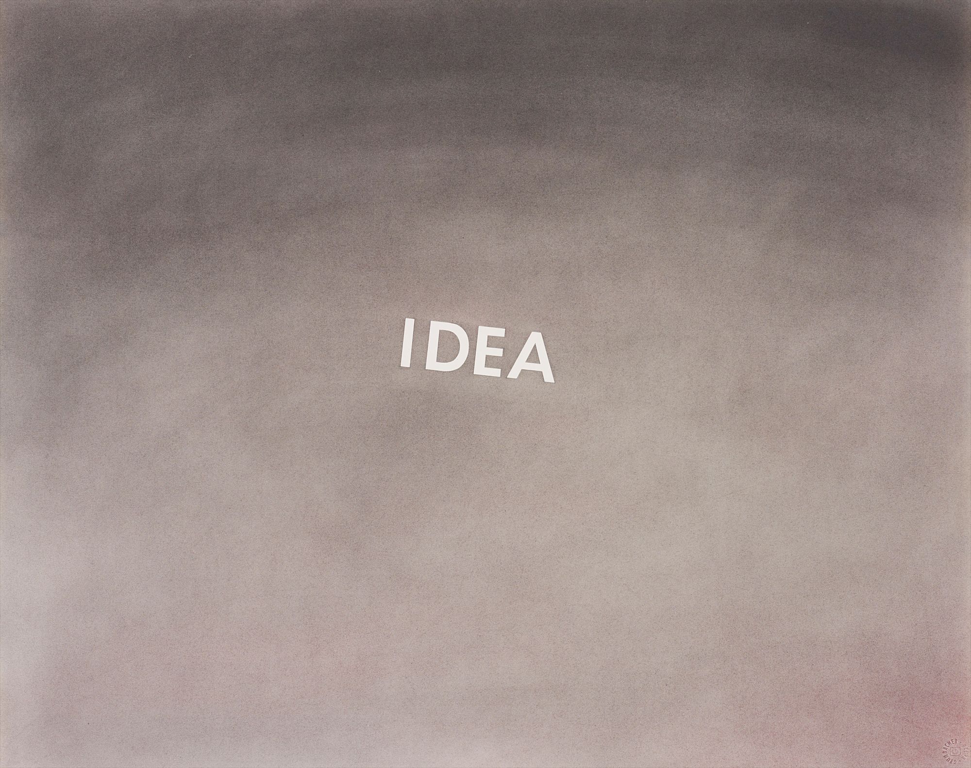
In the present lot, Idea, 1976, Ruscha invites viewers to grapple with such dichotomy, challenging them to find the reality of their own horizons. Through a smoky, monochromatic atmosphere of pastels on paper, Ruscha provides a visual projection for the work’s central subject matter: the word, “IDEA,” levitating at the heart of the piece. Each letter appears neat, closely spaced and in uppercase typeface, causing the viewer to confront the word head-on. Angled on a slight axis, as if a planet orbiting space, “IDEA” is anthropomorphized, granted a life of its own. The viewer is no longer deriving meaning from what they know the word to mean, but begins to treat this word as a very real subject. It lives and breathes as its own object in Ruscha’s landscape. The word appears to swirl in a display of agency.
As the eye drifts through this atmospheric frontier, punchy shots of varying grays gradually become darker and heavier, producing an almost hypnotic smoke and mirrors effect. While murky hues devour much of the piece, the letters of “IDEA” act like an illuminating light source, baring the untouched skin of the paper’s natural white tone. By way of process, these letters were executed through pencil markings, followed by acetate stencils. A chalky pastel was then embedded into the paper by hand and rag, providing the work with its sky-like panorama. Finally, the stencil was peeled back, thereby releasing the word from its abstract confines, into a very definitive and substantial existence.
The chronological voice that Ruscha gives to Idea, 1976 is one that echoes throughout his vast carrier. As displayed in his acrylic on paper, CROSSOVER DREAMS, 1991 Ruscha continues to provide the viewer with something concrete, yet nebulous; both of mind and of matter. Through a punctuated, muted acrylic smog, the viewer is reminded of the inexactitude of dreams and the desire to cross over into something more, a material state. At first glance, the crisp white letters against the ultra light gray background appear to be in perfect symbiosis. Such as to say that these dream-like words have literally crossed over. However, with further glance, the differentiating hues become more apparent, bringing these failed aspirations to a somewhat uneasy forefront. As in Idea, 1976, it goes without saying, seeing, or thinking that this conceptual work is truly a language of its own.
What the small-scale text of Idea, 1976 may lack in size, it makes up for in stern legibility and authority. The glowing white outlines of each letter radiates against the background grays. Every corner and curve of them shine brighter, deeper and heavier with every moment the viewer continues to stare. Like cars illuminating a highway billboard in the night, the viewer drives the solubility of this word, bringing both the word and its meaning to a very real and physical light, “I guess that’s what poets want to do: put ideas on stage. I settle for a single word.” (Ed Ruscha in R. Cooke, “Ed Ruscha: There’s room for saying things in bright shiny colours,” The Observer, September 11, 2010)
Ed Ruscha
American | 1937Quintessentially American, Ed Ruscha is an L.A.-based artist whose art, like California itself, is both geographically rooted and a metaphor for an American state of mind. Ruscha is a deft creator of photography, film, painting, drawing, prints and artist books, whose works are simultaneously unexpected and familiar, both ironic and sincere.
His most iconic works are at turns poetic and deadpan, epigrammatic text with nods to advertising copy, juxtaposed with imagery that is either cinematic and sublime or seemingly wry documentary. Whether the subject is his iconic Standard Gas Station or the Hollywood Sign, a parking lot or highway, his works are a distillation of American idealism, echoing the expansive Western landscape and optimism unique to postwar America.