Article | Soundtrack Editions London Phillips
Soundtrack: Editions
Pairing songs with works from our 14-15 June Editions London sale for a playlist that jumps off the page.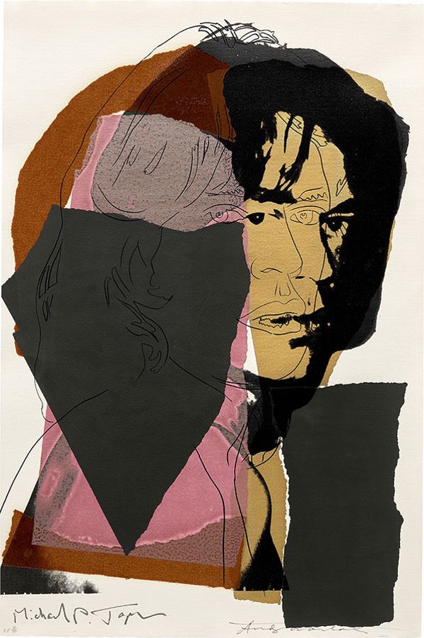
Andy Warhol, Mick Jagger (F & S. 139), 1975. Editions London.
Andy Warhol: The Rolling Stones
Artists, like musicians, don’t particularly enjoy being told what to do. So, in 1971, when Mick Jagger gave Andy Warhol full creative control to design the Rolling Stones’ album cover for Sticky Fingers – the band’s first after creating their own record label with the freedom to do as they pleased – he must have thought it was a courtesy to suggest that it shouldn’t be too complicated for ease of reproduction and save Warhol some trouble with the project. Warhol proceeded to design the innuendo-laden cover with a functional zipper, perhaps to save Jagger the trouble of having to make further suggestions. The relationship between Warhol and Jagger can be read as shorthand for the decade of excess and superstardom. Two people whose names and faces were larger than life, and whose lives in turn were the subjects of tabloid gossip and scholarly pursuit alike. Warhol’s portfolio of Jagger, created in 1975, marked a turning point for the artist, who began to more regularly photograph the subjects of his work, rather than turning to already existing images. Similarly, the Stones of the era turned away from their experimental late 1960s sound in favor of a more mature approach towards their roots after the death of guitarist Brian Jones. The result was by all measures a success, signaling an inward turn smack in the middle of the Me Decade.
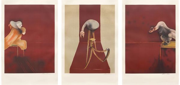
Francis Bacon, Deuxième version du triptyque 1944 (Large Version) (after, Second Version of the Triptych, 1944) (S. 24, T. 25), 1989. Editions London.
Francis Bacon: Pixies
It is time to unite the numerologists and the Hegelians in a way that will upset them both, and we will do it with Francis Bacon’s Deuxième version du triptyque and the Pixies. Popular music, despite all of its confluence with art, remains very much a cult of the number four, whereas art, or our experience of it in the world, narratively speaking, settles on the number three: four beats per measure; four measures per phrase; played on four instruments by four band members for four minutes, against the artistic beginning, middle and end; birth, life, and death; the father, the son, and the holy spirit, the rule of thirds, and so on. This quasi-mystical element appears in both the work of Francis Bacon and the Pixies’ music. Much in the way Bacon explored and developed his own interaction with the altarpiece format in a postwar world shelled out of sublime meaning, Tame is three-chord song that moves through three-bar phrases and three-breath ha-ha-ha lyrics that nest the triptych form within the piece, and the band often returned to the structure in a way that would become a signature. We can almost hear it muffled to a hollow whisper in the infinite red planes in Bacon’s prints that extend beyond Bacon’s borders. In both. For both, the number three is a syncretic understanding of the rules and knowing just what to do to subvert our expectations. Both works are also from 1989, but we’ll stop short of universal synchronicity.
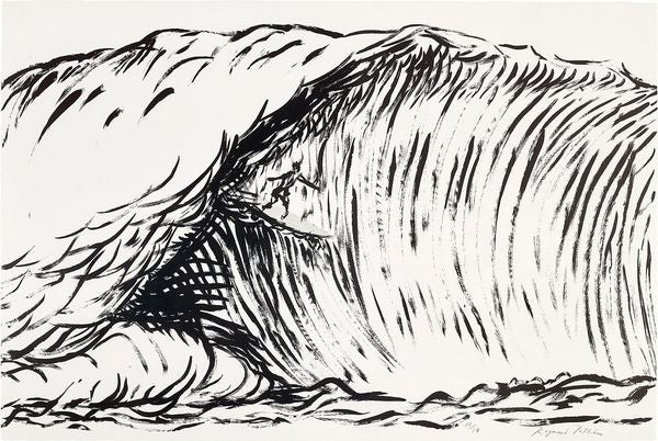
Raymond Pettibon, Untitled (Hermosa Beach) Black and White, 2019. Editions London.
Raymond Pettibon: Black Flag
If we lost you with that last bit, let’s return with something less abstract and a little more up-front about its intentions: punk rock. Think of a band formed after 1990 with a memorable logo. Quite hard, isn’t it? All the more difficult considering that after 1976, they had to compete with Raymond Pettibon, who created the iconic four-bar Black Flag logo that was plastered all over show flyers in the Hermosa Beach area and eventually on everything from T-shirts to the backpack of a 13 year old future Phillips editor who earned a detention for “displaying anarchist symbols on school grounds.” Look who’s doing nothing with their life now, Principal Kuder! Back on subject, when the London and New York punk scenes were confined to the cities, the sound reflected its harsh but still image-conscious environment. With Black Flag, Southern California skate and surf culture seeped into Greg Ginn’s reverb-soaked distortion, like it was being surfed through Pettibon’s waves. Suddenly punk was shirtless in public instead of wearing Vivienne Westwood.
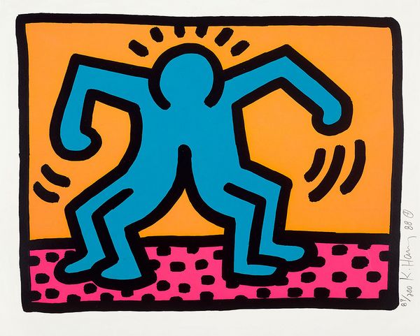
Keith Haring, Pop Shop II: one plate (L. pp. 96-97), 1988. Editions London.
Keith Haring: Talking Heads
File this one under What Ifs of the Century: Timothy Leary – of "turn on, tune in, drop out” fame – was apparently quite into video game technology in the early 1980s, favoring a new catchphrase of “turn on, boot up, jack in,” and going as far as compare the personal computer to LSD itself. A William Gibson fanatic, Leary had ambitions to create a Neuromancer-inspired video game, and the litany of creative partners with whom he had planned to work reads like a who’s who of the era’s icons of odd: Devo would score the game, naturally. Helmut Newton was to provide photography. Keith Haring would create the visuals, and yes, of course, there was room for David Byrne as a character. While the project never took off for what Leary called a “mind movie,” we can still easily picture Byrne running around a cybernetic landscape of Haring’s dogs and conjoined figures in a quintessential How did I get here? moment.
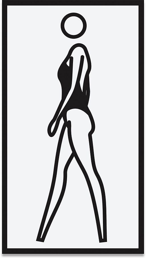
Julian Opie, Monique Walking, 2004. Editions London.
Julian Opie: Blur
A few short years before the style became ubiquitous in early iPod commercials and people taking photobooth app selfies at the Apple store, Julian Opie created a stripped-down greatest hits album cover for Britpop legends Blur. The bandmembers’ faces were removed of extraneous details, highlighting Opie’s ability to convey the essential elements of a person with not much more than a series of lines. It is remarkable that in the era that followed, one of total and limitless customization and lifelike graphics, the popular form of representing yourself digitally was as a flat, featureless icon with a smooth or sometimes pixelated surface of monochromatic or primary colors with only slight variation for personal touches and … hang on … what year is it now? With that in mind, Opie’s Monique Walking is a standout example of the artist’s style not because of how much it follows the herd down to Greece, so to speak, but rather despite it.