Article | The Power Of Color
The Power of Color
On the purposeful ways in which Yves Klein, Mark Rothko, and Yayoi Kusama interact with color and the depth of meaning revealed by a single hue.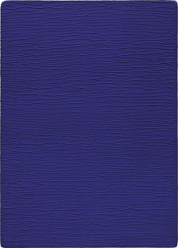
Yves Klein, Monochrome bleu sans titre (IKB 267), 1957. 20th Century & Contemporary Art New York, Evening Sale.
Despite Piero Manzoni’s famous statement that "Infinity is strictly monochromatic, or better still, colorless," artists have long been fascinated by the power of color and have oriented their practices around it in revealing ways. Color is the quiet force which guides human life; it is implicated in science, physiology, psychology, philosophy, and art. From how we describe ourselves and each other to our surroundings to our disposition, color is attributed — feeling blue, tickled pink, yellow bellied, seeing red, green with envy. Colors are ascribed to everything from race to gender to politics; it has an unavoidable yet essential role in how mankind experiences the world. The power of color is in its ability to operate at once as a sensation and a cultural perception; to be its own language yet remain unspoken; and to be both physical and allusive. In the words of French Cubist Fernand Léger, "Man needs color to live; it's just as necessary an element as fire and water."
One day in 1947 while on a beach in Nice, Yves Klein, Claude Pascal, and Arman claimed the earth’s elements for themselves. Pascal seized the air; Arman claimed the land; and Klein took the infinite blue sky for himself. In a grand symbolic gesture of ownership, Klein reached out, and famously signed his name across the azure sky to stake his claim. Together with other Modernists, Klein pursued total transcendence through his art. By the early 1950s, he had determined that the only answer to his questions was color, leading him to boldly proclaim: "Colors alone inhabit space, whereas line only travels through it and furrows it. The line travels through infinity, where color is infinity. Through color, I experience total identification with space; I am truly free." Klein’s earliest monochromatic experimentations were executed in an array of colors — yellow, pink, violet, red, green, white, and green, but by 1955, he realized that only one would satisfy him: blue.
Blue has no dimensions, it is beyond dimensions, whereas the other colors are not [...] All colors arouse specific associative ideas, psychologically material or tangible, while blue suggests at most the sea and sky, and they, after all, are in actual, visible nature, what is most abstract. -Yves Klein
However, the perfect blue did not yet exist; nothing satisfied the color his imagination had mixed. To give life to this dream, Klein enlisted the help of the renowned Parisian colorist Édouard Adam — the famed tripatouiller of Montparnasse. His solution? Mixing ultramarine pigment with the synthetic resin Rhodopas M, thus creating an absolute blue whose saturation would stand the test of time. Klein trademarked this discovery, coining it International Klein Blue (IKB). Art history’s affinity for blue is well documented; Giotto used it in Assisi (it left Klein awestruck), Pablo Picasso notoriously had a Blue Period a half century before, and even Joan Miró referred to it as "la couleur de mes rêves" (the color of my dreams). Unlike Picasso’s ability to "to give form to a sigh" with his use of empty, tragic, melancholy blues wrought with the emotional turmoil of his youth, Klein’s color was ecstatic, intense, and lustrous. The pigment premiered at Galleria Apollinaire in Milan during Klein’s January 1957 exhibition, which featured eleven 30¾ x 22 in. (78 x 56 cm) canvases covered in IKB. To further unlock the chromatic power of his perfect hue, Klein primed the canvases with casein before applying the pigment with a lambskin roller. Immersing oneself in a Klein is both breathtaking and all-consuming as it creates an optical vibration which unsettles the retina, thus inducing an out-of-body experience, leading observers to feel untethered to the world around them. In Monochrome bleu sans titre (IKB 267), this is achieved through the ebb and flow Klein created with the softly raised ridges and the smoother recessions to create a fluorescent blue sea, manifesting the dynamic incandescence that this color could achieve through his painterly experimentations with surface texture. Upon seeing Klein’s blue works, his Spatialist contemporary, Lucio Fontana, even remarked that "Klein is the one who understands the problem of space with his blue dimension [...] He is really abstract, one of the artists who have done something important."
Choosing blue allowed Klein to free himself from the prison of the picture plane. During a 1959 lecture at the Sorbonne in Paris, Klein declared: "The painting of the future will be a colorist of a kind never seen before, and that will occur in the next generation. And without doubt it is through color that I have little by little become acquainted with the Immaterial." Through IKB, Klein created a physical visualization of the French philosopher Gaston Bachelard’s poetic phrase, "First there is nothing, next there is a depth of nothingness, then a profundity of blue;" the poignancy of these works for the artist were immortalized in the dedication to his friend Charles Wilp on Relief Éponge bleu sans titre (RE 49).
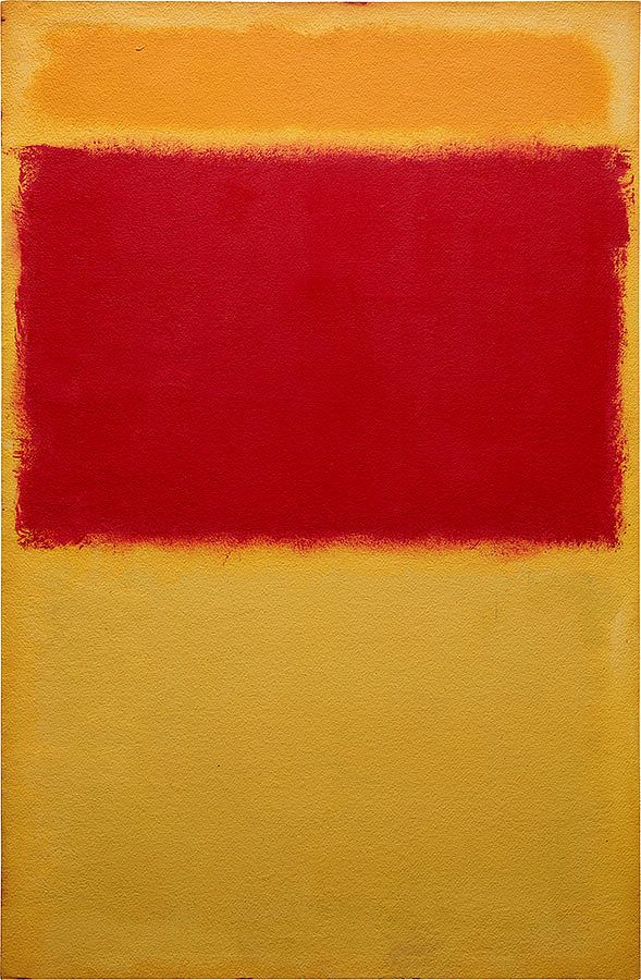
Mark Rothko, Untitled, 1959. 20th Century & Contemporary Art New York, Evening Sale.
A collector once visited Mark Rothko’s studio desperately trying to acquire a canvas from him and asked, "Mr. Rothko, I want a happy painting, a red and yellow and orange painting, not a sad painting," to which the artist countered with a laugh, "Red, yellow, orange — aren’t those the colors of an inferno?" The intensity of the scorching red field radiating between a glowing orange band and lustrous yellow passage in the present work, Untitled, conjures Rothko’s statement that he "wanted a presence, so when you turned your back to the painting, you would feel that presence the way you feel the sun on your back." Red was the paramount color of Rothko’s painting. As Diane Waldman observed: "No other color appears so insistently in his oeuvre […] It dominates Rothko's work of the fifties and sixties and, in fact, was the color of his last painting. Red is so potent optically that it overwhelms or obliterates other hues unless it is diluted or controlled by juxtaposing it […] Perhaps Rothko was so drawn to red because of its powerful and basic associations: it is identified with the elements and ritual — with fire and with blood — and thus with life, death and the spirit." Red’s extraordinary power lies not only with its ability to recall these elemental identities, but also because it has diverse and contradictory meanings including the "various phases of life, such as love, happiness, physical strength, wine, passion, power, excitement, anger, turmoil, tragedy, cruelty, revenge, war, sin, and shame. These are all different, yet in certain respects they are the same. Red may be the color of the revolutionist’s flag, streets may run red with the blood of rioters, yet red may be used in a church ritual for Pentecost as a symbol of sacrifice. Whether blood is spilled upon the battlefield in an approved cause or whether it drips from the assassin’s dagger, blood still runs red […] Love gently warms the blood. The delicacy or strength of a shade of red will suggest the type of love."
He’ll create a painting that looks like it’s a step from the abyss, and yet he’ll nearly always give you something that creates light. – Christopher Rothko
With translucent layers of red, yellow, and orange, Rothko unravels the drama at the core of his painting. "Standing that close to a Rothko, security alarms notwithstanding, means that you are engulfed by, swamped by, his huge fields of rich color. This might or might not have the desired effect. Many people are put off by this sort of grandiosity. Being put off by Rothko was, in fact, a starting point for many innovative ideas in modern art," reflects the art historian Ben Street. "But, regardless of one’s response, it remains of use in our thinking about color in art, because Rothko evidently recognized that color alone, without it needing to be translated into language or used to describe the visual world, might be able to speak to a spectator directly, in an immediate way, that cuts across levels of expertise, prior knowledge or experience. The hundreds of people who visit rooms of Rothko paintings in museums across the world and remain there, transfixed, moved, or overwhelmed, are testament enough to the artist’s understanding of how color speaks."
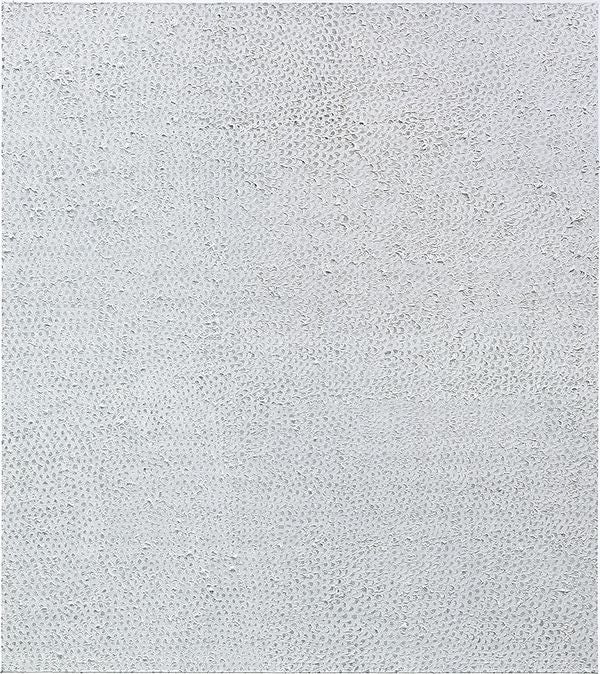
Yayoi Kusama, Untitled (Nets), 1959. 20th Century & Contemporary Art New York, Evening Sale.
One of the most complicated colors — Isaac Newton falsely described it as mixture of all the colors — white is achromatic and loaded with symbolic meaning. Deemed the purest and most perfect color, from blank pages to white walls, in culture we constantly seek out white in its cleanest, most ultra-bright state to eliminate the imperfections of the world. In the 18th century, Johann Winckelmann declared "the whiter the body is, the more beautiful it is" in reference to ancient Greek sculpture, despite having been ornately painted originally. Winckelmann’s statement contributed to a false definition of classical beauty and an overall collective blindness in Western culture, which led restorers at the British Museum in the 1930s to polish The Parthenon Sculptures, "the most treasured sculptures from the Acropolis, until they were as white and shiny as pearls" to maximize their greatest beauty.
Often associated with purity, clarity, fresh starts, and white lies, this color has fascinated artists of the 20th century from Kazimir Malevich to Robert Ryman to Piero Manzoni to Agnes Martin — who spent their careers painting with white. Following the creation of his radical Suprematist masterpiece, Suprematist Composition: White on White, 1918 Malevich euphorically wrote, "I have overcome the lining of the colored sky…The white free abyss, infinity is before you."
Everything — myself, others, the entire universe — would be obliterated by white nets of nothingness connecting astronomical accumulations of dots … and the spell of the dots and the mesh enfolded me in a magical curtain of mysterious, invisible power. - Yayoi Kusama
At a distance Yayoi Kusama’s Untitled (Nets) appears to read as a monochrome, but upon close inspection it reveals a delicate latticed network of small arcs and loops across an obscured pale grey surface. Pulsating before the viewer’s eye, the nets extend beyond the canvas’ surface expanding indefinitely. In her early Infinity Net paintings from the 1950s and 1960s, Kusama compulsively painted for hours on end, often without eating or sleeping, determined to give visualizations to the hallucinations she experienced from childhood. The visual impact of this most coveted early series of Infinity Nets resulted in many of her fellow Minimalists to acquire them for their personal collections; her close friend, the artist Donald Judd even commented, "There is a remarkable variety of configuration and expression from point to point across the surface."
Unlike Newton who stated "whiteness is the usual color of light," Kusama used her white Infinity Nets as visualizations of her psychological turmoil, at the precise moment when her visual field would be obscured with nets and dots, covering her surroundings obscuring what lies beyond. Kusama and her white nets made their New York debut with five mural-sized examples in October 1959 at Brata Gallery. Attracting immediate attention from critics, the Infinity Nets marked a departure from the Abstract Expressionists’ gestural brushwork and instead utilized feverish brushwork and obsessive repetition to create a work which was once meditative and demonstrated the artist’s utmost patience.
Discover More from 20th Century & Contemporary Art >
Recommended Reading