Article | Jeroen Verhoeven Curves
A Symphony of Curves
Glenn Adamson explains the surprisingly historical roots of a Jeroen Verhoeven masterwork.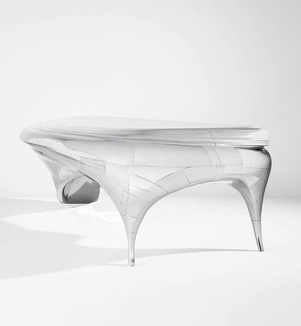
Joeroen Verhoeven "Lectori Salutem", 2010. Estimate: $120,000 - 180,000.
Design at Phillips New York, 17 December.
by Glenn Adamson
“It’s hard to amaze people.” I had to laugh when Jeroen Verhoeven said that to me, back in 2013, because amazement is his stock in trade. I was interviewing the designer and his twin brother Joep about Lectori Salutem, then on its way to a triumphant unveiling at Blain / Southern Gallery. The point that Verhoeven was making to me—and it’s a good one—is that technology is now whipping along so fast that we are becoming inured to it. It’s a textbook case of diminishing returns: the latest digital wonder comes along, and is met by a collective shrug. Achieving escape velocity from this dynamic, as Verhoeven so clearly has done over the course of his career, requires more than just technical genius. It demands true creativity.
Lectori Salutem exemplifies this future-facing instinct, but to understand the work, it’s necessary to take a step back. Jeroen Verhoeven made his name several years earlier with the Cinderella Table, first realized in 2005-2006. Though a bellwether in the then-nascent field of digital design, it began its life in an old-fashioned library, at the Stedelijk Museum. While researching there, Verhoeven became interested in the silhouettes of antique furniture. From this starting point, he created an object of disarming conceptual simplicity. Working in virtual space, he simply placed two different profiles—those of a commode and a dressing table—at a 90-degree angle. Then he charted point-to-point paths between them. This produced a set of gorgeous, rippling curves, far more complex than anything he could have drawn. Once the shape was fully rendered, it was executed in plywood with a CNC-controlled robotic carving arm, and then hand-finished. As its title implied, a workaday robot had been liberated into an aesthetic tool, like a humble servant brought to the ball.
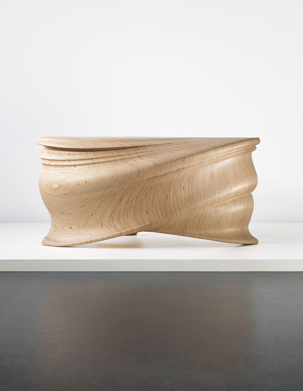
Jeroen Verhoeven Cinderella Table, 2007. Sold in 2014 at Phillips New York, achieving $137,000.
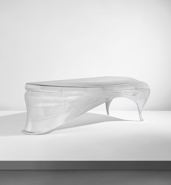
Lectori Salutem is the successor to the Cinderella Table, and like many Hollywood sequels, involves higher production values brought to the same basic premise. Working with Joep’s collaborative support (the twins have since become a formal design partnership), Jeroen conceived a desk which would again be based on a historic silhouette, in this case taken from a drawing by the fin-de-siècle ébeniste François Linke. The shape sweeps outward from a single contour line at one end, curving in a wide arc to full three-dimensionality at the other. This makes for an even more voluptuous volume than that of the Cinderella Table, but the more important difference is in the process and materials. Instead of being carved subtractively out of a solid material, the piece was built of many individually formed parts, in recalcitrant stainless steel.
This ambitious plan required tooling far beyond that available to an independent designer. What Verhoeven needed was a cutting-edge factory, with the capability to achieve extremely precise results in several different processes (laser-cutting, stamping, and welding). Taking advantage of the economic downturn—which made companies much more open to extracurricular activities—he persuaded an automotive factory to take it on. As he told me in our 2013 interview, “a process normally used to make ten thousand of the same thing [was] now used to make only one. We wanted to compress all this attention and put it into one thing.”
Jeroen Verhoeven "Lectori Salutem", 2010. Estimate: $120,000 - 180,000.
Design at Phillips New York, 17 December.
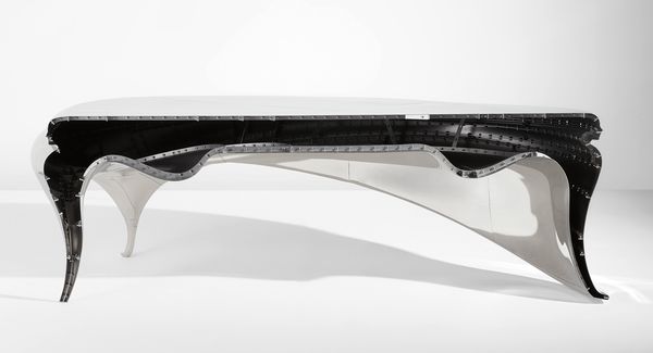
When finally completed, Lectori Salutem included no less than 150 separate panels of steel, assembled using 2,300 bolts. Like the Cinderella Table, it also required extensive hand finishing, in this case to polish the surface to a state of high reflectivity. It has an extraordinary intensity, which is partly (as Verhoeven suggests) the result of a whole factory’s worth of capacity being concentrated into a domestically-scaled object. The incredible intricacy of the object is emphasized by the open back, exposing a complex interior scaffolding that contrasts with the seamless fluidity of the outer surface.
It would be wrong, however, to see Lectori Salutem only as a feat of production. The title provides a clue to the work’s deeper meaning. Latin for “greetings, reader,” the phrase (often abbreviated to L.S.) was once commonly used to begin correspondence. It is now archaic, and Verhoeven’s use of it here is consistent with his interest in historicism. He is, after all, making furniture; so his practice has as much to do with that of Linke, or the great Art Nouveau maker Hector Guimard, as it does with an aircraft or racecar, which it superficially resembles. In this respect, the design is a thoughtful response to Marc Newson’s Lockheed Lounge, which was so important in establishing an ambitious, atelier-led model for design practice. Both objects partake equally of the antique and the futuristic.
Jeroen Verhoeven "Lectori Salutem", 2010. Estimate: $120,000 - 180,000.
Design at Phillips New York, 17 December.
Another level of meaning in the desk is more personal. When Jeroen and Joep graduated from the Design Academy Eindhoven in 2004, they set up a design studio called Demakersvan together with a third student, Judith de Grauuw. As a tribute to his two creative partners, Jeroen configured Lectori Salutem to incorporate the contours of their faces, in the two moldings that bookend the desk’s top. “It is almost like freezing a moment where everything was perfect and polished,” he has said. “For me it symbolizes a moment in life where the perfect balance between myself, Joep and Judith existed.” This touching feature is further extended by an inscription, visible in the desk’s interior, giving credit to all the other people who helped realize the project—a gesture that calls to mind the way that builders will sign their names on the inside of a wall before sealing it up.
Such personalization is extremely uncommon in design. One of the few things that still distinguishes the field from contemporary fine art is the studious separation that designers tend to maintain between their private lives and their public projects. This perhaps reflects an inheritance from the profession’s formative years. Back then, it was expected that industrial designers would subsume their own identities under that of their corporate clients. Then too, there is the modernist argument that good design should not even be noticed, but should instead provide silent service, giving rational shape to experience without bringing undue attention to its own narratives.
These notions have of course been thoroughly demolished in recent years. Curator Gareth Williams’ exhibition Telling Tales at the Victoria and Albert Museum, which included Verhoeven’s work, focused particularly on story-telling in contemporary design. Even so, it’s rare that a designer brings much of their own life into a project, perhaps for fear of interfering with the associations of a future prospective owner. Verhoeven realized, though, that there was another way of thinking. Right from the start, Lectori Salutem was conceived as a conversation. It began with Linke’s drawing, and continued throughout the design and production process. By the time it was finished, the object already contained many stories; its ideal use would be to write letters to families and friends, and so generate many more. Scriptori salutem.