Article | Wide Eyed And Essential Minimalism Auction New York
Wide-Eyed and Essential
When we take things away, we see even more.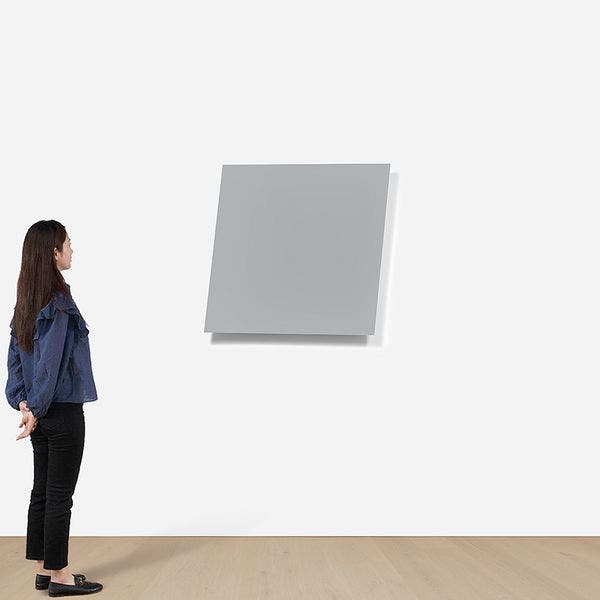
Ellsworth Kelly, Gray Panel from Painted Wall Sculptures, 1982. Editions & Works on Paper New York.
Couldn’t we all do with a little less these days? Less disorder, noise — fewer notifications, even; more room for thought. But of course, as we strip things away, more is revealed. This is the experience offered by a few works on offer in our upcoming Editions & Works on Paper auction in New York. Standing before them, we find that with less overt visual matter to observe, a floodgate of ideas opens. These works deepen the fundamental experience of looking and perceiving, and we can discover more details about light, rhythm, and presence than we perhaps realized were there. Beyond even the sight, we find that sometimes it’s enough to sit with works like these for a moment, have a few breaths, and appreciate how their mere presence can impact us and our surroundings.
Ellsworth Kelly
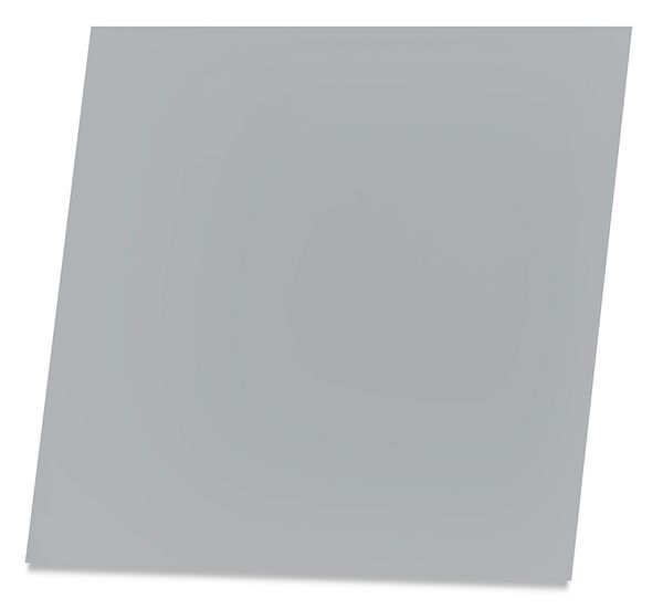
Ellsworth Kelly, Gray Panel from Painted Wall Sculptures, 1982. Editions & Works on Paper New York.
All Ellsworth Kelly needs to get us to open our eyes and minds is a rhomboid piece of aluminum, gray paint, and a wall. The longer we look, the more we discover — the light play creates a shadow that mirrors both the form of the work and its tone, the flat surface of the panel contradicts the depth of its construction, and we see how these aspects shift in changing lighting conditions throughout the day, or even the year. It rewards a long view and a few steps around it to discover how it changes when seen from across the room, from underneath, or even right up next to it with your head up against the wall. To call this a distillation of the essential to its purest form might even be an understatement. It clouds what we think we know about subject and object — its subject is itself, but as an art object it encompasses more than its surfaces, jutting out into space and changing how the things around it are perceived. One can revisit it for years and still make new discoveries.
I did not want to “invent” pictures, so my sources were in nature, which to me includes everything seen.
—Ellsworth Kelly
Though Kelly’s work needs no introduction, it’s worth pointing out that this year marks the 10th anniversary of his passing, and the Painted Wall Sculptures series represents one of his most mature and refined expressions. Pair it with the later Color Squares 3 to be immersed in Kelly’s obsession with the relationships between form, color, and space.
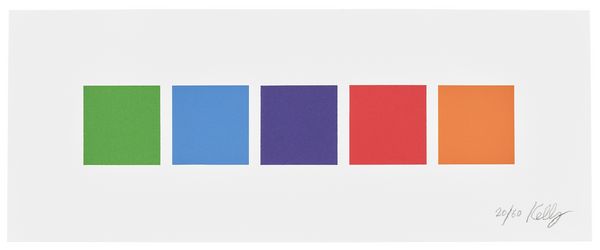
Ellsworth Kelly, Color Squares 3, 2011. Editions & Works on Paper New York.
Carl Andre
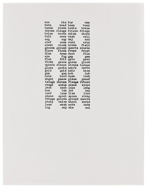
Carl Andre, arc bin bur cam, 1962. Editions & Works on Paper New York.
Cool kid of Phillips Andover turned renegade artist Carl Andre is perhaps best known for his innovations in Minimalist sculpture, emphasizing the purity of materials and their relationship to space without the interventions commonly associated with traditional sculpture. But as a man of many talents, he also worked as a freight brakeman and conductor in New Jersey for the Pennsylvania Railroad. It was at this time that his creative focus shifted to concrete poetry. These works are more interested in the shape the words create on the page and their pure sound than their meanings. The words themselves have an auditory rhythm that seems to parallel the shape they express, while somewhat referential to the sounds of the railroad or musical jam sessions or whatever else one can find.
Visually, the effect is created by two columns containing sequences of words whose number of letters follows the palindromic series 3, 4, 5, 6, 5, 4, etc. On closer look, subtle differences are revealed simply due to the typeface and choice of letters. This construction is reminiscent of process-oriented Minimalist and total-Serialist music that was emerging at this time, like John Cage’s macro-microcosmic works.
And to that, all we can say is eye fog gap gem.
Michelle Stuart
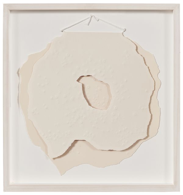
Michelle Stuart, Kuseping, from Tsikomo, 1974. Editions & Works on Paper New York.
At first glance, this work offers a moment to take in a beautiful layering of form and shadow made by the soft neutral tone of textured Arches paper. But with more time, we discover the underside of the sheet has a purple hue, casting a shadow reminiscent of the New Mexico desert light. The work is offered from the collection of the prestigious Tamarind Institute, where Michelle Stuart was in residence in the winter of 1974. While there, the artist observed local Native American traditions, including seasonal ceremonial dances, and researched the region’s geography and culture.
The five-print series’ title references the highest peak of the Jemez Mountains, which is considered the spiritual center of the region by local tribes. Working with Tamarind, the artist developed a method to capture the raw texture of the local landscape with a raised metal plate, and each sheet was torn to give the look of traditional handmade paper. This series was the first foray into printmaking for the noted land artist, and in collaboration with Tamarind, she achieved the conscious approach to geographic and cultural study for which she is so well known.
Tara Donovan
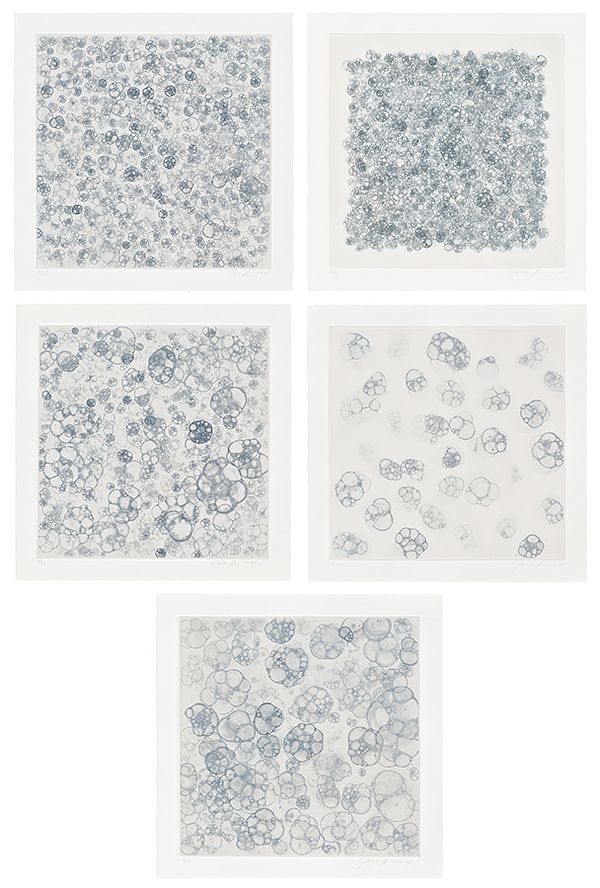
Tara Donovan, Untitled I-V, 2004. Editions & Works on Paper New York.
Lauded for her site-specific installation work and drawings that express an implication of motion frozen in time, New York artist Tara Donovan transforms the ordinary into the extraordinary. Her works make use of everyday materials that are commonly discarded — Styrofoam cups, index cards, paper plates, rubber bands, and, most relevant here, drinking straws. To create this set of four prints, Donovan blew air through a straw into a mix of chloride and soap before laying the resulting bubbles on a copper plate with aquatint ground. The result showcases key characteristics of the artist’s work: a sense of joyful freedom expressed within a rigorous and intentional process, repetition, accumulation, and the impressions of hitherto unseen biomorphic forms.
Yves Klein
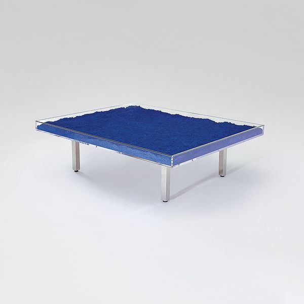
Yves Klein, Table Bleu KleinTM / Klein Blue, designed 1961. Editions & Works on Paper New York.
Not commonly considered a capital-M minimalist, Yves Klein’s works have much to offer when viewed from this lens. While later artists like Kelly would seek to remove a sense of personal expression from their works as they laid bare the essential elements of art, Yves Klein often achieved a similar sense of distillation, but with quite a bit of his personal and distinctive panache. Take this prominent 1961 table, which displays the unmixed pigment of International Klein Blue. Like other works mentioned here, what draws us in is perhaps a greater understanding of our own perception, here of the most blue blue there is.