Article | From Venice To London Phillips Editions Auction
To: London | From: Venice, Paris, Barcelona
Joan Miró’s artistic prowess on paper is on full display at Phillips’ upcoming London Editions auctions.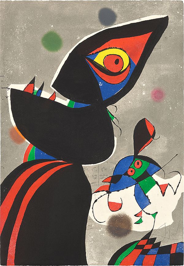
Joan Miró, Gaudí XVII, 1979.
In 1954, thirty-one nations participated in one of the world’s largest and most important exhibitions dedicated to international contemporary art — the 27th Venice Biennale. Adorning the front cover of the accompanying exhibition catalogue was a work by the artist Joan Miró. Simplistic yet eye catching, the cover exemplifies several key traits central to Miró’s unique style: organic forms, flattened picture planes, and calligraphic lines. First conceived as a collage with gouache in 1953, the unique work Composition (Design for the cover of La Biennale di Venezia) will be offered by Phillips in the upcoming Evening & Day Editions auctions, alongside a wide variety of prints by the renowned Catalan artist.
Venetian Abstract
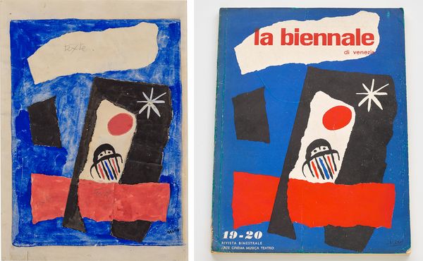
(Left) Joan Miró, Composition (Design for the cover of La Biennale di Venezia), 1953. (Right) Joan Miró, La Biennale di Venezia catalogue cover, 1954. Artwork: Succession Miró/ADAGP, Paris and DACS, London 2022.
Composition (Design for the cover of La Biennale di Venezia) reveals Miró’s tendency towards abstraction, although the artist never considered his work to be purely abstract. Instead, he viewed his compositions as extreme simplifications, frequently conjured from the depths of his imagination. Comprised of several pieces of torn card, the organic shapes which form the catalogue cover were painted with gouache and transformed into color fields — each fragment carefully assembled on the blue gouache background. The word ‘Texte’, written three times on the work, demonstrates the artist’s enduring concern for the composition’s final purpose, reserving space for the necessary information required to appear on the Biennale’s catalogue cover. The final elements of decoration are three hand-painted shapes. These shapes tether the work to figuration and demonstrate Miró’s interest in the natural world, particularly the sky — the rounded red shape could be interpreted as a sun, while the adjacent white shape resembles a star. Similar forms can be found in Miró’s Constellations series; a group of oil and gouache paintings the artist began in 1940, and reproduced as prints in 1959, confirming the artist’s longstanding fascination with the cosmos.
I always have my feet on the ground and my eyes on the stars. It represents a flight toward infinity, toward the sky, while remaining on earth. —Joan Miró
The final object, hand-painted in the center of Composition, appears to float or soar upwards. Produced in the early 1950s, when there was increasing public interest in what would later be called ‘The Space Race,’ one could interpret this as a spaceship or rocket, depicted soaring towards the sun and stars. However, Miró’s interest in space was less rooted in scientific pursuits and more inspired by the endless possibilities that these never-ending galaxies represented. Depicted with two small circles resembling eyes, which seemingly infuse it with sentience, this little figure instead comes to represent a flight toward infinity. Created for the Venice Biennale’s catalogue cover, Miró’s fantastical character encompasses the avant-garde spirit of the biennial contemporary art exhibition, and the infinite creative possibilities presented to us through art.
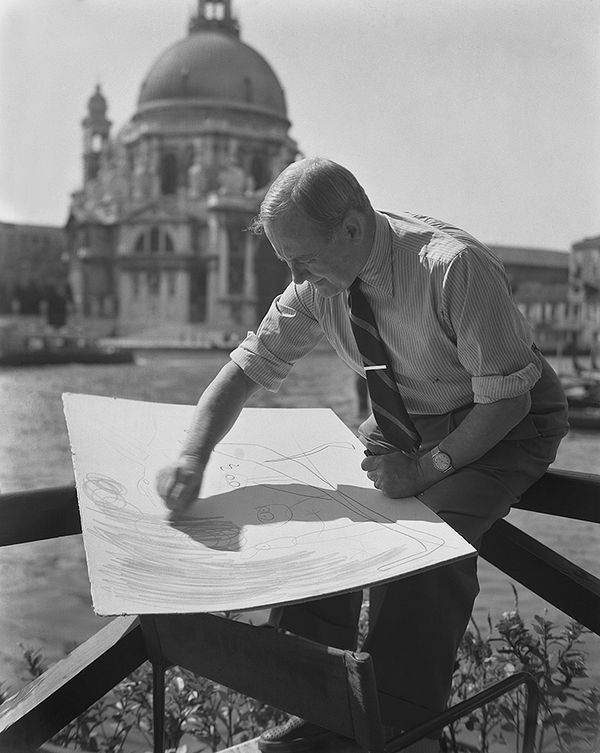
Joan Miró in Venice. Image: © Archivio Cameraphoto Epoche / Bridgeman Images.
Prized Reinvention
Among the many renowned artists represented at the 27th Venice Biennale in 1954 — Willem de Kooning and Ben Shahn formed the American Pavilion, while Lucien Freud, Francis Bacon, and Ben Nicholson made up the British Pavilion — only a handful were awarded the prestigious Gran Premi (Grand Prize). Significantly, it was Joan Miró who received the Grand Prize for Graphic Work. While the genesis of his catalogue cover was in collage, Miró had long been experimenting with printmaking, producing his first lithograph in 1929 and his first etching by 1933. From 1954 to 1958, he worked exclusively in print and ceramics, perhaps inspired by his recent accolade at the Biennale.
Miró constantly sought to reinvent and develop his art and he realized that continued experimentation in a variety of media was a way to achieve this goal. Throughout a career spanning more than seven decades, the artist produced over 2,000 prints. Printmaking became an important art form through which Miró further honed his artistic style, particularly as his fondness for graphic line — which was already well established in his oil paintings by the late 1920s — lent itself naturally to graphic work. Early prints such as La Baigneuse of 1938 exhibit the fundamental importance of line in Miró’s work, as he tackles the traditional subject of bathers through sharp, calligraphic marks created with a drypoint needle.
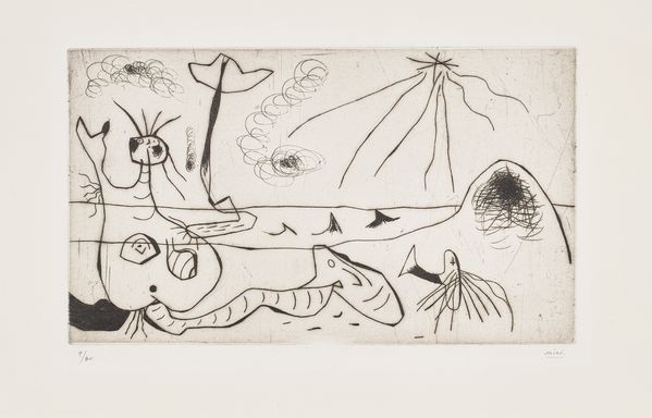
Joan Miró, La Baigneuse (The Bather), 1938.
Lithography was another technique central to Miró’s printed output, and he partnered with some of the greatest printing workshops of the twentieth century to produce these exquisite works. L'Amazone (The Amazon) of 1964, for example, was printed and published by Maeght in Paris, while the artist’s earlier forays into lithography tended to be produced in collaboration with Mourlot studios. L’Amazone once again illustrates how Miró deliberately occupied a space between pure abstraction and figuration. Referencing the world’s largest river in the title of this lithograph, Miro’s sprawling and fluid blue marks appear to indicate a body of water, with the adjacent vivid green seemingly implying surrounding vegetation. Yet, the artist’s expressive gestures which splatter the surface of the work distance it from the real world, and instead transport us into Miró’s kaleidoscopic realm of playful experimentation.
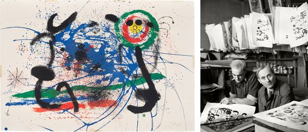
(Left) Joan Miró, L'Amazone (The Amazon), 1964. (Right) Joan Miró at Mourlot Studios in Paris. Image: © Herbert List/Magnum Photos.
An important turning point in Miró’s printmaking came in 1967, when the printer Robert Dutrou introduced the artist to a new technique — silicon carbide engraving. More commonly known as carborundum, this printmaking technique was a seminal development in the artist’s graphic work. While Miró had created vast bodies of work in both intaglio and lithography, this climactic and rich combination of etching, aquatint, and carborundum resulted in prints which the artist claimed could “rival any painting.” Works such as Vers la gauche (Towards the Left) from 1968 demonstrate the exquisite textures this new medium allowed Miró to create, while still relying on organic forms and calligraphic line to form the mainstay of his compositions.
Carborundum gave Miró what he had been looking for: large, powerful original engravings, or ‘engraving-paintings’ that might be hung on the wall...These are monumental engravings, not merely dimension-wise, but also by the sheer force of their traces and inscriptions, by their brilliance and depth, and by the volcanic splashes animating them. —Jacques Dupin
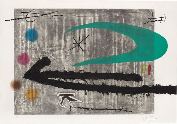
Joan Miró, Vers la gauche (Towards the Left), 1968.
Towards a Late Style

Joan Miró, Gaudí XVII, 1979.
Joan Miró would come full circle in 1979, creating a series of twenty-one prints using etching and aquatint, which occasionally featured elements of paper collage. This series was dedicated to fellow Catalan and esteemed architect Antoni Gaudí, and the seventeenth plate from this body of work titled Gaudí XVII will also be on offer in Phillips’ upcoming Editions Evening Sale. Both Miró and Gaudí had attended classes at the Centre Artistic de Sant Lluc in Barcelona and, although they never met in this setting, the younger artist would always be a huge admirer of the architect’s work — particularly his innovative use of mosaic. Miró’s Gaudí Series translated the architect’s signature trencadís broken-tile technique into his own prints through a strong use of color and black line, as demonstrated in the lower right corner of Gaudí XVII. In addition, other works from Miró’s Gaudí Series included an underlay of torn-edged papers. Fused with Miró’s signature visual language of fantastical creatures and cosmological symbols, the Gaudí Series in its entirety is not only a celebration of Catalonia’s artistic prowess, but also interestingly signifies a moment of unity between Miró’s use of collage and his wider printed oeuvre.
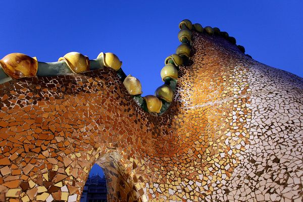
Detail of Casa Batlló, Barcelona, designed by the architect Antoni Gaudí. Image: © jordiphotography / Alamy Stock Photo.
Joan Miró’s involvement in the 27th Venice Biennale confirms the diversity of the artist’s creative output and his important impact on the international contemporary art scene of the time. The invitation to design the Biennale’s catalogue cover illustrates the wide respect his work was receiving and celebrates his unique artistic style. Honoured with the Grand Prize for Graphic Work in the same year, the 27th Venice Biennale highlights Miró’s versatility as an artist, while also serving as an early acknowledgement of Miró’s printmaking abilities which he would continue to develop throughout his career.
Auction /
18–19 January
Viewing /
11 – 18 January
Monday-Saturday 10:00am – 6:00pm GMT
Sunday 12:00pm – 6:00pm GMT
Discover More from Editions London >
Recommended Reading
Devoted to Dachshunds: Artists and their Pets >
Eternity in the Present: Whitehot’s Noah Becker on Alex Katz >