Article | Across The Continent Editions
Across the Continent: Editions
Phillips' international specialists and directors pick their favorites from our 14-15 June London Editions Sale.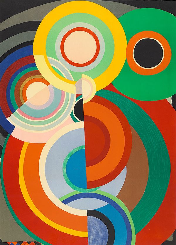
Sonia Delaunay, Automne (Autumn), circa 1970. Editions London.
Sonia Delaunay
Maura Marvão, International Specialist, Portugal and Spain
Immersed in art and culture from an early age, the Odesa-born, Saint Petersburg-raised Sonia Delaunay frequently spent vacations in Europe before attending art school in Germany and then continuing her education in Paris, where she met Picasso, Braque, and Robert Delaunay, who she then married. Their home was a meeting place for avant-garde artists and writers before and after the first World War. She was engaged in avant-garde visual art and poetry, practicing visual and verbal abstraction. During the war, the Delaunays lived for over a year in the north of Portugal, Vila do Conde, in Minho. There she lived a "dream life" in a quiet town with bright white or very colorful houses, and discovered the traditional clothes with colorful shawls and gold accessories. The couple mantained a connection with the country, with Portuguese artists like Amadeo Souza-Cardoso, Eduardo Viana, and Almada Negreiros, and with the popular culture of the northern region that echoes in Sonia's work. In particular, Automne (Autumn) is a good example of the influence the Portuguese light and colors had in her work.
This artist, whom I greatly admire, asserted herself at a time when there were still few female artists. I remember a remarkable exhibition I saw at the Thyssen Museum, entitled Art, Design, and Fashion, which revealed her multi-disciplinary artistic practice and, right there, I also realized the influence of Portuguese culture. At the moment, there is an exhibition named after her at the Louisiana Museum. Ranked among the "most original and fascinating voices of Modernism," she not only modernized the visual arts, but the culture as well.
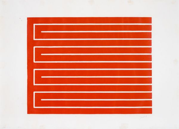
Donald Judd, Untitled (S. 32), 1961-78. Editions London.
Donald Judd
Alice Trier, International Specialist, Germany
Defined by their clarity and elegance, the works of Donald Judd have a meditative influence on me. Growing up as a child of the 60s, I always felt attracted by the clean simplicity of this great master of Minimalism. Playfully experimenting with open and closed forms, Judd’s aesthetic still speaks to the individual’s need for Zen. From prints to furniture, Judd’s works open a space for dialogue, a conversation between viewer and artist, that, unbound by any pre-conceived forms of subject, can be limitless. Judd said, “A work can be as powerful as it can be thought to be […] actual space is intrinsically more powerful and specific than paint on a flat surface.” This interaction between forms, whether it be stripes, blocks of color, and incisions on a flat surface, or squared off shapes in three dimensions, balances on a tightrope between stillness and spectacle. The vibrant red ink of Untitled (S. 32), neatly delineated in a maze-like rectangle, sits between the loud and the contained, with the bright cadmium demanding the attention of the viewer, but its fine outlines encasing the pulsating pigment, repurposing the message to one of controlled calm.
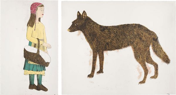
Kiki Smith, Companions (diptych), 2001. Editions Ldonon.
Kiki Smith
Clara Rivollet, International Specialist, France
Companions is an obvious reference to the Grimm brothers’ tale “Little Red Riding Hood.” However, here, instead of running away from the wolf, Little Red faces the animal fearlessly, even with a gentle smile. The girl who was a victim of the wolf not only befriends him, but also becomes his companion. The artist here offers a new perspective on a story so common and known to all that each character’s role feels fixed. The work belongs to a body of works by Kiki Smith in which she reinterprets a series of popular tales and biblical stories as a quest for harmony between human, animal, and nature. She further explores the motifs of the girl and the wolf in a large installation called Gang of Girls and Pack of Wolves (1999), where the girls and wolves act as a harmonious herd.
I love the richness of Kiki Smith, a complete artist expressing her unique artistic world through all media, from sculpture, to video, painting, tapestry, and printmaking. I truly discovered her work at her first major retrospective in France at La Monnaie de Paris in 2019, and it came at a moment of feminist awareness for me. Smith twists our minds in a poetic way.
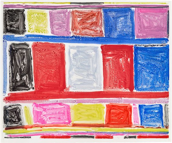
Stanley Whitney, Untitled, 2016. Editions London.
Stanley Whitney
Kirsten MacDonald, Regional Director, Scandinavia
Admittedly, my first choice was the beautiful Automne (Autumn) by pioneering Ukrainian amazon of the avant-garde Sonia Delaunay, but another colleague selected this first! I just went to her exhibition at the Louisiana Museum in Denmark and highly recommend going before it closes mid-June — it’s a must see! However, another favorite is the untitled monotype by Stanley Whitney, printed by the master printer Niels Borch Jensen in my home town of Copenhagen! It’s a superb large-scale monotype created using a fascinating technique mastered by Edgar Degas during the 19th century and loved by contemporary giants like Cecily Brown, Eddie Martinez, and Mel Bochner, too. Monotypes are unique works, created on a featureless plate. The artist doesn’t create permanent marks on the plate and instead paints on its surface. The plate then serves as a vehicle to transfer the artist’s painting onto the sheet. It’s a process that gives the artist a fun and limitless way of testing countless variations of an image.
In the present work, Whitney organizes his plate through the application of a series of horizontal lines and saturated color fields in a wobbly grid-like stack, in a way meditating on the quality of these colors and their relationship to one another. I’m fascinated with Whitney’s grid structure; it feels as if he approaches his compositions like a bricklayer laying down vibrant blocks of colors. It is so simple, yet so powerful and striking to me. His works are so recognizable, and they always leave me feeling joyful and inspired. I recently saw an exhibition of Whitney’s works on paper at Galerie Nordenhake in Stockholm that was incredible and left me even more intrigued by his work. Stanley Whitney has also just unveiled his group of works, The Italian Paintings, in an exhibition at Palazzo Tiepolo Passi during the Venice Biennale. I’m personally a big fan of editions as it is an ideal entry for starting a collection due to the more accessible price points compared to more expensive works on canvas.
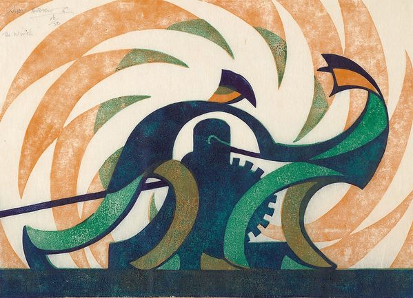
Sybil Andrews, The Winch (S. SA 6), 1930. Editions London.
Sybil Andrews
Lori Spector, Senior International Specialist, Regional Director, Switzerland
I’m quite blown away by Sybil Andrews’ magnificent image The Winch from 1930. Her ability to capture this moment so brilliantly - conveying the power of this massive machine and the workers who are making it go and employing such economic means and simplicity of line to do so. The movement, dynamism, and rhythm are truly mesmerizing. And what a masterful printmaker she was. She so perfectly captured this Industrial Age that she was living through, this period between the World Wars, and interpreted it in such a modern way. It makes me think of the Futurists who shaped the way in the early 20th century, the Italians like Severini, Balla, and Boccioni, but even more so the Russians like Aleksandra Exter and Natalia Goncharova.
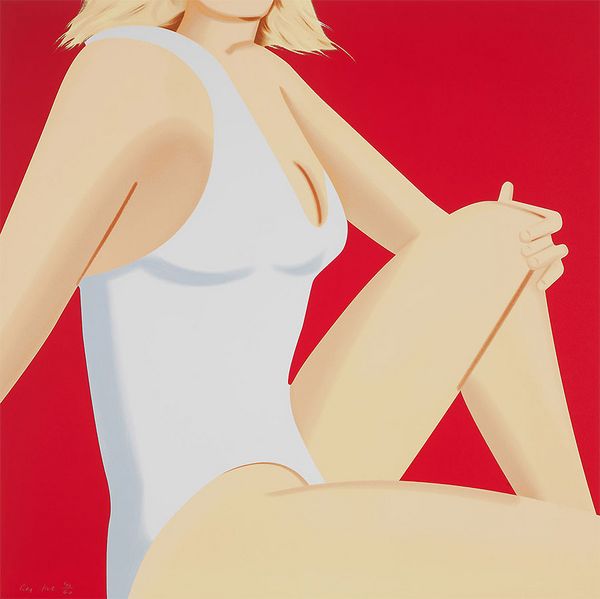
Alex Katz, Coca-Cola Girl 7. Editions London.
Alex Katz
Laurent Taevernier, International Specialist, Belgium
I have chosen Alex Katz’ Coca Cola Girl 7 due to the good feelings it inspires within, and my admiration of his ability to draw people with such elegance. Summer is around the corner, and I like that this woman will be enjoying every second of it! The Coca-Cola girls were a fundamental icon of the beverage company’s publicity from the 1890s through to the 1960s, emanating the idealized standard of beauty for American women. Originally the Coca-Cola girls were reserved and modest, but their look evolved during WWI, first embracing the sexuality of pin-up girls, and later becoming empowered service women in uniform, and athletic care-free women at leisure. In the context of pre-television advertising, the large-scale billboards portraying these figures hugely impacted the visual language of the American cityscape and redefined the feminine aesthetic. I have personally followed the work of Alex Katz for a very long time because each time I see a new piece, I am completely absorbed.
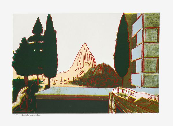
Andy Warhol, Details of Renaissance Paintings (Leonardo da Vinci, The Annunciation, 1472) (S. 320-323), 1984. Editions London.
Andy Warhol
Margherita Solaini, International Specialist, Italy
Leonardo da Vinci, The Annunciation is a very powerful example of Warhol’s extraordinary ability to bring a different meaning to the traditional idea of art and communicate it universally. This beautiful example is part of the series Details of Renaissance Paintings, which includes his own revisitation of other Italian masterpieces, recreated with screenprints and Pop colors. The subject matter here is the biblical scene of the angel Gabriel announcing to the Virgin Mary that she would give birth to her son. Warhol chooses to crop the image and only focus on their hands, which express the universal mix of fear, excitement and deep happiness of a woman finding out that she will be a mother.
I wonder what Warhol would think about the influencer Chiara Ferragni, who visited the Uffizi, where the da Vinci source painting is exhibited, and posed in front of the Birth of Venus by Sandro Botticelli, which he also included in this series. Perhaps he would turn her act into a symbol of popular culture, creating a poignant statement on mass consumption of artistic masterworks.
Recommended Reading