- By Marcello de Marco
“The devil is in the details”. A trite statement, arguably, but definitely on point about many instances of life, most notably watches. Given the restrained size of a timepiece, even a subtle alteration of the shape of an index, the adding of a lume plot, or a change in color dramatically alters the overall look and feel of the watch. This explains why the Series are so important in some models: even if the differences are minimal - such as the change of pushers from square to round on ref. 2499 First and Second Series, to name probably the most notable example - the impact can be monumental.
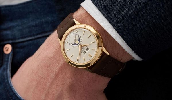
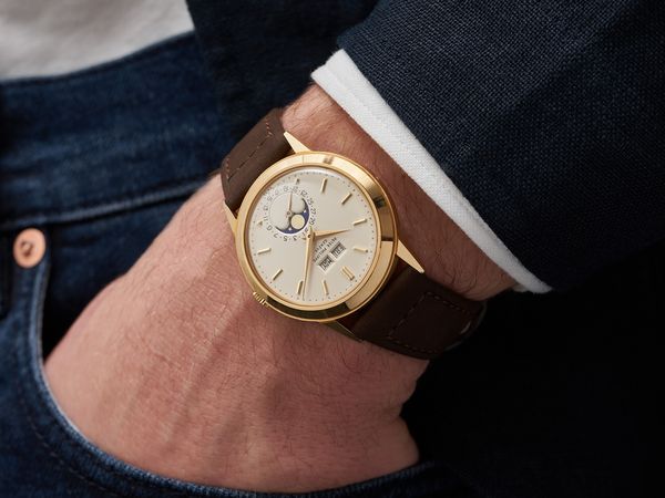
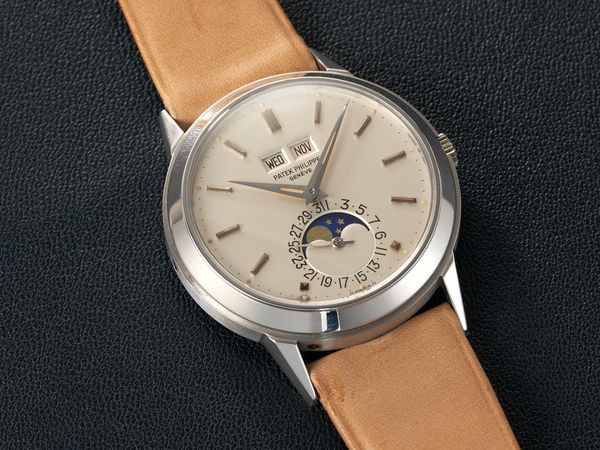
This concept is exquisitely incarnated in the two examples of reference 3448 we have in our upcoming Geneva sale. Both are representatives of the same model, but the yellow gold example is an incredibly rare and early unpolished transitional Second Series example, while the white one is a no more easily attainable special luminous dial piece.
On the paper, the differences are minimal. The most obvious one is of course the case metal, closely followed by the presence of the lume plots on the white example.
Additionally, the white gold example from 1974 features a later dial style with printed graphics, baton minute divisions and large numerals for the date ring - as well as being a “sigma” dial.
The yellow one from 1968 features engraved/enamel graphics - found on only very early examples, as too costly to produce during the 1970s quartz crisis - small date ring and pearl minute divisions. It is important to point out that this is an incredibly rare transitional First/Second series dial: it still features engraved/enamel graphics similar to the First Series, but it already presents the pearl minute division of the Second Series rather than the baton minute divisions of the First Series - which made a comeback later, as the white gold example shows. In fact, the Second Series of ref. 3448 was introduced in 1968 - the same year this watch was made.
It is then immediately apparent how the intellectual pull of the two pieces is equally important but for very different reasons. The yellow gold watch brings to the table the unique aura of being a “scholarly” unpolished example of a very early transitional Second Series 3448 realized with the old-school engraved/enamel technique.
The white gold one instead boasts the undeniable rarity of the white gold case, further boosted by the presence of the luminous dial - which makes this example one of two such pieces known.
It is of course difficult to convey the different aesthetic feel of the two pieces - and the enumeration of the differences made before is factual, but a list of details objectively does not transmit how it feels to wear the watches.
While I strongly urge all collectors and enthusiast to visit one of our exhibitions in order to experience in person what i mean with the next few lines, I can tell you that while the watches are the same model, the wrist feel is anything but the same.
The yellow gold piece exudes warmth, but the angular case design gives it a more utilitarian/futuristic feel miles away from older perpetual calendar models such as ref. 1526 or 2497. Furthermore, the incredible definition of the edges of the watch truly allows the wearer to admire the design of this case in its unadulterated state.
The white gold is instead an icy beauty. The monochrome palette - nearly exclusively black and white, with a hint of cream coming from the luminous material - renders this piece a champion of subtle elegance and stealth wealth, as capable of passing under the radar to the eyes of the layman, as of giving a jolt of excitement to the most jaded connoisseur.
Few other collecting fields allow for such an intellectual and aesthetic variety within what is technically the same object - a ref. 3448, in this instance. This is, in my opinion, one of the lures of watch collecting: it can become a bottomless rabbit hole into which one can endlessly fall, and these two pieces perfectly exemplify this concept.


