Article | Color Theories Five Questions For Kassia St Clair
Color Theories: Five Questions for Kassia St Clair
The "Secret Lives of Color" author on the histories and hidden meanings behind some of our favorite hues, as seen in the March Editions sale.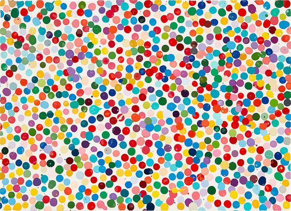
Damien Hirst, 0375 I cannot believe this, from The Currency, 2016. Editions & Works on Paper New York.
Phillips' 11 March Editions & Works on Paper Sale in New York features a number of works whose kaleidoscopic range makes up a color conversation from the 20th century through today. To examine of these works, we spoke with Kassia St Clair, author of The Secret Lives of Color, for a look at the nuance and history behind the pigments.
PHILLIPS: We're looking at a collection of prints with powerful color narratives. Tell us a bit about your approach to uncovering the stories behind a given color. Are there any shades that totally shifted your perspective?
KASSIA ST CLAIR: The idea behind the book was to treat each shade like a character sketch, finding the most illuminating moments in its life, so to speak. In many cases, because the pigments have such long histories, this meant a lot of sifting to try and find a great story that would encapsulate the color's essence. I would do a lot of research to try and find that one moment. In some cases, I just couldn't find a story that was compelling enough, which is why some colors that I originally planned to include in the book did not make it in. I think it's natural to assume that the colors that you personally like best and that you gravitate towards will have the most compelling histories, but this definitely isn't the case: discovering that definitely shifted my perspective and taught me to have an open mind.
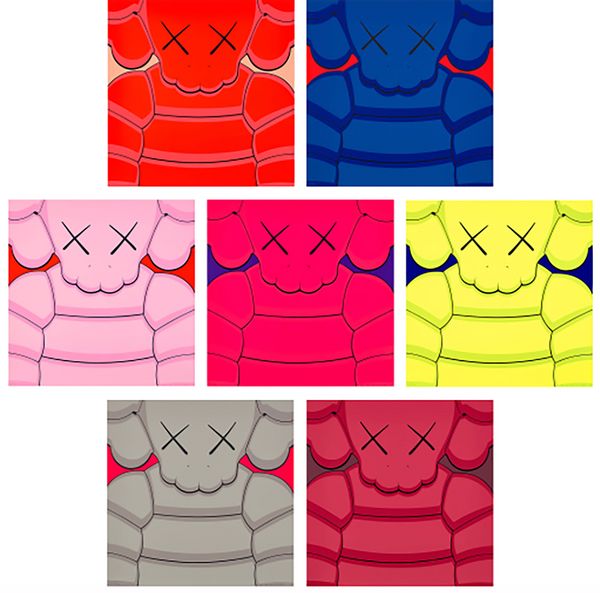
KAWS, What Party, 2020. Editions & Works on Paper New York.
P: How does color operate as a visual language?
KSC: A language is a great metaphor, but I think in the case of color it's rather like Italian: yes, there's a national language, but there are also a lot of regional dialects with great deal of variation. What I mean by this is that color meanings shift a lot depending on where you live and grew up, the language you speak, your personal experience, and the age in which you are living. Today in the West, for example, we tend to think of pink as feminine and blue as masculine, but this wasn't the case 100 years ago. (If anything, it was the other way round, as pink was more often regarded as a faded red, a very martial, masculine color, while blue was still overwhelmingly associated with images of the Virgin Mary.) My father, who is 96, doesn't think of pink as being specifically feminine, for example. So when we look at colors in works of art, digital media, and so on, we are picking up on these layers of meaning, some of which are quite broad and general, and others will be more personal and specific.
P: The present works range from Larry Zox and Ellsworth Kelly in 1960s to artist like KAWS today – a relative blink compared to some of the long histories you’ve traced, but in the context of the speed contemporary life, do you see emergent patterns with color choices among these artists?
KSC: Over the past 70 years the average person has been bombarded on a daily and hourly basis with an ever-increasing volume of images and colors. This has obviously drastically increased with the advent of smartphones, the internet and social media and has several consequences for color. One is that cycles of fashionable or notable colors or palettes are getting shorter and more intense. Another is that people who use colors (including artists) are working harder to get our attention: often that means the use of brighter, more saturated colors, but it can also mean unexpected combinations or finishes.
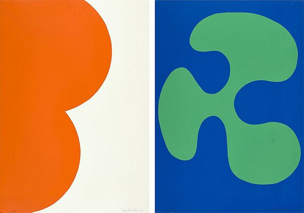
Leon Polk Smith, Color Forms B; and G, 1974. Editions & Works on Paper New York.
P: Which works speak to you the most? What is it about its/their use of color that stands out?
KSC: I love the Ellsworth Kelly piece. It's a gorgeous combination and I've found that, like a lot of other people I've spoken to over the past two years, I've been more drawn to vivid yellows and oranges during the pandemic.
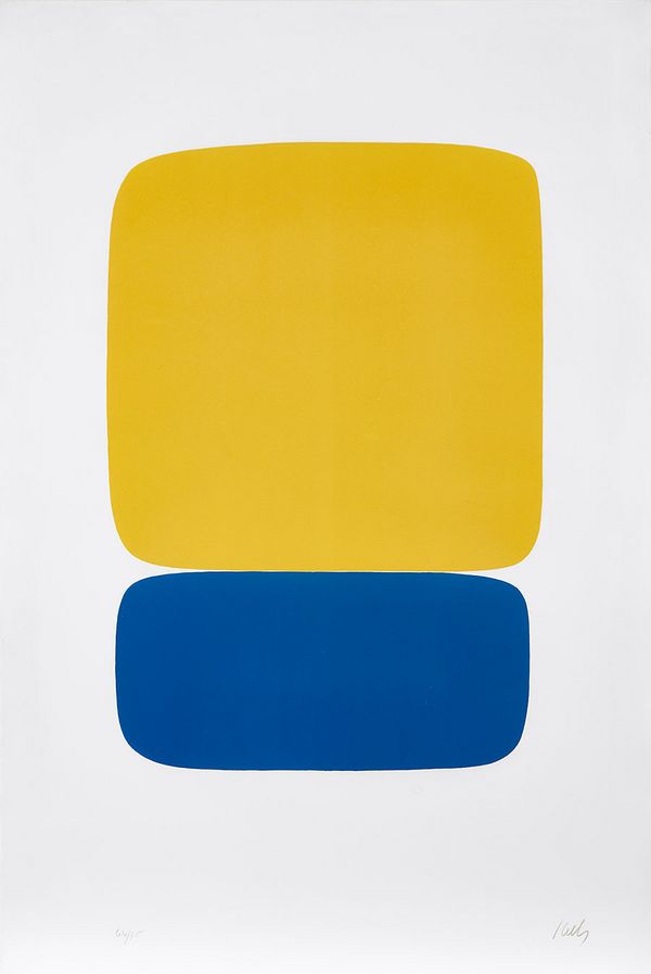
Ellsworth Kelly, Yellow Over Dark Blue, from Suite of Twenty-Seven Color Lithographs, 1964-1965. Editions & Works on Paper New York.
P: Is there a difference or an evolution in how we perceive color today given our access to a seemingly infinite spectrum of hues?
KSC: While color meanings are continually shifting and we're undoubtedly exposed to more colors than ever before, I believe our perceptions continue along broadly similar lines. That is, we invest certain colors with meaning; we tell stories about them; trends shift over time, and so on. One thing that I think will be interesting is the broader creation and interaction with digital colors that have no real-world basis or equivalent. If you know that you can't ever experience a color physically, will you interact with it in the same way?
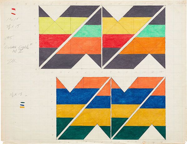
Larry Zox, Two studies, for Cuban Eights No. II, 1965. Editions & Works on Paper New York.
Discover More from Editions & Works on Paper >
Recommended Reading