Article | Bridgerton Costume Designer Ellen Mirojnick On Genieve Figgis Wired Online Auction
How Genieve Figgis Inspired ‘Bridgerton’
Ellen Mirojnick fills us in on how Figgis’ oeuvre informed her rebellious approach to period costume design.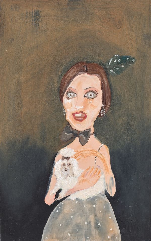
Genieve Figgis, Lady with a Dog, 2010. Estimate £18,000 - 25,000. Estimate £18,000 - 25,000. Wired Online.
Interview & words by Sarah Bochicchio
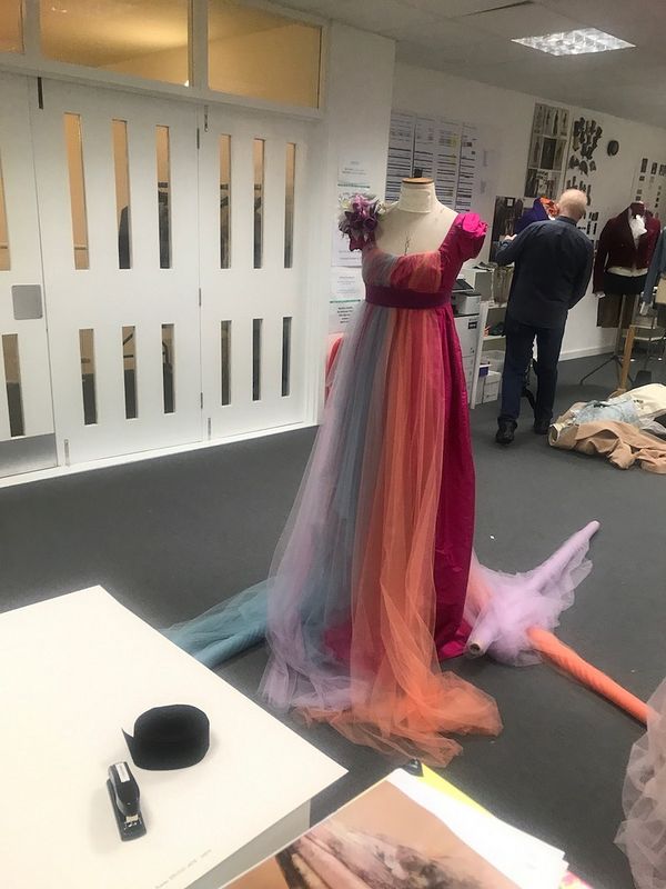
Costume designer Ellen Mirojnick compares designing for Bridgerton to preparing a beautiful feast. The kind where the display is so overwhelmingly enticing that your hand hesitates as it reaches for the first selection. And, indeed, such is the experience of watching the viewership-record-breaking Bridgerton, which is sumptuously layered with historical references, ephemeral fabrics, and perfect pastels.
Mirojnick also gives credit where it is due. The designer, who has worked with icons from Audrey Hepburn to Zendaya, has, again and again, cited one primary inspiration for her designs: contemporary Irish artist Genieve Figgis. Although Mirojnick always does significant research before starting a project, she tells us that she has never referred to a single artist to this extent.
When we speak, Mirojnick fills us in on how Figgis’ oeuvre informed her subversive approach to period costume design. Figgis' signature, satirical portraits in Rococo tones offered both visual cues—fluidity, color palette—and a guide to pairing escapism with rebelliousness. Because like the most enticing feasts, the designs required an element of chance, even a messiness, rather than studied perfection. For Mirojnick, Figgis' work became a lesson in masking hard lines, provoking imagination—and, at the most fundamental level, "total inspiration."

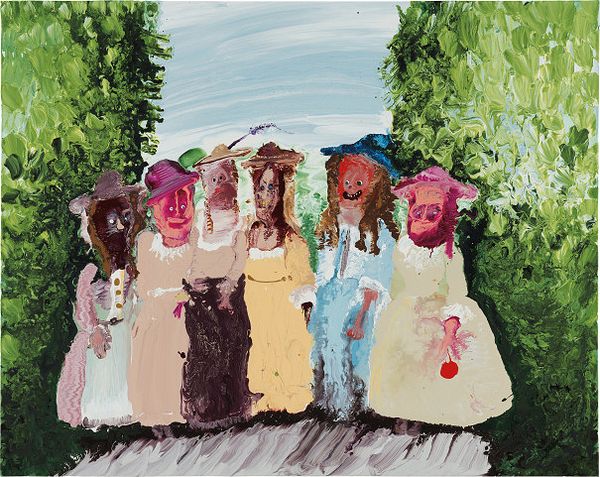
Genieve Figgis, Sunday Ladies, 2017. Sold for $125,000. 20th Century & Contemporary Art Day Sale.
PHILLIPS: I know you’ve spoken quite a bit about Genieve Figgis in interviews—how did you become familiar with her work?
ELLEN MIROJNICK: I love her work so much. I think the first time I saw her paintings, they were published either in Vogue or Bazaar. I remember that I had to see who this was because I was really intrigued by the illustration, and the spirit of it was amazing. I Googled her, found her work, and then just fell in love with everything that she did. I think it was the whimsy of it—but I don’t want to use the word “whimsy” in a whimsy kind of way. It’s more of an ironic way than a whimsical way, I think.
She just captured my imagination. The more that I looked her work, the more I wanted to see. I was fascinated by the way in which her scenarios were composed, what the figurative element was, and how she portrayed that. I found it to be—and I don't know if it's because I'm a designer—cinematic in its own way, and it made her work even more intriguing. So I love that. I think that might have been a good eight months or a year before Bridgerton.
When Bridgerton came around, and I was tasked with creating this world and doing these Regency costumes, it was just one of those magical moments. Also, knowing what Shondaland wanted, knowing what Chris Van Dusen, who is the creator of the show, really had in mind—the first thing that came to mind was "I have to go back and look at Genieve's paintings." And there was the show right in front of me. It was clear that here was the color palette. Here was exactly what I had to use. I could show it to anybody, and they could get a feeling from it.
All I saw was that it had to be exactly that way. Her illusionistic figures translated, for me, into a fluidity that masks a hard line. I interpreted everything that she did: from the palette to how she created her scenarios figuratively. What was really, really sensational was that there was a very organic messiness to it. To me, it never felt studied or precious, which was one thing that I knew that, without a question, I would not take into consideration.
There's no preciousness in this show because we were creating different boundaries, different perspectives from what others normally would look at when it came to the Regency period. Although hers are not necessarily the Regency, it didn't matter. It was about the fluidity, the messiness, there were no hard lines. Of course, the overriding element was Genieve’s breathtaking palette. It was all there. It was probably all there in three paintings. It was total inspiration.
Her illusionistic figures translated, for me, into a fluidity that masks a hard line.
P: Knowing those references makes so much sense to me because normally when I look at Regency clothing, it’s all about muslin. It feels very English, subdued. But the 'Bridgerton' costumes have a kind of Versailles-heyday feel to them. Or even midcentury Dior—they’re so luxe; they’re so dreamy.
EM: Dreamy is a very good word. Because I think that one of our main points, of course, was to create this luxurious world that you just wanted to be enraptured by—and also to be in this world where you're not quite certain what it is.
I had done work for Shondaland before and knew what their point of view was as a company, and Chris Van Dusen always says, “It's a bonnet-less world.” It is not your old-fashioned period piece. Nor are Genieve’s paintings; they’re not period pieces. I had to explore it a little bit further, but that was the foundation for the tools that I wanted to use, to be able to achieve a look, a feel, and a world. It was really important for me to build the world so you would never escape it, and you only wanted to be in it. Make it luscious enough and sexy enough so that it didn’t look like the cover of a romance novel, but its own special brand of romance novel.
One of the briefs early on was “yes, this takes place in the UK, in London in 1813, however it’s not a period piece.” Just as Chris adapted from the books, I adapted from Chris' writing. Because it was an adaptation of the period, it allowed greater range. I was always keeping Genieve's palette in mind, and her work was on the wall in our offices, so you just always knew the pinks were the pink, the sea blues were the sea blues, and everything else had it had dimensions. It was hugely thrilling.
I mean, I have to say, in my entire career, which has been long, I haven't used something of this nature to this extent. It was flat out, you know—I would say, "Oh, I have to look at Genieve." And there it was. And I'm very, very serious about it. You know, we always use paintings, and we always use other means of visual research and photography and images, and we always go on a deep dive way, way, way down the rabbit hole to find things that are inspiring to the period, characters, and storytelling. But she was the single most important inspiration.
Courtesy of EM Archive.
P: One of the things that I think you both do so well is that you take something that we think we know, and you make it modern. I was wondering what elements of the contemporary mindset you thought were important to bring to the 'Bridgerton' costumes?
EM: Let me see if I can explain it this way: you start with the foundation, and there is an element of the time that you have to build your world from. I thought that needed to be authentic. I mean, we weren't going to have bonnets, and there were a whole bunch of things that we weren't necessarily going to pay attention to, inclusive of the fabrication. We knew the foundational silhouettes, but what we chose to do immediately was layer on the palette, which came from Genieve, and shift it to a vibrancy that hadn't been seen in that period of time and stories taking place in that period. In doing that, it adds a freshness to it immediately.
The truth of the matter is that because of the wars, there was not a full import of silks from France during this period; they only had cottons and woven muslins and stuff of that nature. So if they dyed it, they did, but it was it wasn't fluid. The woven fabrics had to be the woven fabrics, but then we just broke that rule and brought in modern fabrics, modern colors, modern feels.
It was really important to add another layer to the female costumes, so they had a fluidity. So inevitably, even if the fabric had more fluidity than before, I would say pretty much 75% of the time, I added another translucent layer or two as an overlay, to create even more of an illusion and change the color slightly. And then the last stage was the embellishments.
The embellishments were really important to me, how you actually could manipulate fabric or add flowers, laser cuts, embroidery, or stoning. They were really important because that was yet another layer. So although when we think of modern, we think of stark, simple, clean lines, our modern twist was totally opposite. It was colorful, overlaid with translucencies, and over-embellished. It created a luxuriousness and a softness. It became the same as if you were sitting down at a beautiful feast and looking at beautiful food and you just didn't know what to pick up first. The overlay of colors and fabrics and textures and patterning and how it's laid out makes it that much more desirable. So that was the goal.
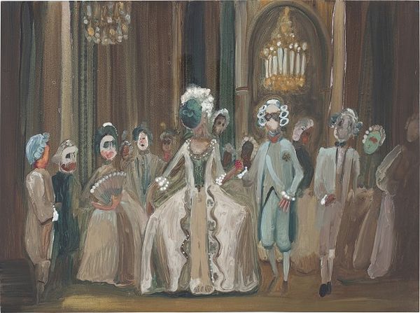
Genieve Figgis, House of Masks, 2013. Sold for £113,4000. New Now London.
P: That is a perfect way of describing it. In Figgis' work and in yours, there's a range of history and of references, and it feels so much more brilliant than the original.
EM: Listen, I have no problem with people who tell stories that are based in 100% history, but for the most part we work in fiction, and so the ways in which people view things are slightly different now. Yes, there's always a screen in front of us, and that kind of distorts the image in a way that whether it's pixelated or clear or cinematic, and your brain is going to interpret differently, and so on.
My co-captain on the show, John Glaser, would use this example, and I think it's a great example. Let's say you were writing, and it was more than 100 years ago, in the 1800s, and there were periodicals, writings, and books in front of you, everything would still look crisp, and clean and beautiful, and have a color to it. Who knows what color but it would have something to it. Later on as time marches through history, and you go decade to decade to decade, you could find that same periodical, and it'll have brown edges, and it might be crumbly and have a smoky layer to it. No matter what the color is, there will be a patina on it. But then, if you saw something today, it would be fresh and vibrant, and not crumbly, and not patinaed. It would be clear. And so we use that analogy to not justify, but to really kind of enforce the idea that period pieces do not have to be dusty, old, and faded. They can be new and vibrant and clear, no matter what the tonality. You want to stay away from primary colors really for the most part, but it's a fresh story.
It is not your old-fashioned period piece. Nor are Genieve’s paintings
P: I do think this is a common misconception people have. Even seeing old portraits, like those from the Elizabethan period, people assume they’re somewhat imaginary because they’re so elaborate. But the past was incredibly rich and technologically advanced in their textiles, staining, and embroidery; those fabrics are real. Do you think that in order to really get to the past, sometimes you need to reimagine it?
EM: I think so. But you know, there are ways in which you would to things at that period of time that could never be replicated. Materials aren't even the same that we use today. There are ways to replicate things today that are a little bit of a cheat. I mean, maybe not for commercial consumption, but they give way to inspiration.
I'm a pretty modern girl, but there is a part of me that is infatuated with history. What I find really stimulating and fascinating is to take what's old and what's new, combine them and create something that hasn't been done before. It's a challenge that I love to accept. Or I make it my challenge—because there are so many things that you could take from so many different places. Did you read the book that you couldn't do this in 1813? There is no such thing. So that being said, I just think that it's so much fun to imagine and to make magic. And so I'm glad that magic struck your heart when you saw the show. And that's what we hoped for, but we never expected it to be what it became.
P: Do you think there's also an element of rebelliousness in the way you approach the costumes?
EM: You're very smart. Nobody has asked me that question. I feel very honored that you have asked me that question today, and I will remember this for a very long time. Yes, there is. There is a way in which I fight against being stigmatized by “well, it has to be this or that.”
When I started this thing, and when we had the first creative junket, it was only myself, the production designer, the supervising producer, director, and the creator, and I thought to myself, after speaking to some journalists, "I’m going to get raked over the coals for what I'm doing." I said I’m sorry, but it’s my adaptation from Chris’ adaptation. There are things about it that are not correct to the period, but you show me what they are. And some people of course, would be able to, and others not. But I am rebellious, definitely rebellious. I like to provoke a conversation. Or I’d like you to have you have a conversation with yourself. I don't have to be the one that’s talking. I mean, I think the Genieve's work is rebellious as well.
Courtesy of EM Archive.
P: Her work is so subversive.
EM: That is a great word for it. It is 100% subversive because when you look at those people, and who's with whom, and what’s going on, it’s very rebellious, particularly set in that period of time. There’s an interesting point of view.
I’m really going to investigate this, now that I have a little bit of time, but when I did The Greatest Showman, somebody phoned me after they saw it. That was a film that people hoped would be good, but they didn’t know what was going to happen with it. In the beginning, people didn't take to it, then on the third day they started to, and then they never gave up. A friend, who is a psychologist, came out of the theater, and she said it was fabulous. She said everybody stood up and applauded. People that you would never expect and lots of children. And I said, oh really? And she said you know why? She said do you know what you did? And I said no. And she said that color has frequency and the frequencies that you hit designing that film are of the highest frequency, and it releases endorphins.
People just become joyous watching it, even if they I don't want to like it. I think that this happened with Bridgerton. I would just love to have study done by someone who knows color theory and the theory of color frequency to see if it also had those high decibels.
P: I mean, watching it, I was just so enraptured.
EM: With a smile, right?
P: Yes!
EM: Now, do you think it was because we've been locked up for all of this time—and it was a great escape into another time and place?
P: I do think it was partially that, but in general, it's so seldom that you encounter something that is that perfect balance of humorous and beautiful so as to make you feel comfortable sitting in escape. Because it wasn't perfect, and I think it would have been uncomfortable if it had been.
EM: Genieve! It's Genieve! She colors outside the lines, and so do I. And so maybe that's why the magic really happened. Or it happened immediately when I saw her work for the first time. She colors outside the lines, and that equals the rebelliousness in my spirit. I just really want to provoke somebody’s imagination. Does she have the same?
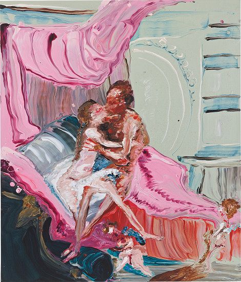
Genieve Figgis, Heracles and Omphale (after Francois Boucher), 2017. Sold for £4,410. Wired: Online Auction.
P: Have you listened to her podcast episode on Great Women Artists? She talks about how she was raised in a very strict Irish Catholic household and so, for her, it’s important to be rebellious. Nothing has made her want to do something more than being told she couldn’t—this even applied to her approach to the Old Masters.
EM: It’s funny because when I first began this career that I have now, which is my second career, I basically did contemporary films, contemporary stories, and I loved them. And I loved them, because well, I loved the stories, and I liked the directors. But also I was really against history, and that was because I thought it was more important to create history, as opposed to replicating history. Because I felt that in 20 years, somebody would have to look back on 1986, and say, what was it like? Where is the research? Where are the images? And I would prefer to be part of making films that took place at that time.
Even though they were upscale films, nobody would hire me to do a period piece. No one. I could not get a job being a designer on a period piece. Ever. And then I did a couple here and there. I'd say well, I think I could do it. By the time I was given the opportunities to do period piece, I had a different point of view about period work, and that was that it needed a fresh approach.
So it's really interesting because it it's the same. She can't do that. Well, did I do it?
P: Yes! You and Genieve both.
EM: Genieve’s work is so sophisticated on it, and I think it takes a level of sophistication to appreciate it. Really appreciate it. I hope one day I can own something of hers.
I just really want to provoke somebody’s imagination.
P: Figgis also talks about the theatricality of her paintings—and I was wondering, do you feel that the role clothing plays in a film or a painting is different than the role it plays in real life?
EM: Yes and no. In a film, it has to tell a story. There's a character, and there's a story that gets unfolded. In real life, we do the same, but our story might not have a timed middle and end. I'm looking at you; you're looking at me. I might be in the middle of my story or at the end of my story. But it's continually unfolding. In a film, there’s a beginning, middle, and an end, and that story really has to be told. We're visual storytellers, but it is through our version of the story and through the characters that you learn what story you're watching. You only learn it from those actors that are that are at the forefront of the frame.
What you really get attracted to is that story. When you look at Genieve's work, it tells you a story, you can make a whole story looking at one of the scenarios that she paints. But my work must tell a story through the images that I create because it has to equal a whole. When you build a world, which I don't always get the opportunity to do, these are all parts of it. And what I thought was really important, and I think it's in Genieve's paintings as well, that even though a painting is a static object, the world isn't static.
