
Robert Kennan, Head of Editions, Europe
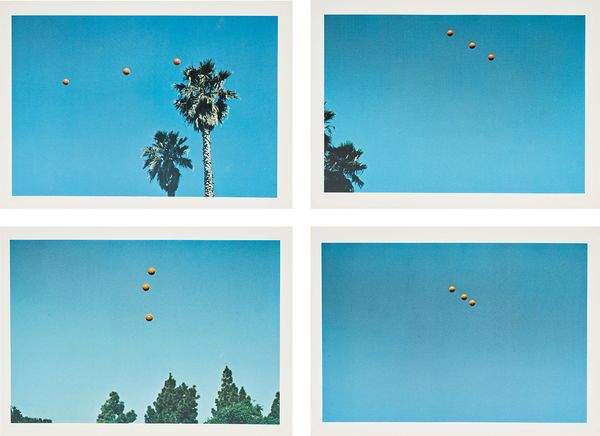
John Baldessari Throwing Three Balls in the Air to Get a Straight Line (Best of Thirty-Six Attempts), 1973.
I’m going for lot 206, John Baldessari’s “Throwing Three Balls in the Air to Get a Straight Line (Best of Thirty-Six Attempts)”. It’s joyous and quite difficult to categorize, much like all of his work. But being one of the foremost 20th century conceptual artists, one cannot pigeonhole such a uniquely creative talent. Part Dada, part Pop, a minimalist, maximalist, conceptualist, a perfect mix to produce witty, accessible works. I love the set for its lack of pretension, a “throw” away idea and the strong graphic visuals. Where the balls align, they’re precise, minimal, geometric abstractions with the boldness of color associated with Ellsworth Kelly, or unaligned; scattered and gestural, Pollock? Here or there a palm tree, Eggleston or Ruscha. It was a collaboration too, Baldessari threw up the balls and his wife, Carol Wixom, caught them on film. A magician and assistant combo. The edition is huge, 2500, yet I can only find 25 sets having sold at auction.
Baldessari was a remarkable art teacher too, a Duchamp for a new generation. I first came across him when I did a project with a group of younger contemporary artists some years ago. I asked them which artists they admired most and the majority said Baldessari. I’d not heard of him, I needed to find out more. The first work I came across was “Throwing Three Balls into the air… “ and I was hooked. Sadly, he passed away earlier this year but his legacy will endure.
Rebecca Tooby-Desmond, Specialist, Head of Sale
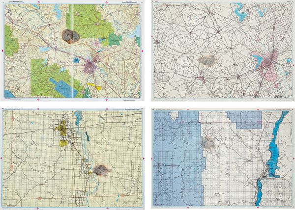
Cornelia Parker Meteorite Lands on Bagdad, Louisiana; Meteorite Misses Roswell, New Mexico; Meteorite Misses Waco, Texas; and Meteorite Misses Truth + Consequences, New Mexico, from Meteorite Lands....in the Middle of Nowhere, 2001.
Cornelia Parker likes to give objects a ‘cartoon death’. She likes to blow things up (a garden shed); tie things up (a Rodin); and crush things (cutlery). Her work is interventionist and conceptual, with a twist of dark, Duchampian humor. She is not a traditional printmaker, which is why her work is the perfect addition to a collection that embraces not-the-norm.
In recent years, Parker has been the shadowy presence behind a number of mysterious meteorite landings. Here we have a group of four "landings" made by heating a 400-year-old iron meteorite that originally fell on Namibia, and then using it to scorch impact craters on six road maps of the American south, hitting or missing locations she has never visited but which have achieved mythic status in her mind.
I love the tragi-comedy of these extraordinary meteorite landings happening in such ordinary places. I also love their implied alien, apocalyptic, fear of the unknown. But most of all, I love the signed edges of the paper craters - you can almost smell the conspiracy theory!
Kelly Troester, Worldwide Co-Head of Editions
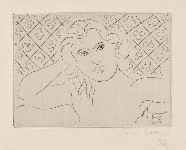
Henri Matisse Torse, fond fleuri (Torso, with Flowery Background), 1929.
Henri Matisse drew the clear, delicate lines of these women directly onto copper plates - fluid gestures create his models using spare lines suggesting their interior settings, space, presence and character of each person. The small scale balances with the thin lines and fine paper surface making for the feel of intimate sketchbooks. His models were various friends and muses, perhaps softer and sweeter pictures than Picasso's classical Vollard Suite women of the same time.
What infatuates me about these drypoints is Matisse’s direct hand in making them and his use of the special printing technique of Chine-collé which allows you to pull the smallest lines off of the plate onto the thinnest of papers. If you look closely along the plate mark (indentations) of these prints, you will see the edge of tissue paper the image was printed to and, at the same time, adhered to the larger sheet of Arches wove paper. Everything: prints, glues and combines going through the press at once. Depending on the wiping of the plate and the pale tones of the tissue you get slight variations in color, which adds subtle contrast to the finely rendered image and creamy support paper. The small editions of 25 make you realize how special and rare they are, especially after almost 100 years of life. I think these prints are undervalued and perfect examples of what great 20th-century printmaking is about. All three of these examples by Matisse come from the same private collection and were acquired through the Museum of Modern Art’s lending and purchase program which began at the museum in the 1950s. From the original labels on the back of the frames, one could "rent" each for $15.00 per two months and would go towards the purchase price. The intention was to "encourage a wider purchase of contemporary art" and, test them in your home and then be able to experience "the special satisfaction that comes with living with art."
Jason Osborne, Associate Specialist, Cataloguer
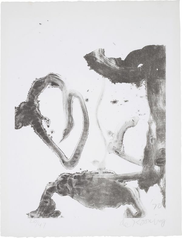
Willem de Kooning Valentine, 1970.
Willem De Kooning’s printmaking oeuvre feels like a bit of a secret. Similar to a few of his heavyweight abstract-expressionist contemporaries he was reticent to take printmaking too seriously until later in his career. He was a Painter and Drawer, capital letters emphasized. Once convinced, however, his printmaking output was every bit as vital as his other chosen mediums. De Kooning’s lithographs from this period and Valentine (1970) in particular feel like a perfect marriage of his paintings and drawings, gestural, hovering between abstraction and figuration, and full of movement. Printed and published in the city at the center of Abstract-Expressionism, New York, it’s a special print that De Kooning himself is on record in a 1985 interview as having an affinity for. He liked it. I love it. I hope you will too. It’s not every day you get a chance to get your hands on a Willem de Kooning secret Valentine.
Louisa Earl, Cataloguer
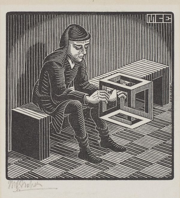
M.C. Escher Untitled (Man with Cuboid), 1958.
A simple man, sitting on a simple bench, in a simple room, holding an impossible cube - while small in scale, this woodcut by M.C. Escher encapsulates the artist’s great dilemma - the limits of possibility and the questioning of reality. Like Alice falling down the rabbit hole, the Man with Cuboid is absorbed into an alternate universe, contemplating the infinity of the object he holds in his hands. Possibly a puzzled character Alice might come across in Wonderland, this print offers the play with logic for which Escher is most renowned. This character, who also features at the base of the tower in Escher’s Belvedere (1958), is the perfect addition to a collection in need of a titbit of the whimsical, coupled with a famous aesthetic.
Cary Leibowitz, Worldwide Co-Head of Editions
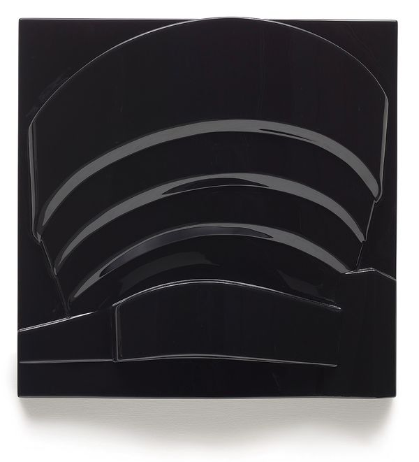
Richard Hamilton Guggenheim (Black), 1970.
Richard Hamilton is considered one of the founders of Pop art –I think you will agree
You will probably recognize his seminal 1956 collage, Just what is it that makes today's homes so different, so appealing?
Dissecting the industrial design and combining it within its context of popular culture Hamilton produced very direct idiosyncratic abstractions that definitely seem to be the older siblings of the yet to arrive Guggenheim.
Richard Hamilton’s Guggenheim(s) are modern—they are vacuum formed acrylic—a very modern technique—Durer and Picasso didn’t do anything in vacuum form plastic
I know in recent years there is an argument that ‘modern’ is a dated word—something from the 20th century
Personally I find the word contemporary in a chic way—maybe I’m a little old lady but I also spoke to a 13 year old (from los Angeles) recently who referred to Murakami and Supreme as modern so maybe there is still hope for me or pray for the 13 year old
These two works are still symbols of the future –not relics of the past
They are also as identifiable as a Warhol Soup Can-------------I hope!
Yet
I guess if someone asks u what that is on your wall and you need to explain it you probably can't win
Anne Schneider-Wilson, Senior Specialist
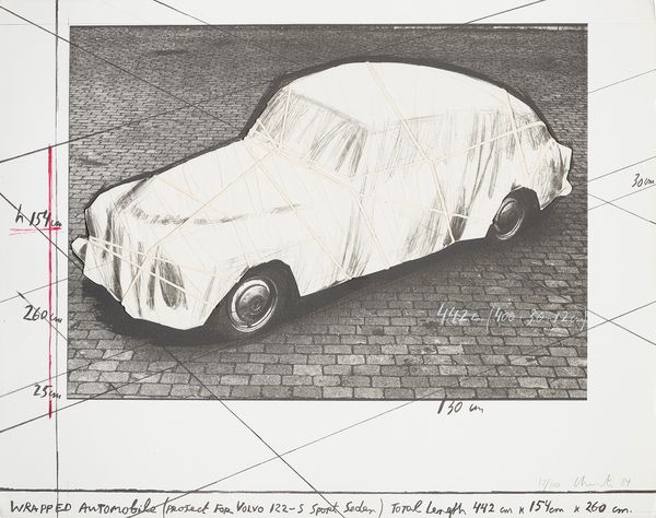
Christo and Jeanne-Claude Wrapped Automobile, Project for Volvo 122 S Sport Sedan, 1984.
This is one of my favorite works in this sale and I love this piece for its texture and 3-dimensionality.
This is a great opportunity to purchase an original work by a renowned artist. This edition would have started as an elaborate prototype done by Christo, which was then transformed into an edition by his publisher, Jörg Schellmann. Schellmann has been Christo’s publisher since the early 1980s and also a close friend. The collaboration between the two men has been fruitful over the years, as Schellmann, a man who likes to push boundaries when it comes to defining an edition, would no shy away from turning Christo’s creations into original editions. A team of skilled craftsman would create each individual copy of this edition, hand-applying the cloth and twin onto the printed, lithographic base.