
Keith Haring The Fertility Suite, 1983
Keith Haring
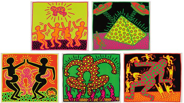
Keith Haring The Fertility Suite, 1983
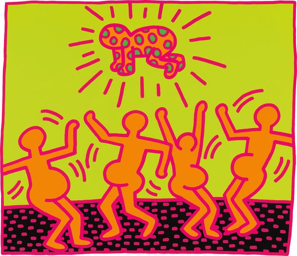
A simple line drawing of a crawling infant illuminated by radiating lines symbolized, perhaps, the most pervasive icon of Keith Haring’s oeuvre: the ‘Radiant Baby.’ “The reason that the ‘baby’ has become my logo or signature,” said Haring in 1981, “is that it is the purest and most positive experience of human existence. Children are the bearers of life in its simplest and most joyous form.” Haring grew up as the older brother to three younger sisters. The youngest, Kristen, was born when Haring was already eleven years old, and her young life would have a significant impact on the artist.
Keith Haring The Fertility Suite, 1983
Greatly influenced by the linear nature and narrative power of cartoons and comics, Haring learned by emulating both. The Fertility Suite, a set of six screenprints, draws upon comics through Haring’s use of thick contours and vivid colors. Large bellied dancing pregnant women appear to worship a kind of ‘fertility god’ in one scene, and a 'radiant baby' in another. Extraterrestrial space ships intervene beaming down upon a pyramid as a pregnant figure cheers on. These are images that celebrate the creation of life in all its absurdity.
As Haring made these prints in 1983, the artist’s close friends began to have children. Kenny Scharf and Tereza Scharf, Haring’s contemporaries and friends, had a daughter that very year, whose childhood touched Haring’s life. “I think Keith used the baby as a symbol of purity. It’s a symbol of hope,” said Kenny Scharf. “This world is so f—ked up, there’s disease and killings, but the baby is still born. Each baby embodies that hope that we all believe in and have to believe in if we’re going to keep on going. That’s so powerful.”
Andy Warhol
Known as an artist of the fabulous and the famous, Andy Warhol created a vast oeuvre of prints unified by his use of repetition and exploitation of the multiple. Warhol came to screenprinting in the early 1960’s, interested by the photomechanical processes of the medium. “I’m for mechanical art," said Warhol. "When I took up silk screening, it was to more fully exploit the preconceived image through the commercial techniques of multiple reproduction.” In many ways, Pop Art was the language of prints and multiples. It was a language of movie stills, consumer goods, cartoons, and closeups. Warhol made prints out of this very context, from his vibrant and lyrical Flowers (lot 60), sourced from a photograph of hibiscus blooms, to his Soup Cans (lot 66), and images of Elizabeth Taylor and Marilyn Monroe (lots 59 and 68). All would come to proliferate society, to be consumed by the masses.
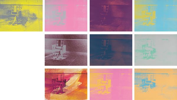
Andy Warhol Electric Chair, 1971
Warhol’s Electric Chair series (lot 67), are from an extensive Death and Disaster series in which Warhol investigated his theory of seriality and the multiple. “When you see a gruesome picture over and over again,” Warhol said, “it doesn’t really have any effect.”
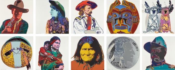
Andy Warhol Cowboys and Indians, 1986
One of Warhol’s last series, Cowboys and Indians, lot 70, features popular western icons from Annie Oakley to John Wayne, as well as important Native American figures; a frowning Geronimo (lot 71). This series, while playful, was as Warhol wanted for “grown-ups,” a Warholian take on a beloved West, and all its twentieth-century allure.
Jean-Michel Basquiat
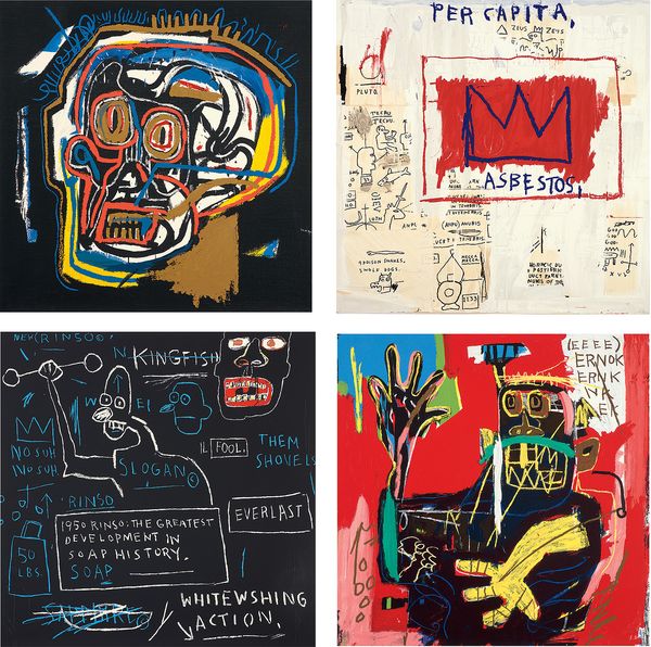
After Jean-Michel Basquiat Portfolio I, 1983-2001
Released posthumously by The Estate of Jean-Michel Basquiat and published by David DeSanctis Carr Fine Art, Los Angeles, this portfolio presents four works that embody Jean-Michel Basquiat’s hybrid text/image iconography.
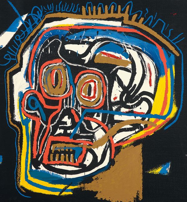
After Jean-Michel Basquiat Untitled (Head) from Portfolio I, 1983-2001
The screenprints of Portfolio I are based on paintings Basquiat completed between 1982 and 1983. Often considered the defining period of Basquiat’s oeuvre, this short period was when the artist was at his healthiest and most productive, having moved to Los Angeles at Larry Gagosian’s behest in an attempt to distance himself from the chaos of the New York art world.
These four works address themes that are essential to Basquiat’s work, including death, capitalism and racism. Clearly preoccupied with his own mortality in the face of both dizzying fame and severe addiction, Basquiat repeats any motifs, such as the three-point crown, the skull and references to ancient Egypt, appear again and again in Basquiat’s painting.
Donald Judd
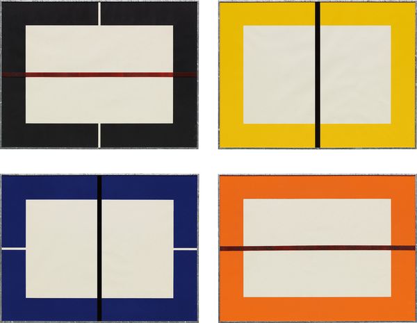
Donald Judd Untitled, 1993
Offering a unique view into the artist’s practice, Donald Judd’s use of printmaking both informed and was informed by his sculpture. “I like doing them [prints],” said Judd, “and also I can learn something from them.” Arguably the most sculptural of all print mediums, Judd made woodcuts from the 1960’s onward. This set of four woodcuts (lot 48), completed in 1993, depicts a series of identical rectangular sheets, varied by proportional divisions. In each, an unprinted central rectangular form is framed by a printed section, spreading all the way to the edges of the sheet. A painted stripe on the glass of the original galvanized iron frames partitions the rectangle into either horizontal or rectangular portions. Interested by varying divisions of repeated forms, printmaking suited Judd’s sensibility for the serial object. Printmaking’s inherent ties to the multiple allowed Judd to explore his interest in depicting variations on a single form, in a medium perfectly suited for that purpose.
Jasper Johns
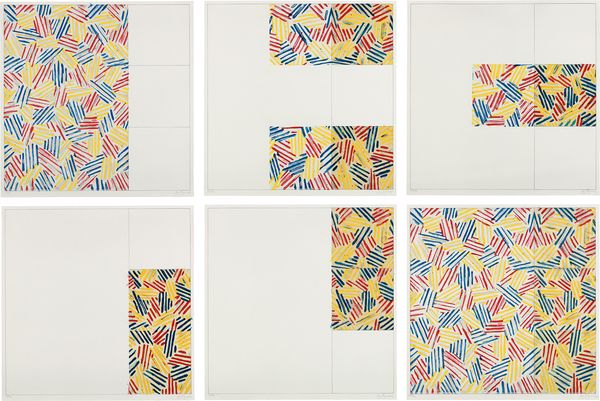
Jasper Johns 6 Lithographs (after "UNTITLED 1975"), 1976
Quoting the evocative gestural brushstroke of the Abstract Expressionists, Jasper Johns represented common objects such as flags, targets, masks, maps and numbers: He sought to explore things "seen and not looked at, not examined" in pictorial form. Drawing from common commercial and 'readymade' objects, Johns was a bridge to Pop, Dada and Conceptual art movements.
Johns has said that he first saw the pattern, known as his crosshatching, on a car zooming by down the Long Island Expressway. Developed in the 1970s, Johns’ crosshatching patterns which would come to dominate his work, “have an hypnotic fascination,” according to art historian Riva Castleman. In 6 Lithographs, Johns manipulates the crosshatch to move and flow in different directions, utilizing the possibilities of multiplicity in printmaking by transferring parts of the whole to different plates. Arranged as a square divided into 9 equal parts, Johns manipulated his crosshatching pattern to change direction, and even swap color. Like this, Johns created a complex system that embodied his way of thinking, a program broken down into an appealing kind of visual language.
KAWS
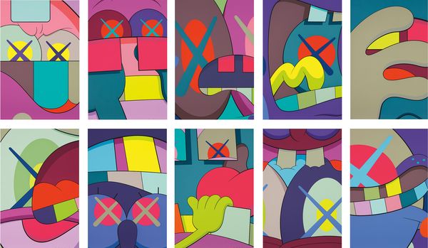
KAWS Ups and Downs, 2013
KAWS is the pseudonym for New York-based artist Brian Donnelly. A former illustrator for Disney, KAWS is influenced by prominent figures in pop culture, adding his own signature humor and style to iconic and recognizable figures. Like Warhol, who similarly worked as an illustrator before transitioning to fine art, KAWS champions the immense communicative power of the everyday and investigates the truly global experience of television and mass media.
This set, executed in 2013, marks a gradual progression from KAWS’ earlier works depicting coherent narratives specific to well-known characters, such as Mickey Mouse and the Simpsons, to more deconstructed, ambiguous compositions. While some forms are recognizable, including eyes marked with the artist’s signature X’s, as well as a sea of dismembered hands referencing SpongeBob SquarePants, others are more abstract, such as the haphazard amalgamation of various bodily features and rendering in bright, contrasting colors. By coalescing cartoon imagery with ambiguous abstract forms, KAWS embraces kitsch and rejects Clement Greenberg’s modernist consecration of pure abstraction.
Alex Katz
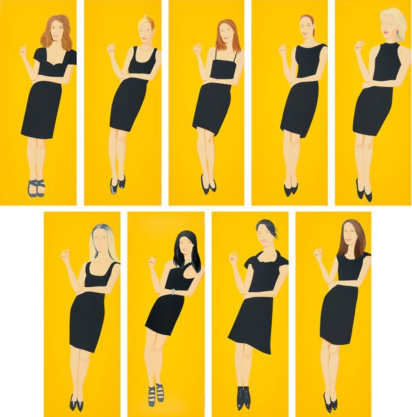
Alex Katz Black Dress, 2015
An accomplished printmaker, Alex Katz’s Black Dress series was two years in the making. Based on earlier paintings, the Black Dress series depicts nine women in classic fashion; the black dress. Each panel mimics the size of the original paintings and was screen-printed in 25 to 35 different colors.
Calvin Klein wrote of the portfolio for an exhibition catalogue at Mary Ryan Gallery:
I also love what a simple black dress says about the woman who wears it. By making such a subtle and concise choice, she’s letting the world know she is strong and her sense of self is powerful. She’s not in need of embellishment or exaggeration. She doesn’t expect to have all eyes on her, although, probably, if she carries herself proudly, she will. And that’s just the most modern and wonderful attitude anyone can have.
Alex Katz’s Black Dress series is just as modern and wonderful. And, ironically, it has absolutely nothing to do with fashion. His portraits have such strong color fields and clean lines. And despite their apparent simplicity, they’re extremely expressive and perfectly capture the essence of his subjects. You can’t help but notice these women, these beautiful enigmas drawn in bold and certain strokes. You wonder who they are, how they live, what they feel, just exactly what they have going on.
The sale includes additional sets by Joan Miró, Robert Motherwell, Sol LeWitt, Donald Judd, Jeff Koons and Salvador Dalí.