Article | Pat Steir In Conversation
Pat Steir: In Conversation
In advance of our New York Evening Sale, we talk to Pat Steir about her waterfall paintings, meditations on nature and influences ranging from John Cage to Chinese landscape painting.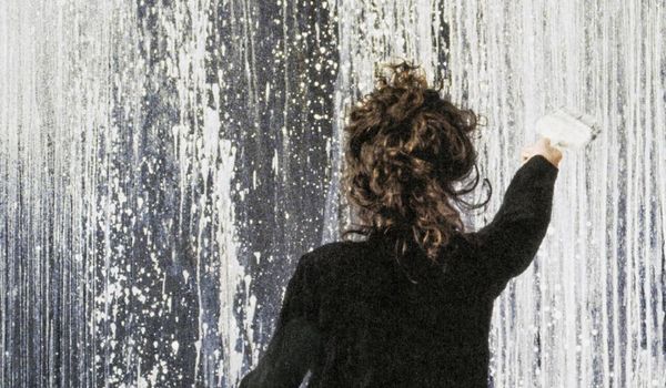
Pat Steir in her studio, 1990. Image Eric Boman/Lévy Gorvy, Artwork © 2018 Pat Steir
Elective Affinity Waterfall is not merely meant to be a painting of a waterfall, but be a waterfall.
In this work by Pat Steir, rivulets of blue and yellow paint cascade, flick and splatter across the vast expanse of the red canvas. Painted in 1992, just a year before the artist's participation in the 45th Venice Biennale, it is one of the largest of Steir's extraordinary waterfall paintings from the late 1980s and 1990s that garnered her widespread critical acclaim. Titled Elective Affinity Waterfall in reference to J.W. Goethe's eponymous novel and his theory of color more generally, it is among the first waterfall paintings that saw Steir embrace the primary colors of red, yellow and blue after limiting herself to a monochrome palette in the four years prior. It celebrates the expressive power of color, its visceral impact palpable as it captivates the viewer with a similar sense of the sublime when experiencing an epic waterfall in nature.
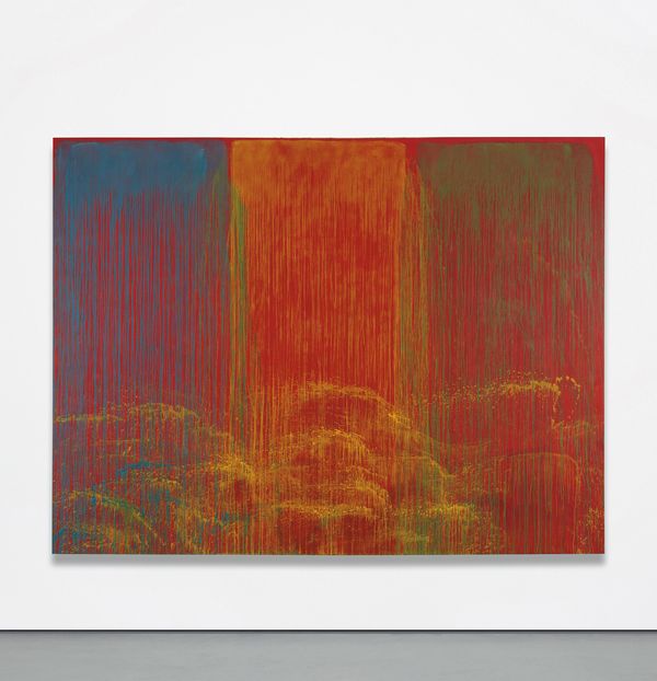
Pat Steir Elective Affinity Waterfall, 1992. This work will be offered in our New York Evening Sale of 20th Century & Contemporary Art on 17 May 2018.
On the occasion of the sale of this painting in our upcoming Evening Sale, Patrizia Koenig, Researcher & Writer for 20th Century & Contemporary Art at Phillips New York, speaks to Steir about this signature series.
Patrizia Koenig: Could you explain the genesis of the group of paintings titled Elective Affinity Waterfall? The title appears to reference J.W. Goethe's novel Elective Affinities.
Pat Steir: It's a reference to Goethe's title, particularly "Affinities," but not strictly speaking to the novel because in the novel the "elective affinities" are between people and their names. Each character had a permutation of the same name. My "elective affinities" are affinities between colors, and it is elective. It's a mild literary joke about color. In Goethe, they were all lovers with similar names—husband and wife and lovers. In my painting, it is in not about permutations but about affinities between colors, which is elective. A little literary semi-pun on my part.
PK: What made you limit yourself to a monochrome color palette prior to painting works such as the present one, and why did you return to the use of bold color?
PS: I never left the use of bold color. I paint in series; there was a series of black-and-white waterfalls and then waterfalls with bold color and then with pastel colors. I always use a limited color palette. I set the limit parameters for each set of paintings. It's a conceptual decision and not a psychological decision. Nor does it indicate my personal preference for any color or colors over others.
PK: Could you give us some insights into the influence of Chinese landscape painting as well as Chinese and Japanese ink painting on your practice? Were there any particular artists or artworks you were looking at with regard to Waterfall Paintings such as the present one?
PS: I was deeply influenced by Chinese literati paintings and John Cage. I was interested in Cage's practice of Zen Buddhist ways of thinking in his work, which can be described as a mode of non-interference, non-intervention. I was influenced by the way the Chinese landscape painters practiced their art, more than the resulting images. They would go into nature and meditate and spend time there; they would let nature pass through them, if you will. And then they would come back into the studio and paint what they had retained from that experience. They were not painting what they saw but what remained in their mind very much shaped by meditation and Zen practice.
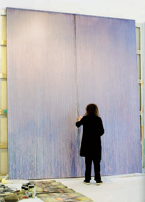
Pat Steir in her studio. Image Jean-François Jaussaud, Artwork © Pat Steir
PK: You've famously said that "Gravity makes the image." For the middle section in Elective Affinity Waterfall, you appear to have flung paint from the end of the brush. How does this "flung-ink" technique fit into your practice? It seems to be a much more intentional and controlled gesture than the pouring technique you're known for.
PS: In essence it is anti-gravity. I throw the paint on to the canvas from three feet away. The paint takes its shape in the air before it hits the canvas. It's intentional and it's controlled except it's out of control. In a way, it's like throwing a basketball into a basket—you aim it at the basket but its course and result are subject to uncertainty and probability.
PK: It is striking how you work on a very large scale. What is the significance of scale for you?
PS: I think of my paintings as landscapes and I want the edge of the painting to be beyond the viewer's field of vision. Barnett Newman had a similar conception of his large zip paintings. I think of my paintings as large openings, as portals one could conceivably enter into.
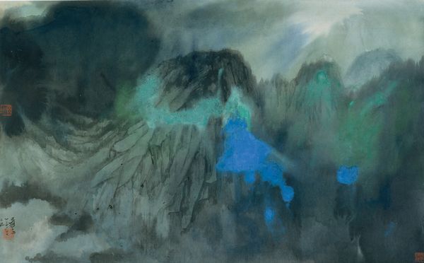
In her practice, Steir is influenced by Chinese and Japanese ink paintings of landscapes. Shown here: Zhang Daqian Splashed-Color Landscape, 1965. The Metropolitan Museum of Art, New York, Image © The Metropolitan Museum of Art, Art Resource, NY
PK: You've remained steadfast to your commitment to painting, despite the prevailing trends in the art world. Could you speak a little about how your waterfall paintings were received when you first created them?
PS: They had a warm reception, and they have always had an enthusiastic and strong following. When they were first shown, they were compared to Pollock and Abstract Expressionism. The results might look similar, but in their conception, my paintings are very different. They are antimodernist paintings.