
Cary Leibowitz, Worldwide Co-Head of Editions
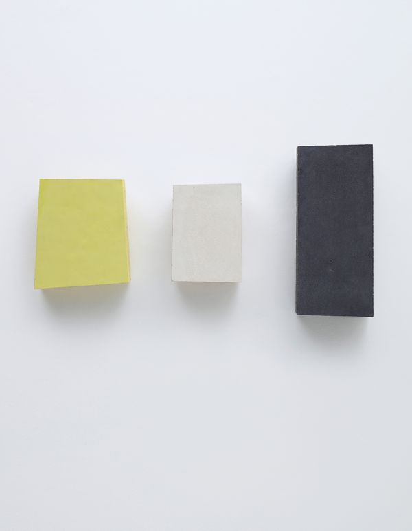
Imi Knoebel Betoni, 1990 (three works) and Pinguin, 1992
You may want to say 'Oh yeah, Ellsworth Kelly or Donald Judd!', but my eye and taste takes me to Imi Knoebel. Wikipedia says he is a minimalist but here's my take: He may be more akin to the conceptual nature of the shy, quiet Richard Tuttle than the purity and bombast of a minimalist.
Imi Knoebel (born Klaus Wolf Knoebel) was born in 1940 even though his work can pass for something that was made by someone born in 1992 or 1993. Imi Knoebel sounds familiar to many but is unknown to most. His works are only modest compared to the heroics of others.
The first thing you might notice is that these works (lots 152-156) are small and 3-dimensional—in fact, very small and very 3-dimensional. They all have depth and are very object-like. They are magical, and if I had one I would find a 10-foot wall and only let this one jewel hang on it, radiating a weird joy...or joie de vivre, as we say on Park Avenue.
If you ask me which one from this group of five lots you should focus on, I'd say it's a bit like adopting a rescue puppy—it will come to you. Roll with the punches; they are all winners.
Don't worry if your future mate is allergic to cats and Imi Knoebels—they can take a pill.
Louisa Earl, Administrator
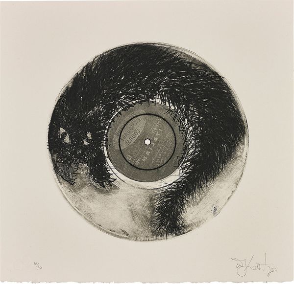
William Kentridge Living Language (Cat), 1999
What I love about the Living Language series is the inventiveness of the printmaking process, in which Kentridge experimented with using a gramophone record as the printing plate. Kentridge scratched his drypoint lines directly onto each record, incorporating its features to form holistic compositions. The subtle nuances of the cat’s posture being formed around the record, curling its body to fit the circular shape, captures the incredibly flexible habits of cats that like to creep into odd spaces and squeeze into hidden nooks.
Since the human eye expects a record to be black, and the cat turns around the record so easily, I think it doesn't pounce at the viewer immediately. It takes a second glance to realize that there is something lurking in the shadows. This secretiveness of the image catches the quiet contemplative feline nature. In contrast, the cat's fur has been drawn in such a way as to appear 'electrified', a typical rendition of the black cat that makes an appearance in several Kentridge works. I think this dynamic portrayal alludes to the volatile personalities that keep all cat lovers on their toes.
Rebecca Tooby-Desmond, Associate Specialist
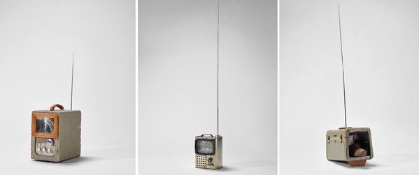
Left to Right: Edward & Nancy Kienholz The Block Head, 1979/1981; The Econo-Can, 1977; The Same Old Shoe, 1984
Rather than selecting a single lot, I've chosen three that are cumulatively less than £5,000. I think this rule-breaking would be entirely approved of by the artists I've chosen: Edward and Nancy Kienholz.
First it was Ed, then Ed & Nancy, and now just Nancy (Ed was buried in 1994 inside a vintage Packard coupé, stocked with cigarettes, wine and the ashes of his dead dog Smash). Their co-authorship, so out of line with the 19th-century idea of a lone (and usually male) artistic genius, yielded these three wonderfully clunky and ugly multiples, published by Gemini G.E.L. Each piece is assembled from the detritus of Modern existence: televisions, luggage, radios, light-bulbs, plastic knobs, tin cans, useless wires and antennae; each serves as a shrine to the junk that becomes treasure in an apocalyptic future.
These works are somehow both rancid and precious; they make me want to cringe and reach out to touch them at the same time. Their cumbersome forms, rendered void of any functionality, are drizzled in an extra-terrestrial slime-like polyester resin, embalming them as reliquaries of consumption and consumerism.
Ross Thomas, Specialist
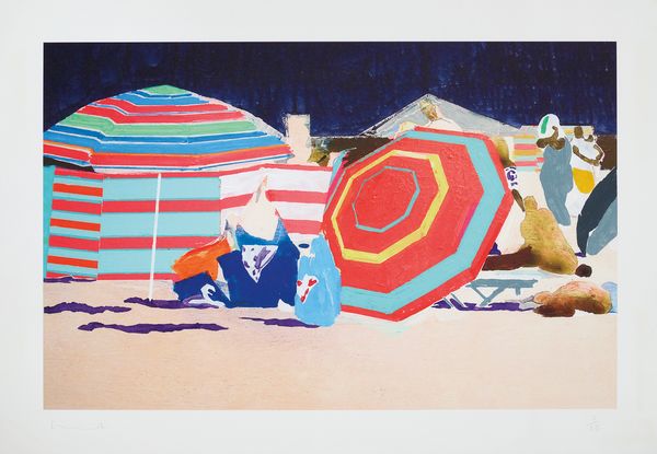
Hurvin Anderson Sun Shade, 2013
Maybe it's the fond memory of hurricane-force ice winds lashing tiny pellets of sand against my face, while huddled behind a makeshift striped storm curtain eating small cartons of Sun-Maid raisins, that draws me to this work by Hurvin Anderson. Not that the pure thrill of contracting hypothermia could ever come close to the calming warmth that exudes Anderson's portrait of beach life, but it's nice to know that somewhere on earth this scene might well exist. Somewhere where the sand is too hot to walk on and the sea is like a warm bath.
Anderson presents us with a snapshot of holiday-living that could be anywhere in the world—even England for one day in August—where, just for a moment, the screaming children kicking sand into your cucumber sandwiches and the repetitive breaking of the waves are silent for one perfect second of peace and quiet. It's at that moment when you wake from a deep beach slumber, the heat from the sun gently burnishing your pale English skin, and you think to yourself, 'This is the life.' Then your body stirs, your torso contracts and you realize the sun has moved and you've been walrus-like in the midday sun for 3 hours.
This scene has everything: it's at once fast-paced and utterly still; it's burning hot but with a refreshing sea breeze. I like it a lot—now pass the after sun.
Anne Schneider-Wilson, Senior Specialist
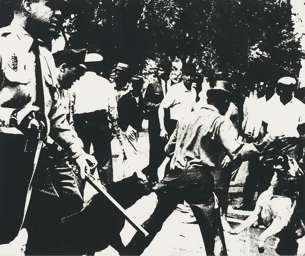
Andy Warhol Birmingham Race Riot, from Ten Works by Ten Painters, 1964
This is the third screenprint Andy Warhol made that was published in 1964 in a portfolio called Ten Works by Ten Artists. This print is based on a photograph by Charles Moore from Life Magazine in 1963. The magazine presented a picture story of police dogs attacking a black man during the Birmingham race riots.
What I like about this print is that Warhol moves away from images of mass consumerism to show a darker side of the American Dream. A lot of people associate Warhol with bright bold colors of mass-produced popular culture, and so I find this politically charged black and white print fascinating. This image is part of Warhol’s disaster series, focused on photographs from newspapers depicting victims in car or plane crashes, or, as here, in the American Civil Rights movement. Because it was published in a large edition of 500 and the print is not signed by the artist, you can buy a very important work by a blue-chip artist for only £2,000-3,000. That is what I love about Editions; you can acquire significant artworks for, relatively speaking, very little money.
Robert Kennan, Head of Editions, Europe
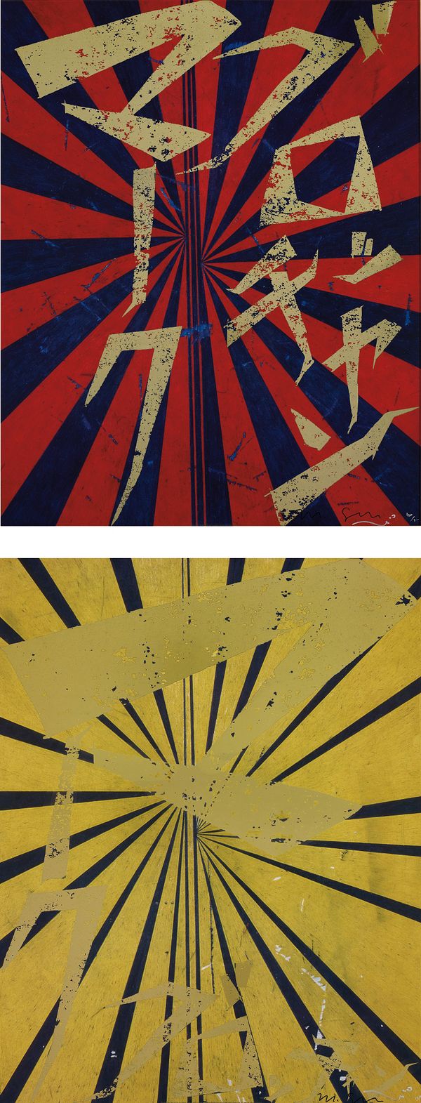
Mark Grotjahm and Takashi Murakami Untitled (Scarlet Lake and Indigo Blue Butterfly 826); and Untitled (Canary Yellow and Black Butterfly 830), 2008-2010
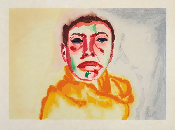
Francesco Clemente I, 1982
I've always liked collaborations between artists, so my choice is lot 321: the Murakami / Grotjahn pair. It's East-meets-West, layered over one another. Murakami's superflat Japanese characters, spelling out his collaborator's name in gold leaf, float above a Grotjahn "Butterfly" vortex, inspired by Op art and Piero della Francesca.
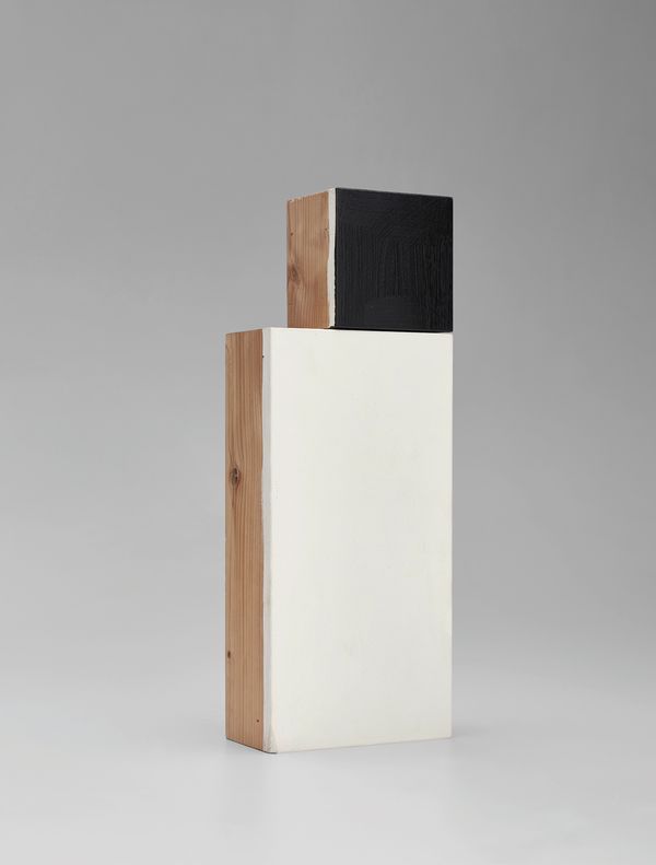
Another joint effort of note is lot 218: Francesco Clemente's self-portrait, a masterpiece of printmaking, created from 17 wood blocks by Ukiyo-e artist Tadashi Toda. The two were brought together by Kathan Brown of Crown Point Press in the early 1980s. As part of the same project, she introduced many other Western artists to Toda, including Wayne Thiebaud, whose Dark Cake graces our catalogue's front cover.
Kelly Troester, Worldwide Co-Head of Editions
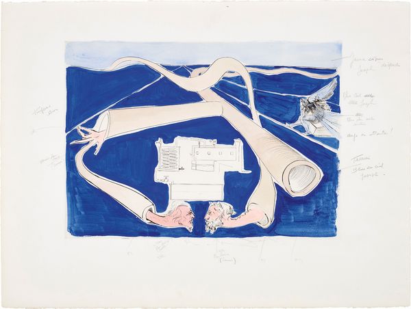
Salvador Dalí Le Cracking du pétrole (Cracking Petroleum), from Hommage à Leonardo da Vinci (American Inventions), 1975
What I love about this Salvador Dalí piece is that it shows us a glimpse of the process of making a fine art print—the artist and craftsmen working together in studio to achieve the final version to be hand-printed in a limited edition. Printmaking incorporates a vast array of techniques that can be quite challenging to understand or envision. You have to become familiar with the surface details and read the clues to figure out how it was made.
This unique color proof starts with a printed impression of the drypoint (etching) image—the velvety black lines—and then Dalí paints with watercolor to see what colors he wants to add, ultimately done through the use of aquatint plates for the edition. His extensive French pencil annotations and instructions in the margins tell the printer how he wants these areas to look and pertain to color and shade refinement, shapes, deletions and notes about the print run. The painterly additions and specific notes make for a historically important work on paper straddling many collecting interests.
This proof of Catalytic Cracker was done for the series Homage to Leonardo da Vinci (American/Great Inventions), 1975, and was one of 12 images illustrating various important inventions such as the airplane, car, computer circuit, sewing machine, linotype, rocket, telephone, light bulb, air brake, wireless phone and the harvesting reaper.