Article | Specialist Picks Editions Season In New York
Specialist Picks: Editions Season in New York
Our favorite works across several auctions this spring.
David Hockney, Man Looking for His Glasses, April 1986, 1986. Editions & Works on Paper New York.
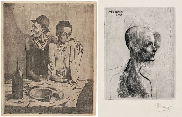
Left: Pablo Picasso, Le repas frugal (The Frugal Meal), plate 1 from La Suite des Saltimbanques, 1904. Right: Pablo Picasso, Buste d'homme (Bust of a Man), plate 4 from La Suite des Saltimbanques, 1905. MODERNISM: Editions & Works on Paper.
Kelly Troester, Worldwide Co-Head of Editions, Deputy Chairman, Americas
After years (!) surrounded by the history of printmaking in one fashion or another, many colleagues and friends in the business think about or are asked, "What would your fantasy collection include?" I am sure we would all have large storage spaces to rotate themes and new passions, but master prints would be a classical focus of mine. I’d have a few Dürers for sure, a Three Trees, Schongauer’s Temptation of St. Anthony, Blake, Segers, early Klee, Manet, Redon, a Degas monotype, Kirchner, Munch, Frida’s only litho… and these two moody beauties leading us into the 20th century. Drawn when Picasso was 23 or 24 years old, and his second and fourth prints made: truly, wow. All dramatic black and whites on my walls — especially with these rich and rare impressions of mannerist street performers: a blind man, an early lover of Picasso’s, and a young man — both (or all three figures) are glimpses of history as we move further away from them. Probably more important to me would be their symbolism of the dark fragility and the contrasting strength of life at the same time. How fortunate that these sheets still exist for us to savor. #collectprints
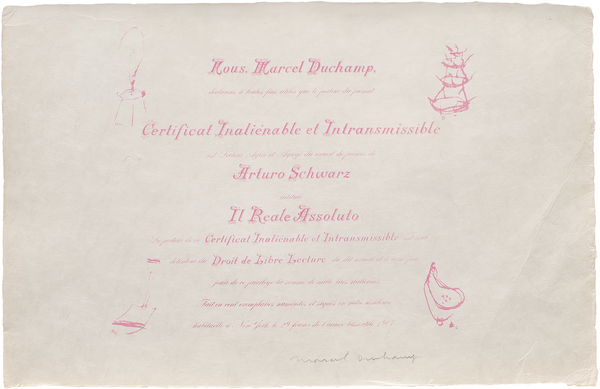
Marcel Duchamp, Certificat de Lecture, from Il Reale Assoluto (Degree in Reading, from The Absolute Reality), 1964. DUCHAMP & COMPANY, Curated by Francis M. Naumann, New York.
Cary Leibowitz, Worldwide Co-Head of Editions, Deputy Chairman, Americas
I love this lithograph. Hang it on your wall to show that you are not only allowed to read, but also to look and think about what you want to read and think whenever you feel like it.
Maybe it's an over-60 thing.
Certificat de Lecture, or a "Certificate of Reading," a "Degree in Reading."
(Made about 40 years after Mr. Duchamp “wasn’t making art” for a book of poetry by Arturo Schwarz.)
Sometimes, an artist not making art is art history in the making.
The certificate serves as an "inalienable and non-transferable" document — I have earned this certificate to prove I have a seat at the cool kids' table!
Get me a bigger bucket list!
But I am tired and can only think about so much per minute, hour, day, month, year, decade.
Hang it on your wall to show that you are not only allowed to read, but also to look and think about what you want to read and think whenever you feel like it. Sorry, I said that already.
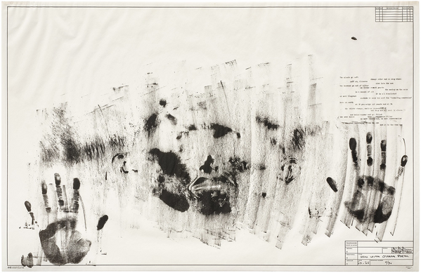
Jasper Johns, Skin with O'Hara Poem, 1963-65. Editions & Works on Paper New York.
Sarah Browne, Specialist, Head of Sale
A poem to honor Frank and Jasper:
Jasper Johns presses himself
into the surface
not drawing, not describing
just leaving
proof of contact
hands, face
not drawn, not described
but transferred
like a thought you didn’t quite finish
the paper stays precise
cool, measured
a presence
a moment of contact
that’s already gone
and still it lingers
somewhere between touch and image
as if the act of making
hasn’t quite let go
Howard Hodgkin, Venice, Afternoon, from Venetian Views, 1995. Editions & Works on Paper New York.
Jason Osborne, Specialist
Howard Hodgkin mostly painted at a modest scale, though there were exceptions. Think paintings-you-could carry-on-the-subway type scale. I find it strange and unpredictable that, with the less immediate medium of printmaking, he often chose to go so big. As seen here in his 1995 etching Venice Afternoon, from Venetian Views, which measures just over 66 x 77 inches. This is one of a set of four Venetian views, which are presumably abstract interpretations of the landscape, light, and vibe of Venice in the Morning, Afternoon, Evening, and Night. What I love most about them is that they have an immediate and beautiful sense of a specific place that belies the difficult poetic labor and repetition that went into their production.
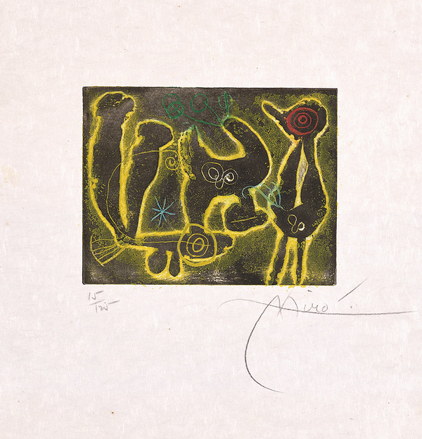
Joan Miró, Saccades: one plate, 1962. MODERNISM: Editions & Works on Paper.
Audrey Bastian, Cataloguer
I’ve heard people bemoan that prints are flat, but isn’t that the point? The paper passes through the press and is merged with the plate. But prints aren’t just flat; they started with dimension, in the printshop with heavy ink rollers, deep-etched lines, and acid baths. Maybe on account of my knack for looking closely, a trusty loupe (magnifier), and its 4x5-inch scale, this little Miró is full of depth. The yellow ink was printed last, and with the help of magnification, I see all its freckles sitting atop the surface, radiating against the black ground. The yellow ink oozes out of the plate's contained borders, like hands reaching out from two dimensions, telling you this is a Miró, come and look closer!
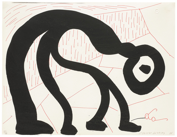
David Hockney, Man Looking for His Glasses, April 1986, 1986. Editions & Works on Paper New York.
Elizabeth Hoskins, Associate Researcher
I relate to this poor guy, as I, too, have spent many a morning in frantic search of a pair of glasses that seem to effortlessly blend in with their surroundings. Hockney perfectly captures the awkwardness that comes from this pursuit: supremely hunched over, neck craned in all sorts of directions, feeling cartoonish and barely human as you pad around in relative blindness, hoping for a hit. To know Hockney goes through this same struggle with his iconic round specs brings me great comfort... even though his frames are a lot cooler than mine, if one of the greatest artists of our time can forego the contacts or Lasik that would put an end to the ever-maddening glasses hunt, so can I!
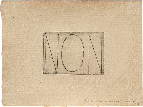
Marcel Duchamp, Première Lumière (First Light), 1959. DUCHAMP & COMPANY, Curated by Francis M. Naumann, New York.
Vivienne Lange, Sale Manager
I might be the biggest fan of one of the smallest works in the sale (the image itself is only 2 3/4 x 3 7/8 in!). Duchamp was renowned for his humorous use of wordplay, and this work is no exception. The etching served a practical purpose of replying to a submission request from Duchamp’s friend and collaborator, Pierre-André Benoit, for inclusion in his publication Première Lumière (First Light). Despite its petite proportions, the message packs a punch: a resounding NON (no, en français), though still fundamentally acting as a submission itself — a cheeky contradiction. I might just take some inspiration for my own responses... you must agree, non?
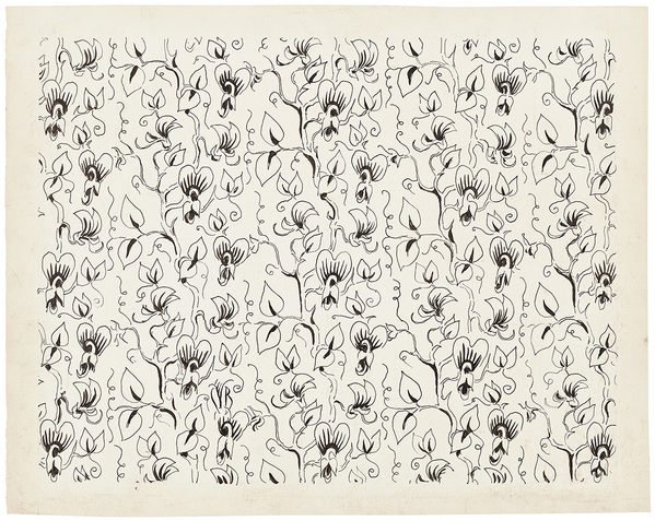
Charles Burchfield, Study for Wallpaper in Black and White, 1922-28. MODERNISM: Editions & Works on Paper.
Eliza Whalen, Intern
In this 21st century world of minimalist kitchens and greige living rooms, Charles Burchfield reaches out his hand and mercifully lifts us into wallpaper heaven with this study. Between 1921 and 1929, Burchfield worked for M. H. Birge & Sons Company as a wallpaper designer; in a later interview, he claimed the incentive for taking the job was that he had "fallen in love" and needed steady work to support a future family. This piece was illustrated between 1922 — when Burchfield married his wife, and 1928 — when she became pregnant with their fifth child. Emblematic of a key period in his creative career before he was able to embrace painting full-time, I find Study for Wallpaper in Black and White to be a masterpiece in its own right.