Article | Specialist Picks Show Your True Colors Editions Auction London January 2026
Specialist Picks: Show Your True Colors
Pantone picks white for 2026, but Phillips Editions team prefers to dip into a wider palette.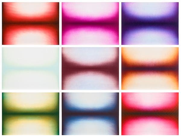
Anish Kapoor, Horizon Shadow, 2010. Evening & Day Editions, London.
Pantone’s choice for the 2026 Color of the Year — a shade of white called “Cloud Dancer” — has led to much discourse, with one social media commenter remarking, “yesssss baddie give us nothing 😍,” and another, “it’s giving walls of the asylum.” While we here at Phillips aren’t nearly as fatalistic or ironic about it, we’d add that, for as much as we love the white walls of the gallery, it’s nice to fill them with some color.
But have no fear, even with 2026 on the horizon and the art world slowing down for some much-needed time off, our London team is hard at work. In fact, they’re Editionsmaxing more than ever, and here they are with all the color one needs to get through the next lap around the sun, featuring works from the upcoming Evening & Day Editions auction.
Andy Warhol
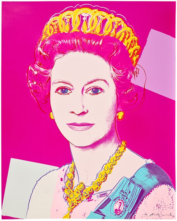
Andy Warhol, Queen Elizabeth II of the United Kingdom, from Reigning Queens, 1985. Evening & Day Editions, London.
Stephanie Wickham-Eade, Cataloguer
When I consider Warhol’s Queen Elizabeth II of the United Kingdom, I’m immediately inspired to start planning and implementing my New Year’s resolutions — this bold and beautiful pink Pop Princess gets me thinking about how I can try to embody even the tiniest bit of her queen-tessentially cool energy in 2026.
For me, it’s back to basics this year:
Hydration: H2O reigns supreme above all other beverages. Coffee, tea and Diet Coke all contain water, of course, but nothing does the job quite like the real thing.
Appearance: Shake off the tired look with some hot pink blush — the brighter the better.
Nutrition: As my husband always says, an oat flat white does not count as breakfast. Bring on the fruits and veg.
Exercise: The holidays never fail to be full on. While all the glitzy parties, decadent foods and free-flowing flutes of bubbles have me feeling like a royal in my own right, things slow down again in January and I’ll get back to practicing my most regal postures on the yoga mat.
It seems like a foolproof plan, right? Give me a couple of weeks and I hope to be radiating just like our majestically magenta monarch.
Roy Lichtenstein
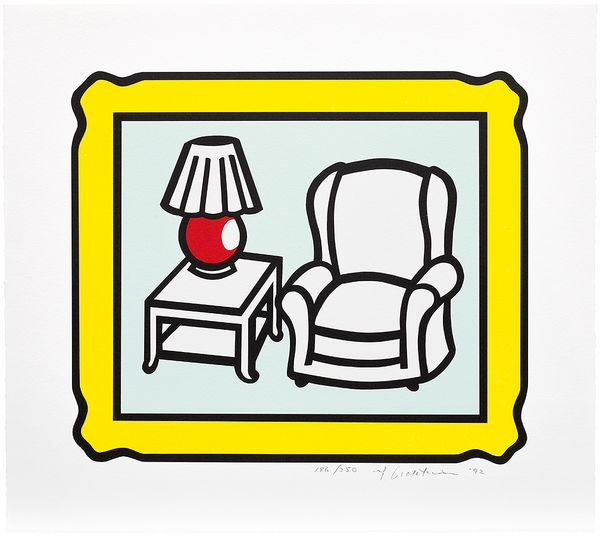
Roy Lichtenstein, Red Lamp, 1992. Evening & Day Editions, London.
Robert Kennan, Head of Editions, Europe
Red is the color we editions specialists fret over most. “Is it attenuated?” we ask each other earnestly. It’s the most fugitive of printed colors.
It’s the bravest of colors too, burning bright. Here, it colors the lamp with brilliant warmth, hot with compassion, beside an armchair providing a place for reflection and solace. An apt pairing for an image created, and donated, by Lichtenstein to support a charity for sufferers of AIDS and the elderly.
Red is not the only thing on the run; time flies too, carpe diem.
David Hockney
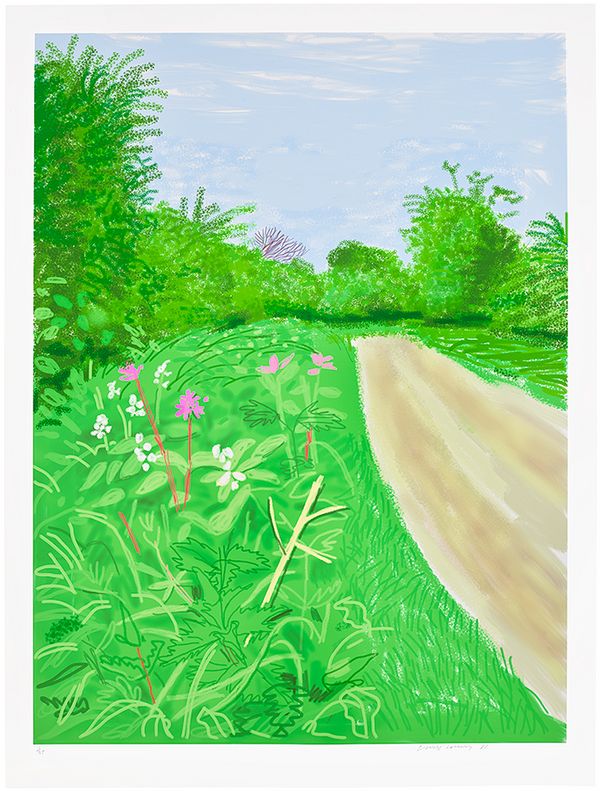
David Hockney, The Arrival of Spring in Woldgate, East Yorkshire in 2011 (twenty eleven) – 26 April, 2011. Evening & Day Editions, London.
Anne Schneider-Wilson, Senior International Specialist
There I am, forever looking for the perfect color to repaint my bedroom walls. Shall I go for calming white like I always do? Maybe we should take inspiration from the vibrancy of Arrival of Spring to spruce up my living space. David Hockney manages to capture this tone exactly, a spritely shade of green we only find for a few precious days in April when Yorkshire’s countryside is at its beautiful. In a world full of chaos — we don’t need calming white but the positivity of a fabulously luscious green.
Pablo Picasso
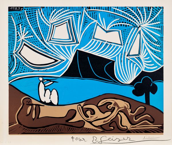
Pablo Picasso, Couple et flûtistes au bord d'un lac (Bacchanale) (Couple and Flutists by a Lake), 1959. Evening & Day Editions, London.
Christian Rosolino, Sale Manager
This… “stuff”? Oh, okay. I see. You think this has nothing to do with you.
You… go to your palette, and you select… I don’t know, that vibrant blue ink, for instance, because you’re trying to tell the world that you take yourself too seriously to care about what you put on your print, but what you don’t know is that that ink is not just blue, it’s not turquoise, it’s not lapis, it’s actually cerulean.
You’re also blithely unaware of the fact that, in 1959, Pablo Picasso did a collection of cerulean linocuts, and then I think it was David Hockney, wasn’t it?… who showed cerulean pools…
And then cerulean quickly showed up in the prints of eight different artists. Then it filtered down through the studios and then trickled on down into some tragic casual corner where you, no doubt, fished it out of some clearance bin.
However, that blue represents millions of dollars of countless jobs, and it’s sort of comical how you think that you’ve made a choice that exempts you from the printmaking industry when, in fact, you’re printing a giclée in inks that were selected for you by the people in this room… from a pile of “stuff.”
—Miranda Printsly from The Devil Prints Picasso
Gerhard Richter
Gerhard Richter, Ophelia, 1998. Evening & Day Editions, London.
Julia Paeslack, Cataloguer and Associate Specialist
White may be having its immaculate little moment, but Ophelia prefers to linger where the light gets moody and the color starts doing the emotional heavy lifting. Enter dark green and teal: cool, velvety, and deliciously dramatic — the shades of deep water, forest floors, and your houseplant that everyone insists is dead, yet thrives out of spite. Richter’s surface slicks, pools and slides like light on water, where green melts into teal and teal drifts downstream along the broken willow tree (as one does). Tragic, but très chic.
Rashid Johnson
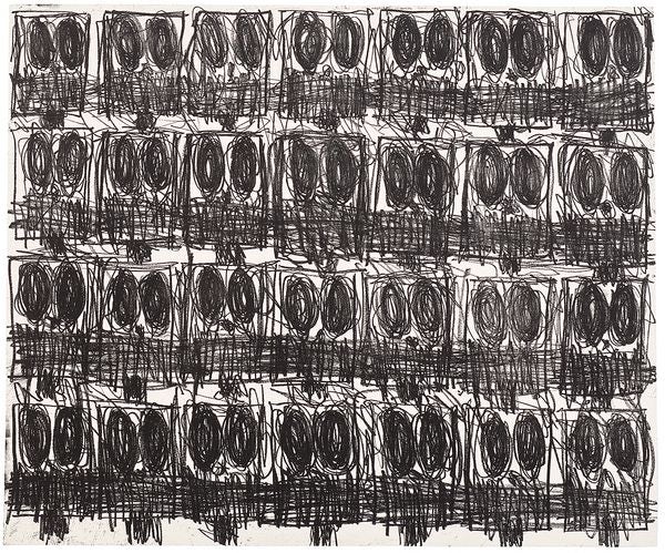
Rashid Johnson, Untitled (Anxious Crowd), 2018. Evening & Day Editions, London.
Imogen Bond, Administrator
Johnson’s “anxious faces” depicts a society which is monochromatic and frantic,
Reduced to individuals severed from one another, its palette is dim, cold and unromantic.
Illustrating a crowd of anxious people, multiplying and compressed into a single plane,
Is this repetition a portrait of modern life? Or is it simply fifty-six circles, insistently the same?
Opposing this, however, he suggests no one is truly isolated or alone,
Inviting solace and peace through his definitive use of color and tone.
As individuals wander through life, freedom emerges from a sea of anonymous faces,
Where beauty and stability are found in repetition and people sharing small spaces.
Johnson acknowledges life’s chaos, it's inevitable highs, lows and changing weather,
Where anxiety has become the thread that binds us together.
Louise Bourgeois
Louise Bourgeois, Fallen Woman, 1996. Evening & Day Editions.
Eleanor Laycock, Editions Intern
Whilst some people favor a winter warmer over the festive period — perhaps a Mulled Wine, a Baileys, or even an Eggnog — our golden lady doesn’t mind what the season is, Limoncello will always be her drink of choice.
This luminous liqueur might be divisive, but for those who are fans, one sip is never enough… however, as Fallen Woman will testify (at least tomorrow morning), the sweet-tasting alcohol has a habit of slipping down slightly too easily. Fallen, but retaining her grace, she glows from all angles, her flowing mane of hair retaining its perfect form.
KAWS
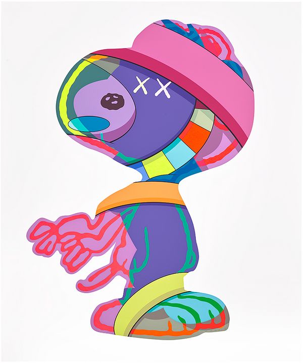
KAWS, THE THINGS THAT COMFORT, 2015. Evening & Day Editions.
Hebe Reynolds, Associate Researcher
Who let the purple dog out? (Woof, woof, woof woof). This rainbow Snoopy has been dunked in a vat of periwinkle purple — think lavender fields, plumpy plums and royal amethyst. Playful yet profound, KAWS’ comforting canine brings joy and happiness through his lively purple palette. Mass-produced merchandise? No! This pawesome pup has bull-dogged his way into the fine art faction, no ifs or mutts. If you’re in the market for a forever-friend, this guy is straight out the doghouse!