Article | Specialist Picks Editions New York
Specialist Picks: Editions New York
Our team highlights a selection of standout works from Phillips' 24-26 October Editions & Works on Paper auction.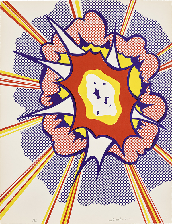
Roy Lichtenstein, Explosion, from Portfolio 9 (C. 49), 1967. Editions & Works on Paper, New York.
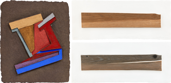
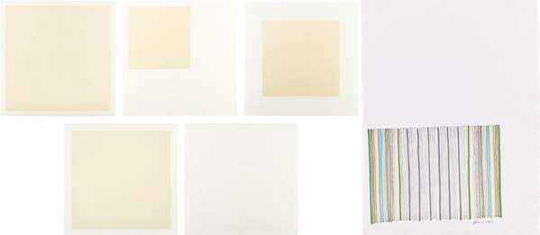
Left: Frank Stella, Olyka (III), from the Paper Relief Project (T. 544, A. & K. 106.3), 1973. Editions & Works on Paper, New York. Right: Ed Ruscha, New Wood, Old Wood, 2007. Editions & Works on Paper, New York.
Jason Osborne
These two prints, even though divided by decades in their production and thousands of miles in their artists’ coastal residencies, somehow manage to find common ground in their sculptural qualities and reference to the elemental nature of wood. East Coast abstraction meets cool West Coast pop. And pop these works do, right off the paper into a three-dimensional space. Ed Ruscha’s New Wood, Old Wood (2007) relief print is a strikingly convincing trompe l’oeil depiction of a fresh piece of rough wood resting above an aged, cracked plank. Published by Mixografía®, known for their trademarked and involved relief print processes, the prints are uncanny in their likeness to actual pieces of wood and virtuosic in their craft and making. Frank Stella’s Olyka (III) (1975) from his Paper Relief Print series also rests in substantial relief. The titles of each work from the series reference specific places in Poland and the Soviet Union where centuries old, intricately constructed wooden synagogues were destroyed. One can see the homage to these lost synagogues in the tightly, carefully constructed and geometric composition of this hand-colored paper pulp relief.
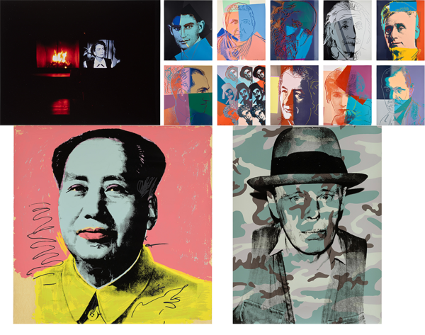
Clockwise from top left: Nan Goldin, Joan Crawford on Fire, Thanksgiving, New Jersey, 2005. Editions & Works on Paper, New York. Andy Warhol, Ten Portraits Of Jews Of The Twentieth Century (F. & S. 226-235), 1980. Editions & Works on Paper, New York. Andy Warhol, Mao (F. & S. 91), 1972. Editions & Works on Paper, New York. Andy Warhol, Joseph Beuys in Memoriam, from For Joseph Beuys (F. & S. 371), 1986. Editions & Works on Paper, New York.
Cary Leibowitz
Someone once said
Or a billion people have said more than once
Or like we say here on Park Avenue
A picture is worth a thousand words
But
May I interject —
Let’s do the math
Nan
Goldin
Joan
Crawford
on Fire
Thanksgiving
New Jersey
Here the 7-ish word title is worth it all (OK plus artist’s name)
Don’t get me wrong
It’s a great photo
Here Nan Goldin captures a moment
Really quite magical and it isn’t some smarty pants photo-shopped juxtaposition
I confess
I get FOMO (fear of missing out) with every every every single Nan Goldin photograph
The glow of a roaring fire and an old Joan Crawford movie
A belly full of turkey and pie
Tomorrow Black Friday in New Jersey
Speaking of missing out---
Bear with me this will be shorter
I never did meet Queen Elizabeth
I realize that doesn’t get me a lot of sympathy and maybe she wasn’t in my top ten to meet but this is a perfect portrait.
Right royal as they say — even with diamond dust — because it’s the royal edition
It’s like the portrait of George Washington by Gilbert Stuart
Or the Holbein portrait of Henry the VIII
I mean — there are great portraits of other people too and don’t start talking about Goya!
— BUT
by Andy Warhol??
How did he do this — and in a way he still does it as his ‘way of working’ has now been ‘adopted’ by everything everywhere all the time
If I count the Warhol portraits in this auction there are 21 — including Mickey Mouse (which he already prefaced as a myth) and a self portrait
I am totally back to my overwhelming FOMOF (fear of missing out FOREVER)
I’ll never meet Marilyn Monroe
I’ll never meet Elizabeth Taylor
I’ll Never meet Sigmund Freud
I’ll Never meet the Marx brothers
I’ll never meet George Gershwin
I will never meet Gertrude Stein (I do feel gipped)
I’ll never meet Franz Kafka
I’ll never meet Martin Buber
I’ll never meet Justice Brandeis
I’ll never meet Sarah Bernhardt
I never met Albert Einstein
I never met Golda Meir
I’ll never meet Muhammad Ali
I will probably never meet Mick Jagger although I did see him once
I’ll never meet Mao (Tse Tung) (I’m very Ok with this)
I never met Joseph Beuys
I never met Andy Warhol (very very gipped!)
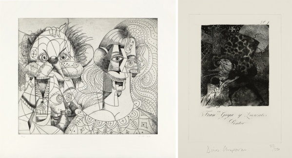
Left: George Condo, Untitled, 2019. Editions & Works on Paper, New York. Right: Jake and Dinos Chapman, Dinos not Jake, Reworked and improved etching from Francisco de Goya's 'Los Caprichos', 2006. Editions & Works on Paper, New York.
Sophie Shapiro
It is an art lover’s dream when an artist can make historical references while simultaneously maintaining their own contemporary style, giving a wink and nod to those who recognize the artistic conventions of past movements. These etchings by George Condo and Jake and Dinos Chapman expertly reference Pablo Picasso and Francisco Goya. George Condo’s thin lines depict three, maybe four, cubically distorted bust length portraits that draw on the Mannerist style of the 16th century and Cubist style of the early 20th century. He has referred to his art as “fake old masters,” and despite these overt references, his prints are unmistakably Condo. Jake and Dinos Chapman modernized Francisco Goya’s 'Los Caprichos', a series of 80 etching and aquatints that critiqued society and the Spanish government. Goya included titles at the bottom of his prints illustrating Spanish proverbs and contemporary references. Jake and Dinos Chapman do the same, their simple title reading Francisco Goya y Lucientes: Pintor. These artists use their unique styles to add a contemporary spin on this historic medium, innovating and, as the Chapman brothers might argue, improving on the cornerstone of 19th and 20th century printmaking.
Left: Robert Ryman, Four Aquatints and One Etching (S. RRG10/1-5), 1991. Editions & Works on Paper, New York. Right: Gene Davis, [Untitled], 1981. Editions & Works on Paper, New York.
Sarah Browne
Davis and Ryman's signature artistic repertoires convey movement and joy. Seemingly quiet and contemplative at first glance, each work has an electrical current running through the surface. The Smithsonian American Art Museum remarks, "Despite their calculated appearance, Davis’s stripe works were not based on conscious use of theories or formulas. Davis often compared himself to a jazz musician who plays by ear, describing his approach to painting as ‘playing by eye'." While Davis explores rhythmic color intervals, Ryman says "the real purpose of painting is to give pleasure." He compares painting to music and the joy one feels just listening to the sounds of a song, not being concerned with the score itself. Ryman too found inspiration from jazz; escaping the country music of his youth in pursuit of New York's bebop tunes.
Two jazz aficionados finding pleasure in subtleties and familiar marks.
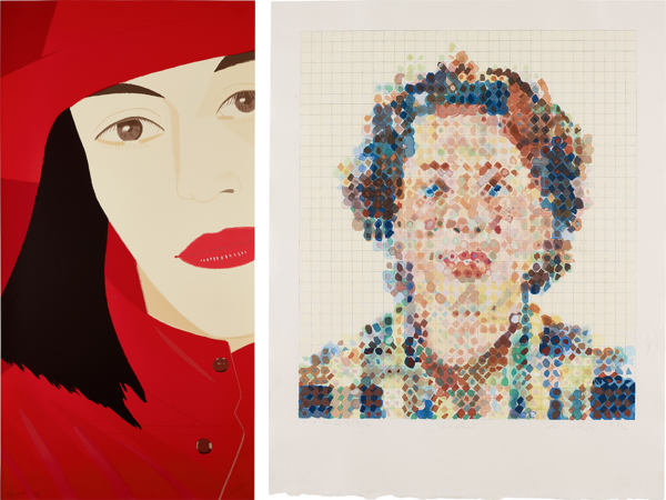
Left: Alex Katz, Red Coat (S. 164), 1983. Editions & Works on Paper, New York. Right: Chuck Close, Leslie, 1986. Editions & Works on Paper, New York.
Emma Pfeifer
Just blocks away from our lovely Park Avenue saleroom are the 57th and 86th street subway stations. These new terminals opened to the public in 2017 and 2019 and have been used by thousands on their daily commutes and by tourists navigating the city. Alex Katz, a native New Yorker, has several monumental pieces in the 57th street station on the F line, depicting his iconic portraits and flowers. The recently deceased artist Chuck Close decorated the walls of the 86th street station with a series of kaleidoscope shapes that from a distance become a portrait. Our eagle-eyed visitors may recognize the same artists represented in our galleries with Alex Katz’s Red Coat and Chuck Close’s Leslie. Both artists are well-known for their portraits and have a distinctive aesthetic that makes their works recognizable to visitors, art enthusiasts, and auctioneers alike.
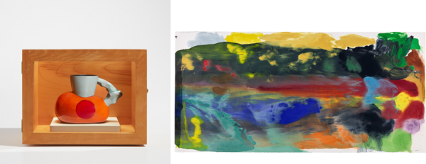
Left: Ken Price, Chet (G. 1539), 1991. Editions & Works on Paper, New York. Right: Friedel Dzubas, Untitled, 1981. Editions & Works on Paper, New York.
Audrey Bastian
Of course, Ken Price admired Meret Oppenheim's famous fur-covered cup and saucer; in Price’s own words: "I just like the cup." Ken Price explored the subject of the cup through constant reinvention and whimsy. "The cup essentially presents a set of formal restrictions — sort of a preordained structure," said Price, "but it can be used as a vehicle for ideas.” Price’s sculptures explore his interest in the recesses of space, varied surfaces, and textures. In Chet, Price places his delicate ceramic on a tiny pedestal in a wooden display case, enticing the viewer in. Not entirely unlike color field painter Friedel Dzubas’ work, whose inventive and painterly gesture persuades with richly pigmented imagery. Dzubas’ monotype from 1987 makes for a large and vibrant pairing to Price’s brightly glazed cup. Full of naturally occurring phenomena and references to the experience of color, Dzubas utilizes the most painterly of prints to his advantage. As Dzubas once wrote, and despite my own undying defense of the multiple, “you cannot mechanically materialize spontaneity.”
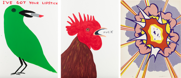
Left: David Shrigley, I've Got Your Lipstick; and Fuck, 2021. Editions & Works on Paper, New York. Right: Roy Lichtenstein, Explosion, from Portfolio 9 (C. 49), 1967. Editions & Works on Paper, New York.
Fiona Fraser
“The Heist”
A kleptomaniac bird and an overly ambitious rooster awake before dawn, the unlikely duo team up to pull off a heist. The meet. The disastrous results. Someone should have checked their references.
Shrigley sass meets Lichtenstein pop. British wit meets the American desire for action. Distilled to their bright primary colors and recognizable graphic motifs, the commercial appeal of these prints draws the viewer into a storyboard that no one asked for — but a little humor never hurt anyone. Both artists find cartoons at the center of their artistic practice, Shrigley’s deadpan humor offering balance to Lichtenstein’s idealized Americana, both beckoning you to look a bit deeper beneath the surface. Eye-catching and effective, don’t let these simple motifs fool you, there is more than meets the eye and if you don’t watch out, a little birdie might just steal your lipstick when you aren’t looking.
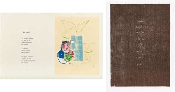
Left: Marc Chagall, Poèmes (Poems) (C. bks 74), 1968. Editions & Works on Paper, New York. Right: Ugo Rondinone, Poems, 2006. Editions & Works on Paper, New York.
Kelly Troester
The Romantic Tradition - nature and the human condition. Chagall and Rondinone, a few generations apart, two Romantics who had/have similar need to wander in those special personal inner worlds expressed through art and poetry.
Chagall thought of himself as much of a poet as a painter and preferred the company of fellow poets. He composed many poems and illustrated tales, people, and places in a truly poetic style of drawing. Rondinone creates poems as part of an extended artistic lexicon, his breathing. With their artistic fullness in media and techniques, these two artists both afford us a wonderful coincidence here with their choice of woodcuts used to illustrate their words. And neither have used carved wood blocks in printmaking really that much. Chagall adorns his poems with elaborate woodcut imagery, Rondinone carves out his words and marks in the blocks using them as his elegant forest. Both embrace the earthy, spiritual texture of the wood and papers they are printed on.
The poems Chagall wrote in this set span a lifetime of creativity, and Rondinone’s collection feels as if they do, too; their words giving us just enough to grasp, relate to, yet we are left to decipher more of their experiences and visions.
Beautiful chance, I see
Beautiful rhymes and reasoning.
Recommended Reading